
MakeoverMonday has grown beyond my expectations. The community’s contributions each week are astonishing and create an amazing conversation.
One of the principles Andy Kriebel had when he started this was to be positive: nobody sets out to deliberately create a bad viz. Andy always points out the positive as well as the negative. MakeoverMonday is not about sneering about other people’s work.
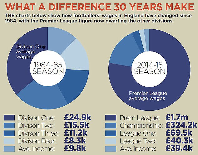
In my Premier League Salary makeover post, I forgot this principle. Here’s what I said about the Daily Mail’s donut chart:
But, oh dear, this week’s chart is committing many crimes against dataviz. I wonder sometimes what the motivation behind a chart like this is. Do the editors just expect people to glance at it and think, “Oh, a chart. This story must be backed by data. Therefore it must be valid”? That must be the reason because this chart collapses under serious scrutiny.
And what happened on Twitter? Nick Harris, who wrote the article and collected the data, was upset, and started a defensive debate with me on Twitter.
@VizWizBI @acotgreave All in favour of most effective / striking data viz; but when u make errors of fact on something you've not read, poor
— Nick Harris (@sportingintel) February 29, 2016
We eventually worked it all out, but given the aggressive language in my critique, how else would I expect Nick to react?
I should have been much more respectful. I could have emphasized the things I liked about the viz and neutrally explained why I think the charts didn’t work. Had I done that, our debate would have been developed in a much better way.
This also raises a point about our own opinions and beliefs. I am not a fan of the Daily Mail. I don’t agree with its politics or approach to journalism. Did that cloud my reaction to the chart before I even looked at it? If this had been in the Guardian, would I have been fairer? I suspect the answer is yes to both those questions.
Here’s what I need to remember: MakeoverMonday is about building positive conversations. We find vizzes with great data which we feel could be improved in some way. The intention is to generate conversation, not upset the creators.
I was at Tapestry this week where Enrico Bertini said something perfectly captures what I think MakeoverMonday is about: “Use data visualization to generate ideas not truth. Data visualization is a creativity tool.” The variety of perspectives we see based on all the contributions prove that.
There have been many great articles about how our community should critique visualisations. I recommend you read them all:
- Design and redesign by Fernanda Vegas and Martin Wattenberg
- Walking the tightrope of visualization criticism by Andy Kirk
- What’s happened to the trust? Also by Andy Kirk
(thanks to Rob Radburn for feedback on drafts of this post and Leigh Fonsecca for encouraging me to write this)

4 Comments
Add Yours →[…] Andy Cotgreave | Criticise Positively […]
Beautifully said, Andy. Your humility and honesty is something our whole dataviz community should aspire to! Isn’t it fascinating how one idea -#MakeoverMonday – can open so many cans of worms!
Thanks Jane. “so many cans of worms” is so true. This project has been fascinating from day one!
[…] Andy Cotgreave on critiquing positively […]