This week’s source chart is a shocker. There’s very little right with this chart. The title is good, because it asks a question. After that it pretty much falls apart. The actual percentage value is very hard to see. The donut doesn’t help. The percent change circle is totally confusing. They also used a negative scale to size the circles which requires mental hurdles to overcome.

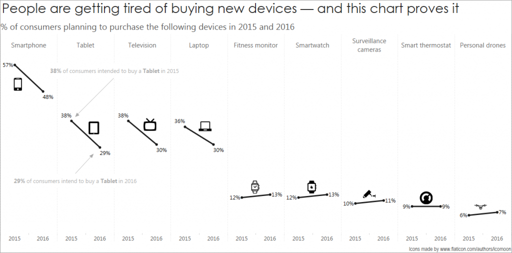
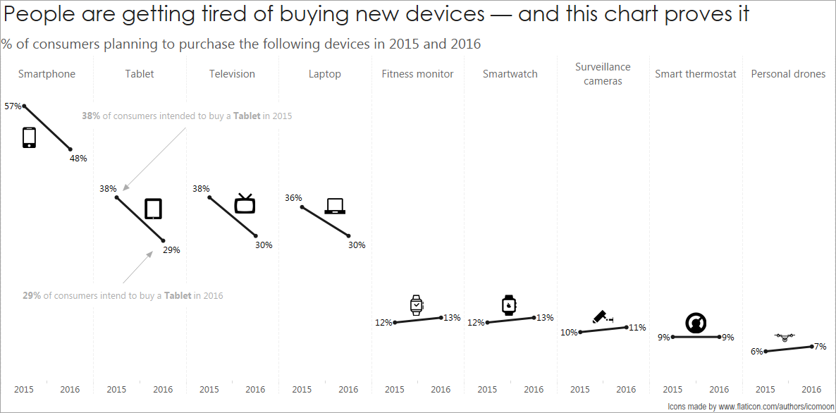
My makeover is at the top.
Comparing growth and decline between two time periods immediately cried out “Slope Chart”. It could have been a side-by-side bar chart, but I am not a fan of those. A dumbbell chart might have worked too, but showing the direction of time is a challenge. I tried Comet Charts to show this, unsuccessfully, a few years ago.
I really wanted a pure slope to work, with all lines within one pane.
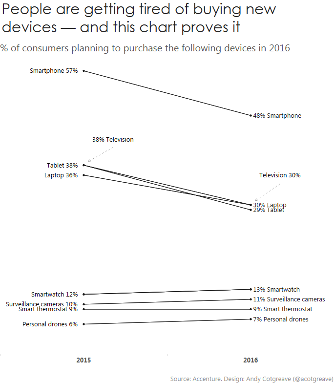
However, this didn’t work for me. Too many of the lines were too close. I had to do callout labels for Television. The four lines along the bottom are all a little too close to each other for my liking.
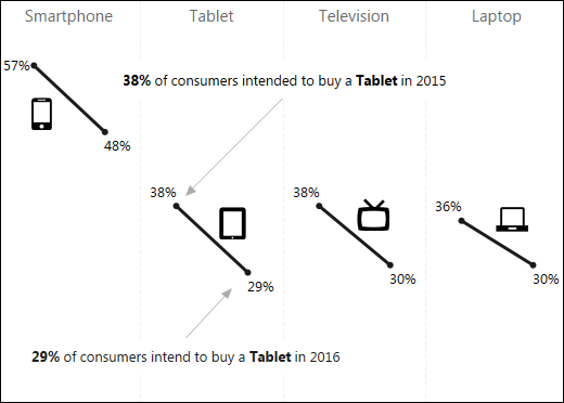
Instead I resorted to a pane for each item. Here’s the version without shapes:
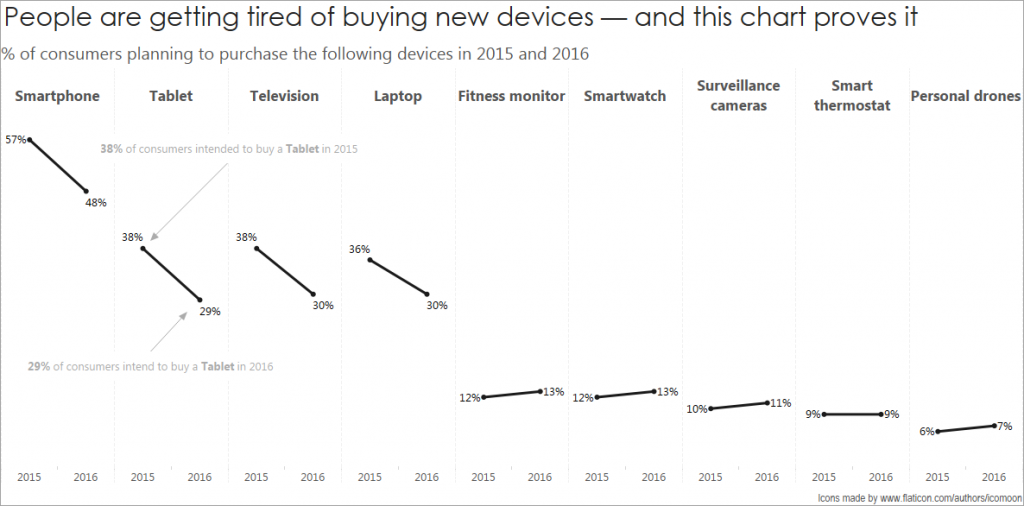
It’s still easy to compare the slopes of each line but not quite as easy. The cognitive load is a little higher this way. As you can see at the top, I chose to add icons. I did this to make it easier to identify each line without the requirement to move your eyes to the top of each pane. Icons are more appealing than labels. However, using icons can be a challenge: what’s a universally identifiable icon for “smart thermostat”? How do you tell the difference between a Smartwatch and Fitness Monitor icon?
We chose this week to stick to greyscale. Remaking this chart was straightforward. Because there are multiple panes, I don’t need to use colour to identify each product.
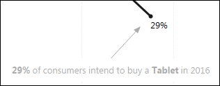
I added the annotations to help users read the slopes, if they’re not familiar with them. Being in greyscale this week was a good reason to soften the text to a very light grey. This helps the annotation disappear when you want to focus on the marks. If the labels were as black as the lines, it all gets too much:
5 Comments
Add Yours →I like this redesign quite a bit.
I immediately thought of a slope chart as well, but as you mentioned, the standard layout results in far too much clustering.
A couple of changes that I would make:
1) the title. I know it’s the title of the article, and I realize the goal is to remake the chart, not re-focus the point, but – the title is a conclusion not supported by the data, and leaves me looking for something that the chart can’t tell me.
2) the icons are nice to include, for the reasons you specified, but I would like to see them muted to a mid or light grey. They take over a bit.
3) possibly different colored lines for the items with an increase vs those with a decrease, or some other method to highlight the increases.
One of the downsides of this layout is that it gives the overall impression of decline, as the items are sorted in declining order, and the overall shape of the layout is a decline…
The small scale of the increases at the end make them easy to ignore.
hello jl! I concur with all your comments. I wanted to do lighter icons, but ran out of time to lighten them. I did try the colour scheme to indicate up or down and it looked fine, but again, ran out of time to give it the finesse it needed.
The slope graph is ok but I’m not as crazy about it. For one, it takes up a lot of screen real-estate. Secondly, and more importantly, it hides the story nearly as effectively as the original viz.
My take is here. https://public.tableau.com/profile/mp.lee2014#!/vizhome/MakeoverMondayConsumerElectronics/Sheet2
I didn’t spend much time on it so I will grant you the aesthetics are lacking. They story for me was the division between older and newer technologies. Yes, they’re down for smartphones and tablets but trending up for newer devices like smart watches or fitness monitors.
HI marc-paul. Thanks for the comment. I agree there’s a lot of real estate taken up. That’s not always a bad thing, but it’s definitely a fair point. I did try the more compact standard slope, but the lines were too close for my liking.
There’s one major problem with your remake: the stacked bars suggest that the percentages can be added together. However, that’s not valid: you can’t add those percentages together. I agree the end result makes a bar which looks smaller this year than last, but stacking different percentages is a risky game.
Agreed that stacking bars can be misleading although I think there is some value in showing that their share of the market is much larger than for the new tech items.