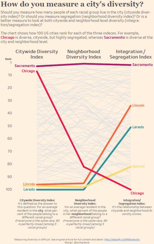
This week reiterated that when you engage with data rather than just consume it, you learn more. This week’s data is fascinating. FiveThirtyEight’s original article is very good at explaining the perils of choosing just one measure to explain something as complicated as a city’s racial profile.
Understanding the nuances of statistical measures is vital at all times. This is especially true this year for people in the US and the UK. In the US, the election will be rife with statistical claims, and in the UK the EU Referendum is also awash with claim and counter-claim. Even when statistics being used are true, we need to be educated enough to judge if they are appropriate.
Here’s their great chart:

What do I like about their scatterplot?
- Two trend lines. One is the 45 line, showing what a perfect correlation would be. The trend line for the data is in red. Having both helps you see more clearly how one measure skews the other.
- It’s well labelled. Scatterplots do need time to digest as you work out what all the different areas of the chart mean. The annotations and title help greatly.
What would I improve?
- I do find FiveThirtyEight’s grey background a tiny bit frustrating: I don’t know why they consciously reduce the contrast between foreground and background in this way. It’s only a small gripe.
- The article discusses three measures but the chart only displays two of them.
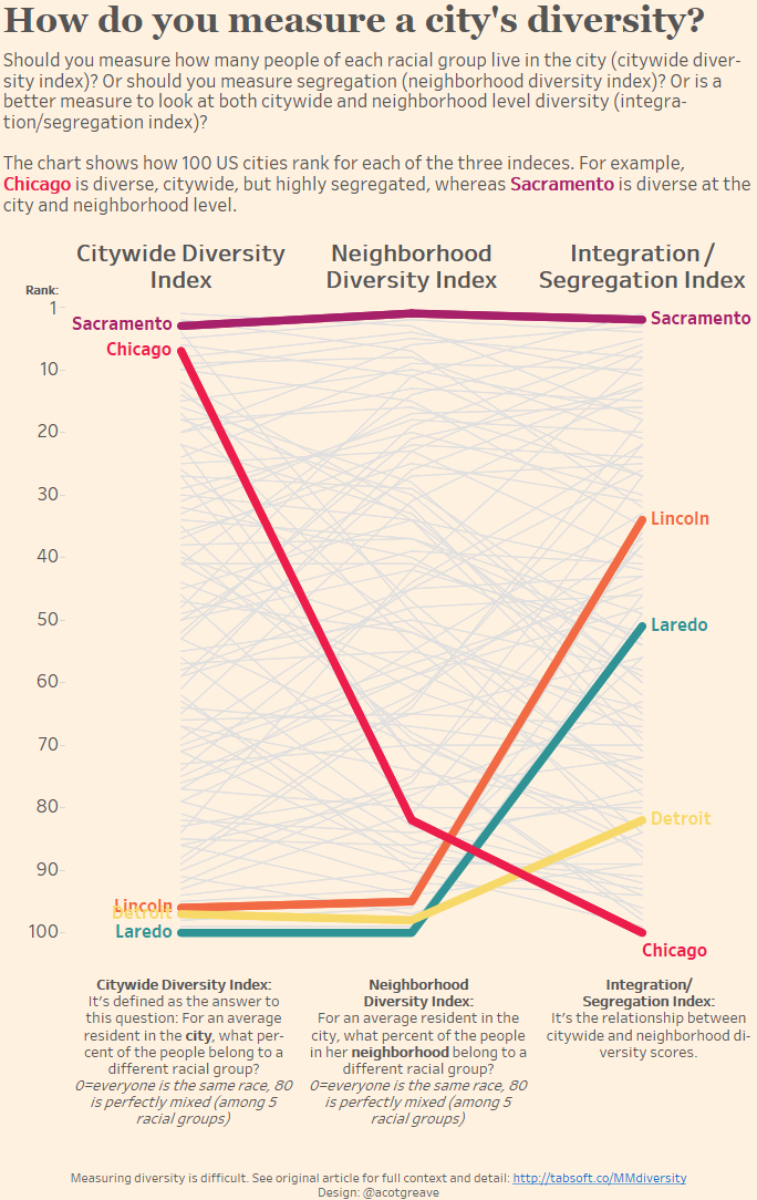
I wanted my makeover to focus on comparing all three of the different measures in one view. I chose to highlight some of the cities they talk about in the article in order to see how the 3 measures change the rank of the city.
Design challenges
I had plenty of ideas this week. My first idea which, in my head, looked amazing, was to take the format of the FT’s excellent economic indicators dashboards: contextual paragraphs to the left of insightful charts.
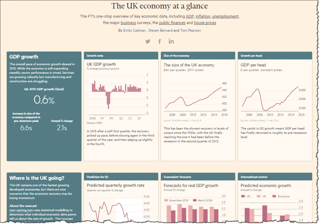
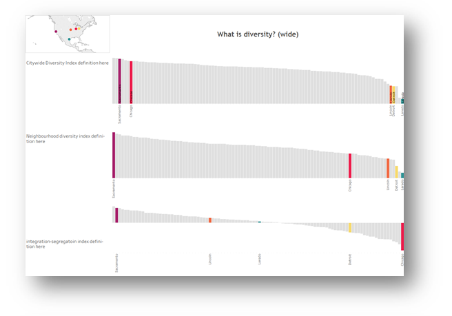
I imagined 3 rows, one for each measure. On the left of each row would be a description of the measure, and on the right, a tidy sorted bar chart. All bars would be grey except for the cities I wanted to highlight.
But it just didn’t quite work. The bars for the highlighted cities were too indistinct:
Since horizontal didn’t work (a shame, because horizontal charts fit better in a tweet!), maybe vertical would? Nope.
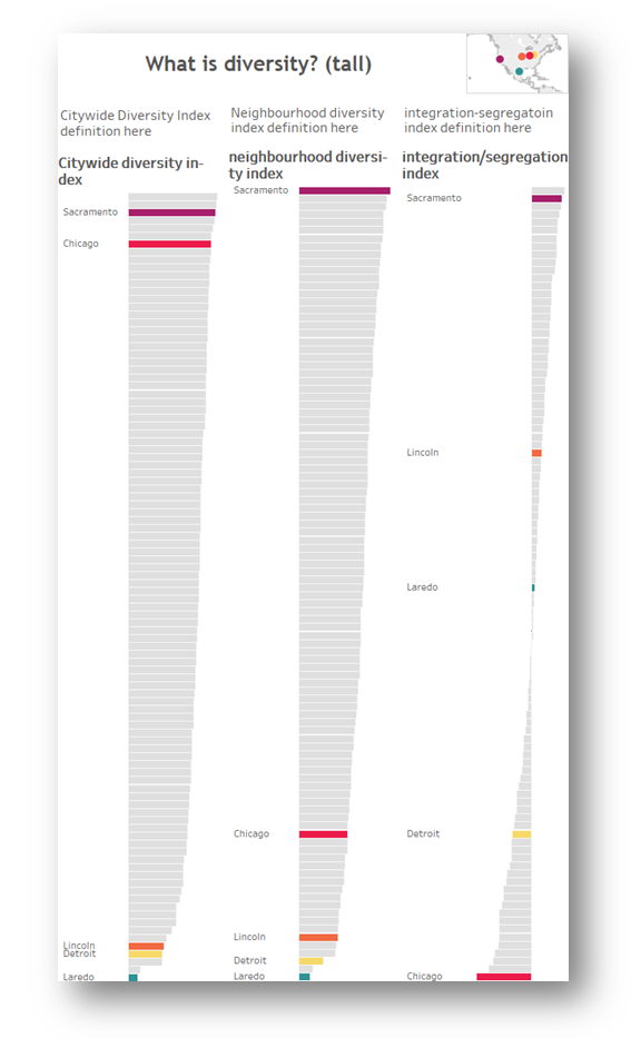
Note: writing up this post, I now think I could have succeeded in this design by dropping the 5 citites and using highlighting to show cities. Problem is, that would require people interacting with the viz to get anything out of it, and I’m trying to focus on static charts in my Makeovers.
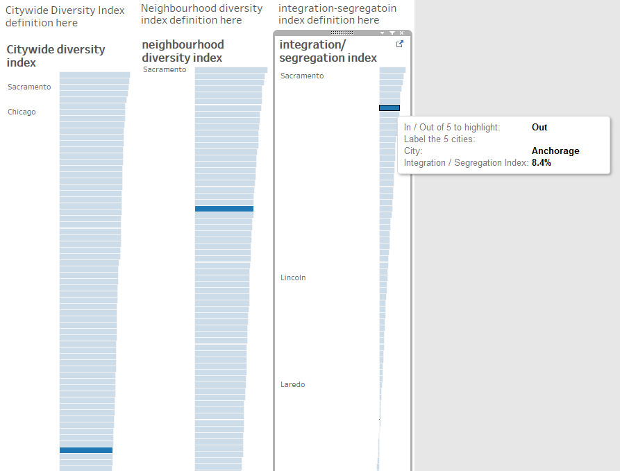
The problem with both of these is the Integration/Segregation index. Because that crosses the zero line, many of the bars are tiny, so it’s hard to see individually highlighted bars.
My solution to this was to change the measure: instead of showing the actual value, I’d use Rank. Also, at the back of mind all along had been the words “Slope Chart”. I had initially wanted to avoid the slope because I seem to be using them for lots of my Makeovers.
Could I tell a slope story in a new way? Can slopes work horizontally?
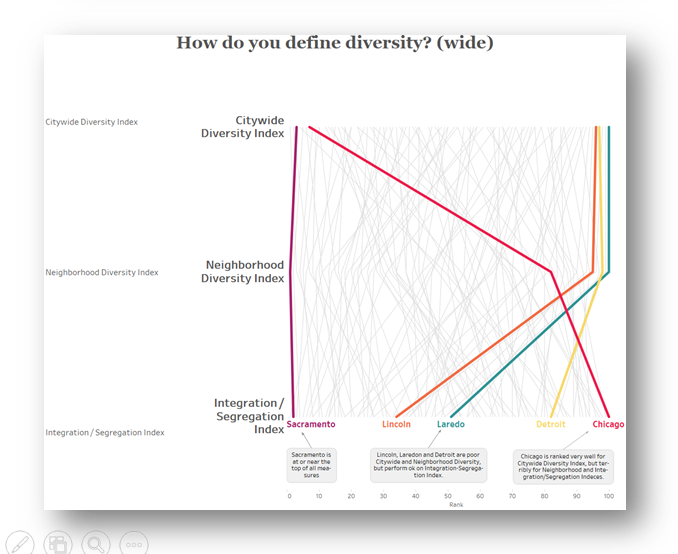
I don’t think that really worked. Slopes seem like time lines in that we are totally accustomed to seeing them oriented horizontally. Is this is an aspect of our visual system or because convention has trained us to read them this way?
Feel free to download the workbook and see the different versions I tried.
Check back tomorrow and I’ll blog about some Tableau-specific tips I want to share from this week’s Makeover.


Recent Comments