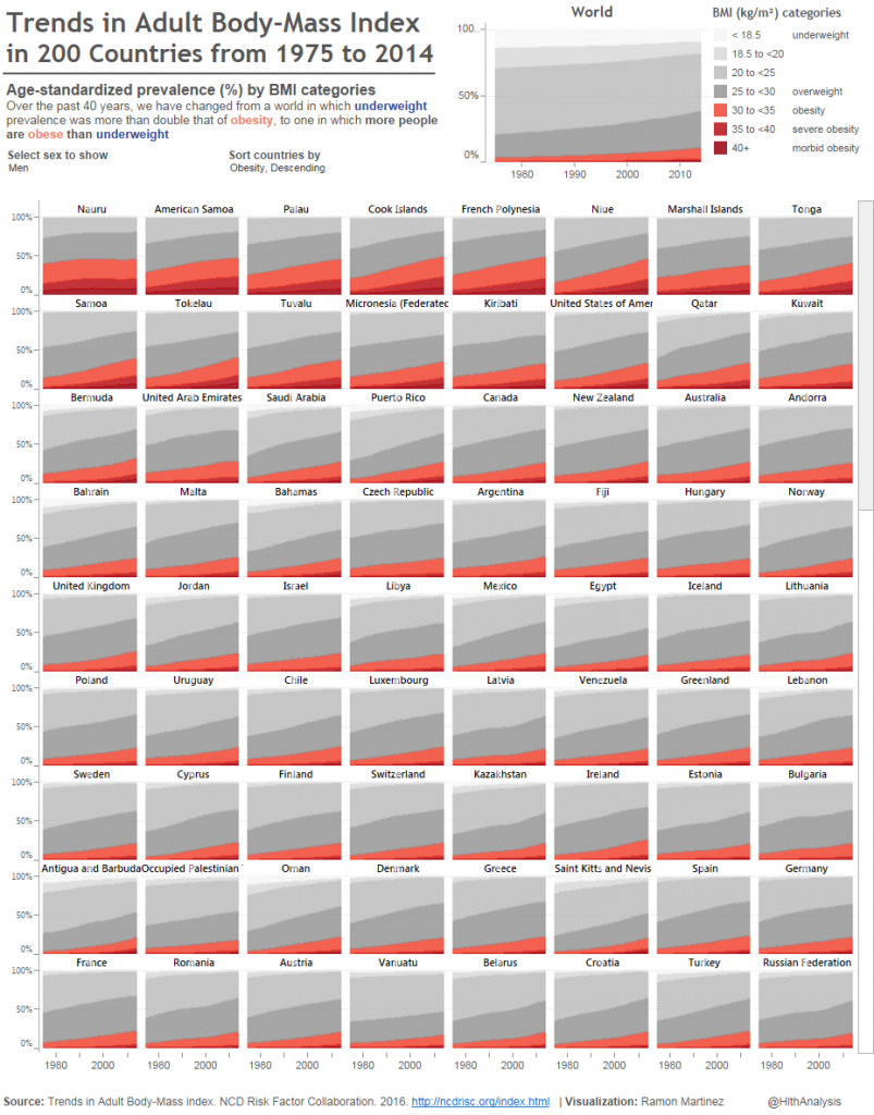
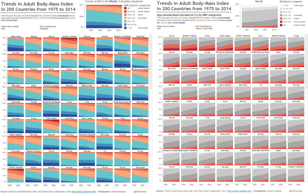
Ramon Martinez produces excellent work. His latest is a small multiple masterpiece showing the growth of BMI over 40 yrs. It’s beautiful, impactful, full of insight and has rightly been celebrated by people on Twitter.
I love these #dataviz #infographics #dataJournalism https://t.co/zN6m1ejl0N
— Alberto Cairo (@AlbertoCairo) April 4, 2016
I do propose four changes to help focus on what I think the key story is: the growing obesity crisis.
- Change the colour scheme. I found it a little hard to decode the colour scheme. Which colour is good and which is bad? I’ve changed to a red/grey scheme: now red is bad and pops out more clearly. My palette choice isn’t perfect as it’s not a truly continuous scale.
- Change the order of the BMI categories. I’ve put the highest levels of BMI at the bottom, so it’s easier for us to see the growth of obesity.
- Change the default view to be sorted showing the worst countries first.
- Go tall! [I didn’t implement this one] I would show all the countries on the dashboard without needing the scrollbar. One thing MakeoverMonday is revealing to me is just how effective very tall charts are. I’m loving seeing these and they work very well on mobile devices.
What do you think? Would you have kept the original? What would you have changed? One thing I wonder about is whether the original colour scheme, harder as it was to decode, was more appealing because of its novelty and brightness? If you spent time looking at Ramon’s, did the colour scheme draw you in? Would my red/grey one have piqued your interest?

1 Comment
Add Yours →Hi Andy,
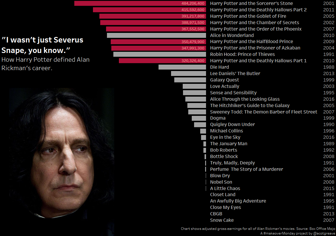
Your makeover creates a rather disturbing optical illusion for me that each graph and the country labels are slanting down to the right, it actually made me do a double-take on the viz. I really like all of your changes, but the net effect is not usable for me except as an example of how the layout can create illusionary effects.
Jonathan