
This week provided a good challenge. It’s difficult to present data which divides one percentage (US Wealth) into categories about another percentage (household income).
My first try is with an Area chart. I like the area chart because it shows part-to-whole for the entirety of US Wealth:
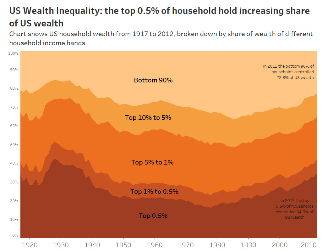
But it doesn’t quite punch home the differential between bottom 90 and top 0.5. Could I do that another way?
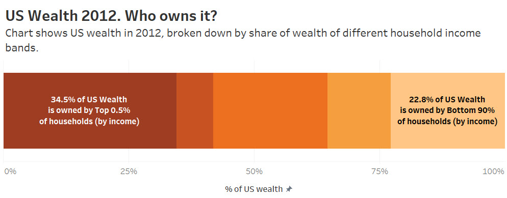
I chose to drop the history and focus on just the most recent year.
How about a stacked bar?
Or a bar chart?
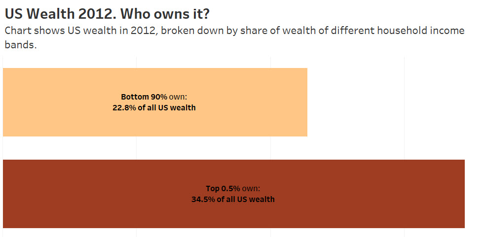
They’re ok but the fundamental problem is that this approach doesn’t capture the size of “Bottom 90%”. The words “Bottom 90” don’t capture that magnitude of the inequality.
To tell this story in the most powerful way, I think we’d need a way to encode the 90%/0.5% households, too. And rather than spend time making that viz, I’ll share this video instead. It does one of the best jobs of showing the extent of inequality I’ve ever seen:
This week’s original had some annoying design choices.
What I liked:
- The legend was clear
- Everything that needs to be labelled is: axes, data sources, etc
What I didn’t like:
- The tick mark interval on the x-axis. 1917, 1927? Make it 1920, 1930, etc
- No need for the dual axis labels
- Lots of fonts
- Nothing is aligned or spaced out nicely. It’s all cluttered and creates an amateurish look.

Recent Comments