
Jon Schwabish just posted a nice solution to the problem of the side-by-side bar chart. I won’t go into why they’re A Bad Thing – he does that just fine.
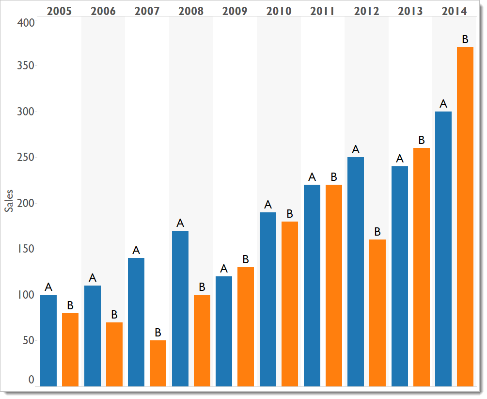
I wanted to put this post together because it’s something I’ve been thinking about too. My solution is slightly different. Consider the side-by-side bar chart at the top showing sales of Product A and B over ten years. Too much ink! It’s confusing and impossible to interpret. It’s really hard to see anything.
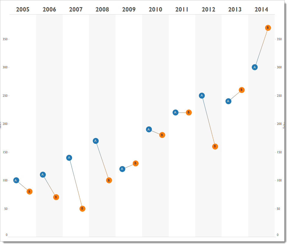
How else can we show this info and ask “in which years did B outsell A?” Simple. Do something heretical and connect the dots using a line (what? Use a line to connect discrete values? But you can’t do that!):
Because we’re so well evolved to see slopes, we quickly and easily see the three years in which B outsold A:
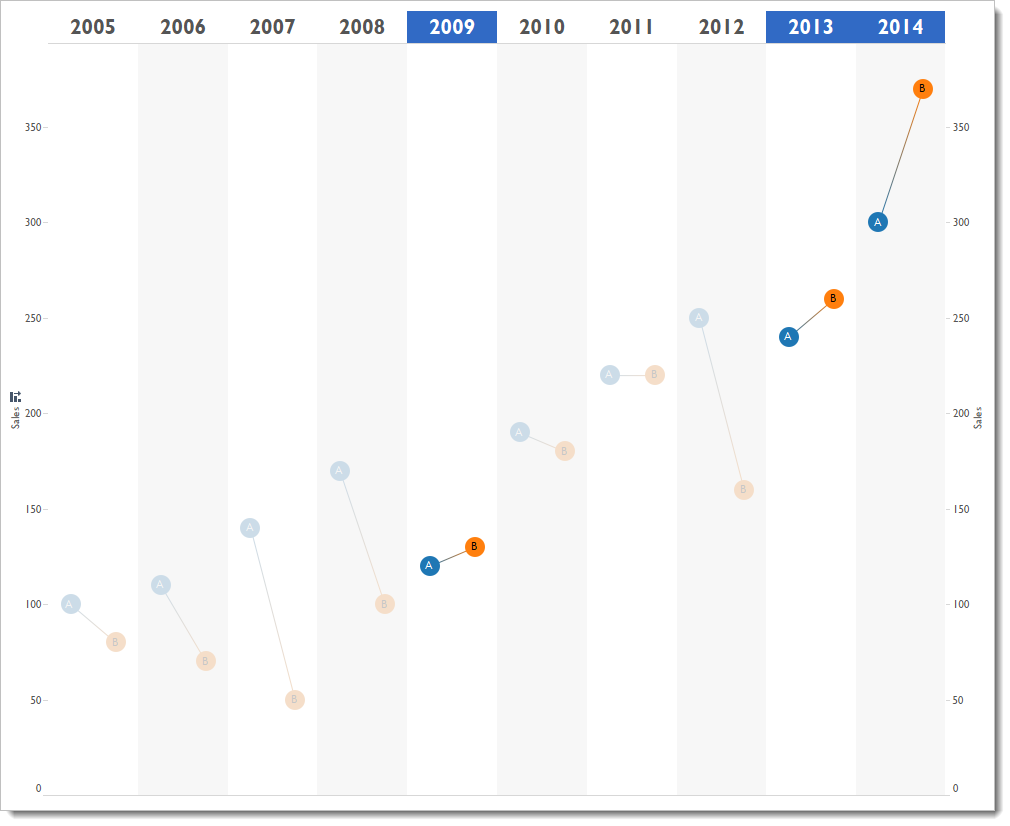
In this example, because it’s sales over time, I kept the years as separate panes.
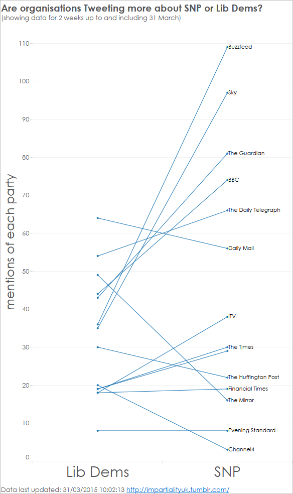
With slightly different data, you can acheive the same results using a categorical slope chart. I’m doing this as part of my analytics based around the UK General Election (http://impartialityuk.tumblr.com/).



5 Comments
Add Yours →Nice stuff, Andy. It’s going to come in very handy very soon.
Hi Andy,
Nice work. Did you consider labeling whichever side of the line had a higher tweet count, rather than always down the right hand (SNP) side?
That way you would be able to quickly get a flavour of which publications are more interested in either party.
Just a thought.
Thanks,
Sheel
Hi Sheel
You don’t know how long it took just to get the labels and tooltips working as they do! The answer, then, is that I tried lots of ideas for labelling the lines, and the one we have (including tooltips) is the best I could manage!
Love the simple and elegant redesign. Thank you!
Hi Andy,
Nice work. We just followed the idea and made an online chart generator for the paired slope chart using the open source project “Raw”. it can be found here: http://raw.infographics.tw
here is a screenshot of the generated result:
http://i.imgur.com/xsqDZ5B.png