
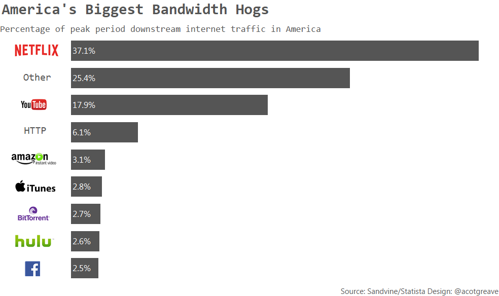
This week’s source chart was a donut chart. Donuts are rarely a good idea. At least the labels are clear and it’s sorted, but really, why make me move my eyes all over the place just to identify labels and colours? The choice to sort it in descending order, except for the Other category is visually confusing, even though I understand why that decision might have been taken.
Here’s my alternative:
A sorted bar chart provides the information much more easily and quickly. You only need to make one scan downards to discover all the information you need.
I used logos not text headers because it easier to identify with the brand.
Did I struggle with anything in this makeover? My main design challenge in a straightforward bar chart is where to put the labels. You’ve probably notice I tend to label the bars rather than rely on the axis labels. I think it’s better to see the values on the bars rather than have to look up and down to the axis and back in order to decode the value.
But should they be left, right, or centre-aligned? I’m always torn. Which do you think is best?
Two more offerings this week.
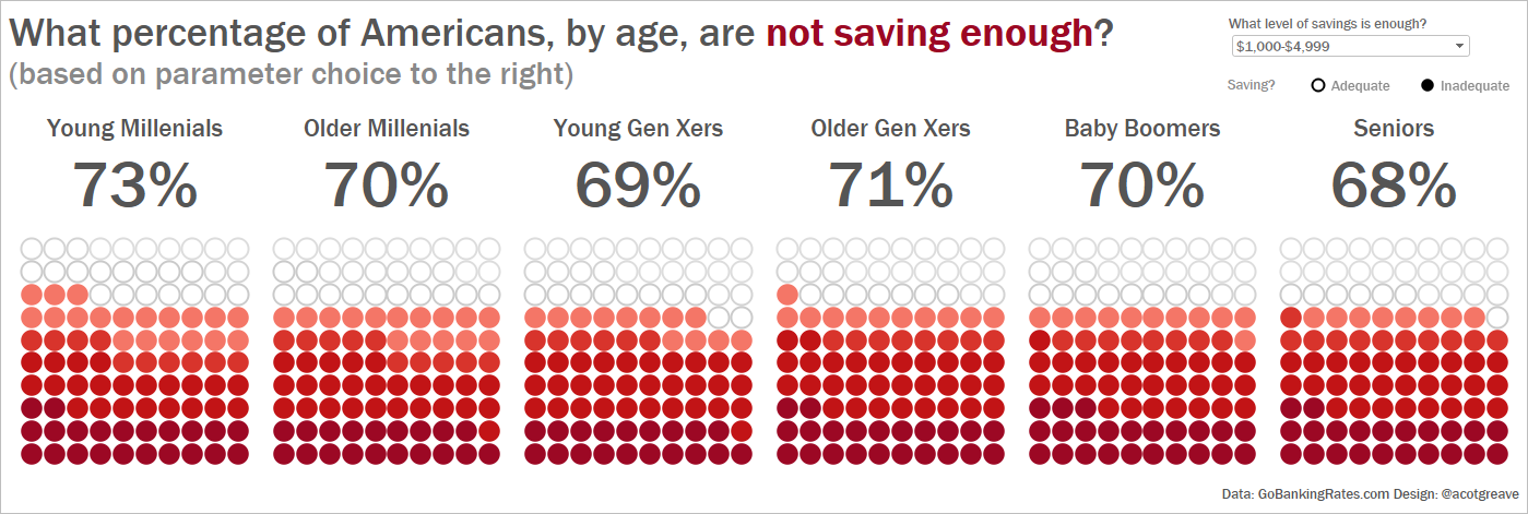
Finally, I did want to try a stacked bar. Sorted bars break the visual “part-to-whole” relationship a little, which has been debated at length recently. So as an attempt to draw something which keeps the part-to-whole, here is a stacked bar version. I kinda like it. What do you think?


5 Comments
Add Yours →Is it currently possible to do anything like this in Tableau? The closest I’ve found is this: https://www.interworks.com/blog/ccapitula/2015/01/16/tableau-essentials-formatting-tips-custom-shapes
Hi Andy,
I agree that the legend was badly placed in this graphic and there’s too many segments. The colours are pretty bad too. Other than that I think showing parts of the whole in this disguised pie-chart is absolutely intuitive here.
I like the way you come back with the stacked bar, but would you not consider bending that around so the two ends touch and form a lovely circle? Please?
I hope you don’t mind but I’ve blogged you up here: https://newsgraphicsblog.wordpress.com/2016/02/26/doughnuts-are-pies-too/
Welcome to comment if you were interested.
I find the whole anti-pie thing fascinating and I’ve started a campaign called #NGARP (News Graphics Association for the Restoration of the Pie!) I hope you’ll join us one day!
Hi john
Thanks for the comment and the excellent blog post. I partially disagree with some of your comments, but I think your remade donut is a great example of how to make a donut work . It still has problems in that it’s not the most efficient way to get your audience to read the information, but it’s certainly more aesthetically appealing, which is important too. One has to make a choice between aesthetics and efficiency and I am happy for people to go either way. Your labels certainly make it easier to read than the legend approach did.
I can’t argue against your thoughts on logos or where to put the “other” category too!
I was wondering how you added the logo’s?
I’m hoping there is a way of substituting images for text, but think you may have just hidden the headers and created floating object with the image in…
They are images, floating on the dashboard. So it’s a bit of a hack to do that, because it won’t change if the data changes. 🙁