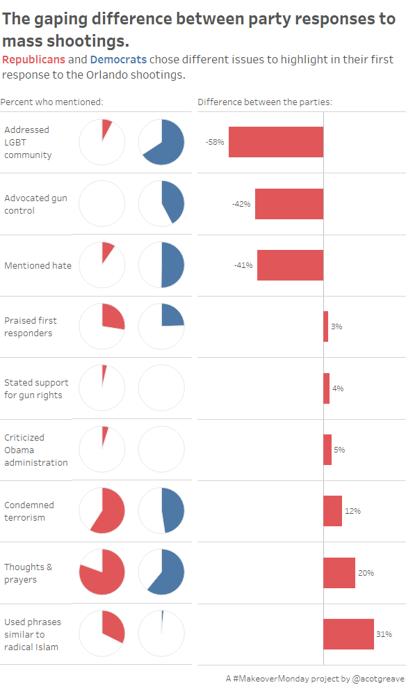

As shooting after shooting occurs in the USA, this week we’re looking at politicians’ responses to these shootings. Specifically, the first response statements of members of congress following the tragic Orlando shooting a few weeks ago.
I went through quite the process this week.
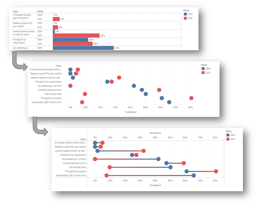
I started with a side-by-side bar to examine the data. I don’t like side-by-side bars, so changed to single row with two circles. That made it too hard to see the difference so I joined them as a dumbbell. And then I thought that the GAP between the parties was most interesting.
For a long time my makeover was just the gap:
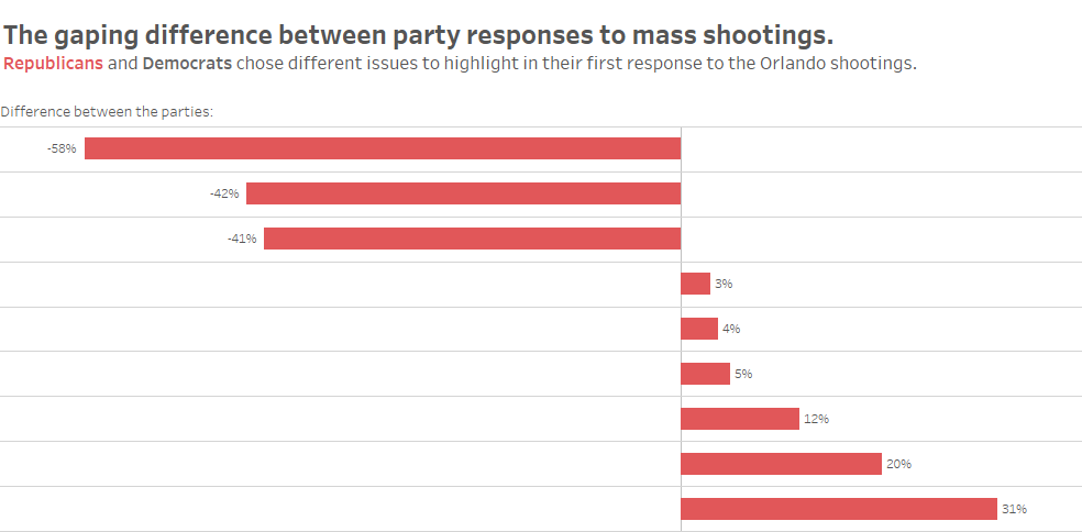
… but this was unsatisfying: the gap is interesting, but what does a 40% gap represent? 90%-50% or 40%-0%? Knowing whether 0% or 50% of a party mentioned a topic is more important than just the gap.
And so I tried the pies. I quite like them. I could have just shown the number, or a bar, or a sized circle, but I thought I’d try a pie. The problem with pie and difference bars: you still only show percentages, not the actual values. However, if you DO show numbers via circle size, you still have a problem: there aren’t equal numbers of Democrats and Republicans in Congress so the numbers don’t relate directly.
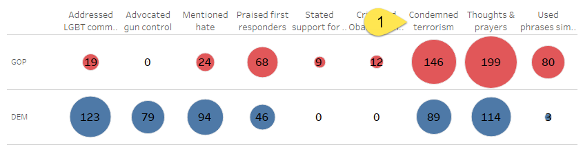
In the circle chart above, looks like way more GOP condemned terrorism than the DEMs. It’s actually a 20% difference. Maybe a bar would work? This is one where you can go round in circles balancing most efficient visual with the most engaging. I went round in circles before running out of time and sticking with the pie. It’s not perfect!
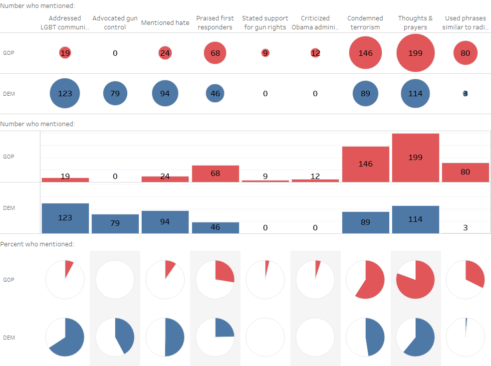
The original chart this week is unconventional but does convey the point well.

What’s unclear is just how the slices are sized. By area? Radius? Diameter? The choice of semi-circle is abritrary. Despite that, it is easy to see the difference, even if accuracy is sacrificed.
2 Comments
Add Yours →Thanks for putting so much detail into explaining your thought process!
Hi Andy, I really like the dumbbell idea to join two data points. I wasn’t able to find an easy way of doing it on Tableau. Could you please provide a guidance? Thanks – Pinar