In 2016, I’m joining Andy Kriebel on Makeover Mondays. Each Monday, we’ll take a viz, or some data, and create a new perspective. You can join in by checking Andy’s blog. Click here to find the latest data.

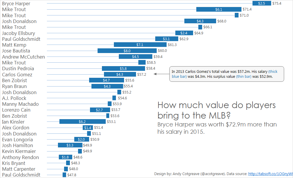
This week Andy chose baseball data and some of those wacky statistics which mean nothing to a British person. WAR? Surplus Value? Fortunately, FiveThirtyEight’s story was very clear: some players perform wayyyy beyond their salary.
I have to admit I struggled with this. What’s the most important thing to show? Is it just salary? Or value? Or surplus value? In the end, I felt that all 3 need to be shown, but finding a good way to show it was difficult. I’m not even sure I succeeded. I wanted the salary bar to stand out, and tried all manner or Gantts/dual axes/stacked bar combinations. Only the one above came close to emphasising total value and surplus value.
What I like about my makeover:
- Salary is labelled
- Total value is labelled
- Surplus value is implied but not labelled
- Annotated mark to help comprehension
- Sorted bar charts allow you to put the title in the white space, freeing up space for the marks themselves
- I enjoyed combining Gantts and Bars on dual axes to make the marks this way
- Custom sorting with parameters on the interactive version
What I don’t like:
- I’m just not sure how understandable it is!
- Formatting is pretty plain. I ran out of time!
- I wonder if a simple bar of surplus value would have been enough?
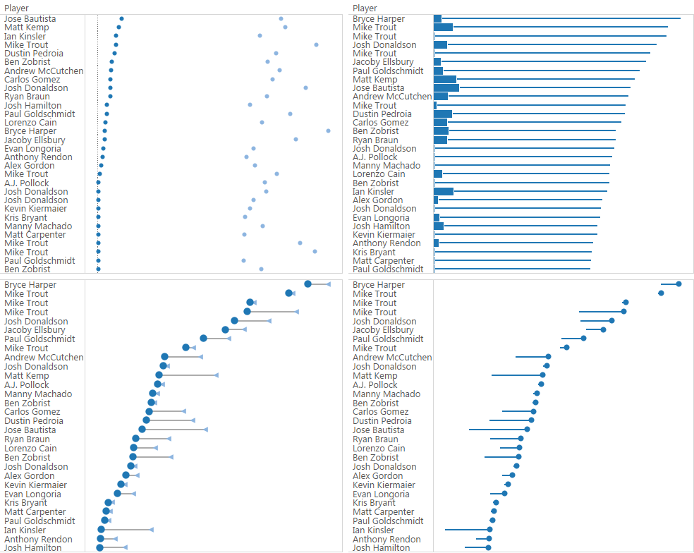
Here are some of the prototypes I tried:
3 Comments
Add Yours →Hi Andy – great job with this. I undertook this challenge and in my head I was visualising something like what you have created but was never happy with the result, here’s my alternative https://public.tableau.com/profile/chrisluv#!/vizhome/MLBSurplus_0/Dashboard
I agree when you discuss around being unsure of what to visualise, being baseball I was equally lost, and reviewing what people did I can see that that lead to a divergence in methodologies from the people who attempted this. How should they visualise it? Well to coin a phrase: “it depends”.
Andy K clearly tried to show all the data and answer lots of questions, you showed the Surplus and Value, I tried to show all three using a parameter.
I must admit I like your visualisation over mine for a number of reasons:
– the lack of an axis (it isn’t needed given the clear labelling – which leads to a tidier viz)
– the use of the “explainer” annotation
The areas I perhaps prefer mine for were that mine showed Seasons in the label (you have several Trouts) which you could be solved by adding the season to the player name in Brackets. Secondly I added interactivity to mine, which I think allows the user to make their own, albeit limited, design decisions (at the expense of being able to use the title as you did).
Look forward to more of these as it’s a great way to get inspiration from across the community.
This makeover leaves me extremely confused about scaling (clearly the salary bars are scaled separately from the value series, which is confusing), and also about the positioning of the salary bars.
I spent a minute or so trying to figure out if they were directional, or if they were showing the difference of two numbers, or what, before realizing what they actually represented, and that they were out of scale.
Not sure how I would go about this yet myself however.
hello jlbriggs,
Thanks for the comment. Each row is basically a stacked bar, and I used size, not colour, to differentiate the two marks. Nothing is scale separately.
The thick bar is the player’s actual salary. The thin bar is their calculated surplus value. Thus the total is the player’s total value.
My annotation was intended to help the reader understand the chart.
I’d love to see how you’d do this. I did try a standard stacked bar chart and while it did look better from a point of view of best practice, I was trying to see if I could push the boundaries. I don’t claim to have succeeded! Chris Love did do a straightforward stacked bar. It was easier to interpret but less engaging. But that doesn’t mean it was less successful.
Cheers
Andy