
What is your process when doing visual design? This was asked at David McCandless’ talk this week. It’s also something I and others get asked a lot.
David McCandless starts with a question and then finds the data to answer the question. Often he ends up finding many other questions to answer along the way!
In my job, I more often start with the data and then need to find the story.
Both are valid ways to start. Sometimes the approach is decided for you.
I wanted to go through my process, based on reflections of my US Fatalities dashboard. In this case, I’m explaining a situation where I have a ready-made dataset that I have not seen before. It’s my job to find and communicate anything interesting I can find.
Get a sense of the data
How many records and for how long?
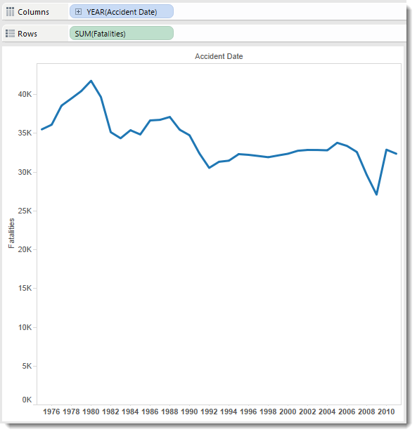
The first thing I always do is look at the number of records and what they look like over time:
Why? So I can see how much data I have and what the trends are. Looks like things are trending downward and something odd happened in 2009/9. Economic crash, perhaps? Missing data?
I’ll delve into seasonality, at this stage. If you’ve been reading my Design Month posts, you’ll know that I ultimately focussed on seasonality.
What dimensions do I have?
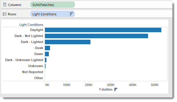
Second step is to break out the bar charts. I look for the ones that are interesting and have good data in them. “Light Conditions” was a pretty clean Dimension:
I need to focus on a few things at this stage:
- Is there a lot of Unknown/Null data? If so, it’s unlikely to be of interest
- Does the data need me to go find myself more data? Looks like most accidents happen during the day. But I would guess most driving is done during the day, so it’s risky just reporting the raw numbers
- Am I interested in the Dimension? If I’m not, I’m unlikely to care much about exploring it further
Do dimensions and measures compare interestingly?
Next up, I’ll begin comparing dimensions. Is there a relationship between Light Conditions and Road Type and fatalities, for example? (answer: no)
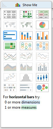
At this stage, I could not do without Show Me. If there’s one thing that puts Tableau above everything else, it’s this part of the process. Even by now, I’ve probably drawn 50 or so views, most of which I have looked at for less than 3 seconds. Each one gives me a sense of the data at virtually no cost of effort or time. For example, the chart below is a bit of a shocker but was a valuable part of my exploration. It existed only fleetingly.
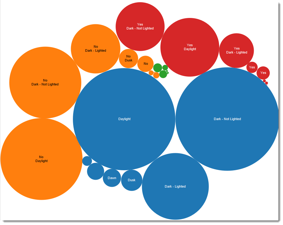
As I begin to really dive into the data to find the links, the ability to cycle through views, drop dimensions in new places is just amazing. It doesn’t matter if 99% of the views I make reveal nothing or are visually awful, I’m getting a sense of the data and I will eventually find the gems that form the story.
Geography?
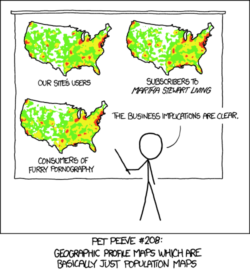
Stories that answer where questions are engaging so I’ll check out the quality of the geographic data. In this dataset, we had State available but it was pretty clear it reflected population.
What level of detail is there?
I need to explore the level of detail. Is the story more interesting at aggregate level of down in the detail? In this dataset I didn’t find anything I wanted to proceed with. An example where the granular detail was of great interest was my Gooaaaal! viz during the world cup.
How long should “goooaaalll” be when yr team scores? http://t.co/pVHxmJV2BR #WorldCup #dataviz pic.twitter.com/ZAUJGJBgr2
— Andy Cotgreave (@acotgreave) July 2, 2014
Focussing on the story
By this stage I might have cycled through 250+ views of the data in maybe 30 minutes or so. I’ll now have a good sense of the data and will begin to find the story.
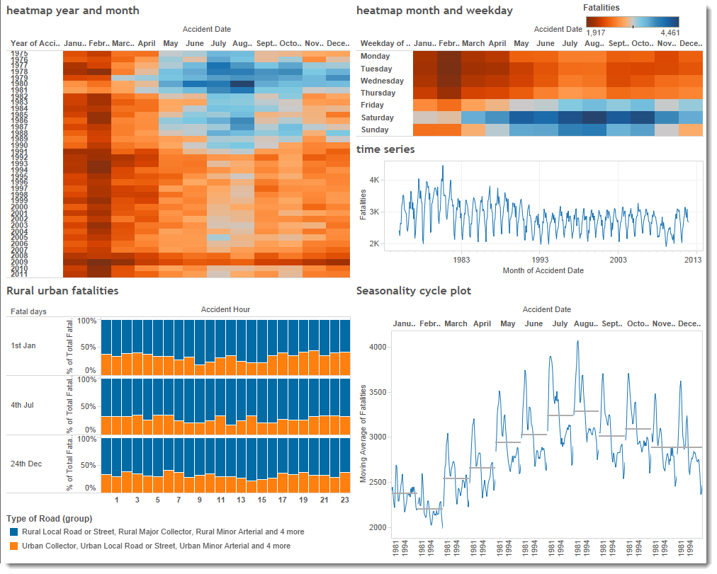
I kept some of the charts as you can see below.
Early on I had noticed that seasonality had a great story. The only dimension I’d find that really interested me was about road type (rural/urban).
At this stage, I decided to go with seasonality.
Make a painting

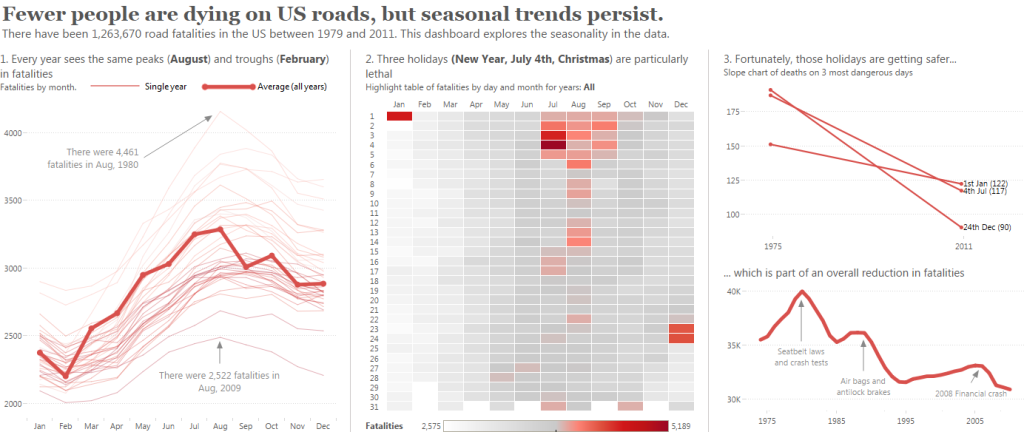
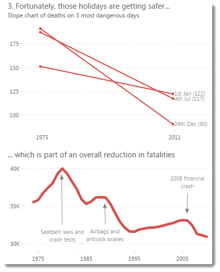
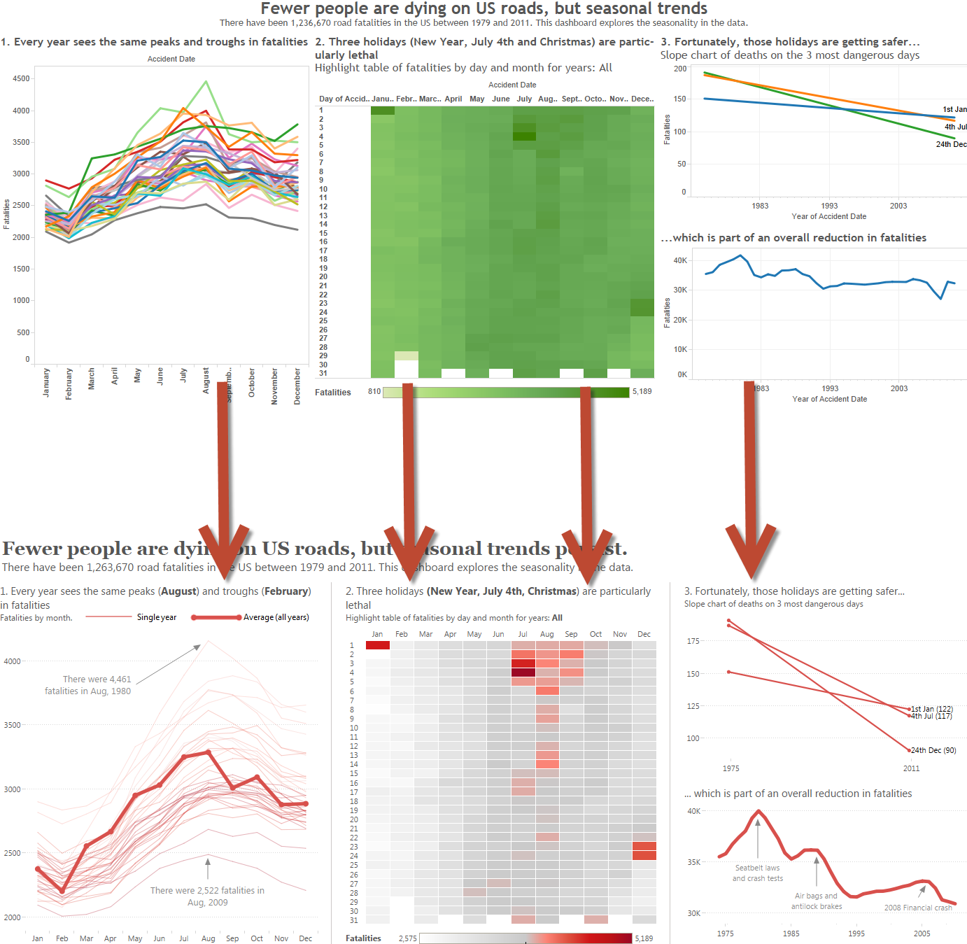
By now, I know what my data feels like and I have a sense of the story I want to tell: I wanted to focus on fatalities during the holiday seasons.
The next stage is like painting. I start again with a blank canvas and begin to add elements here and there. For a while there’s a mix of analysis, exploration, making calculations, tweaking designs, choosing fonts, colours, and changing layout. They all happen simultaneously, intuitively. These decisions are fully documented in my Design Month posts.
Finishing touches
Feedback
Finally I’ll be almost there. Now to open the door and share with others. I asked for feedback on dataviz communities, on Twitter, from my wife and kids, from colleagues. You cannot get enough feedback! You don’t need to listen to all of it, but if 80% of people tell you the same thing, you know that thing is a problem.
Walkaway and come back
It’s important to walk away from your work for a day or so (as long as you afford). This allows you to return to it with fresh eyes.
Know when to stop
Sometimes you will just know. Other times you could keep on tweaking forever. There’s often deadline which will make the decision for you but in the end you need to know when to stop.
Have a gin and tonic
Publish it and reward yourself.
What’s your process like? I would love to know how you do things.
* the image at the top is an infamous US diagram portraying the Afghan war. It was widely lambasted for being incomprehensible. I’ve always thought that was kind of the point, and they deliberately designed it like this to make the point.
4 Comments
Add Yours →The picture at the start (a description of the factors influencing the Afghan war) is, indeed, about showing how things there are complex (I know some of the people who did the work).
As you say in the footnote the whole point is that things are complex and interact so a simplistic military strategy won’t work. In fact it isn’t really a data visualisation at all, but the visualisation of a complex system model that, to some extent, can simulate the potential side effects of some interventions.
Hi Steve , thanks for the comment. It was amazing when that was released just how many people lambasted it as a terrible viz. But as you say, they didn’t get the point: it was MEANT to look like a mess. I often use it in my classes as an example of making complex look complex!
[…] Explore your data and iterate quickly. You need to fail fast, and fail often, in order to discover the story in your […]
Love the Gin and Tonic part of this 🙂