
Amy Alberts and I hope you enjoyed our talk at #data17 about eye-tracking and what it can teach you about building better dashboards.
This post is a list of links and resources we talked about in the talk:
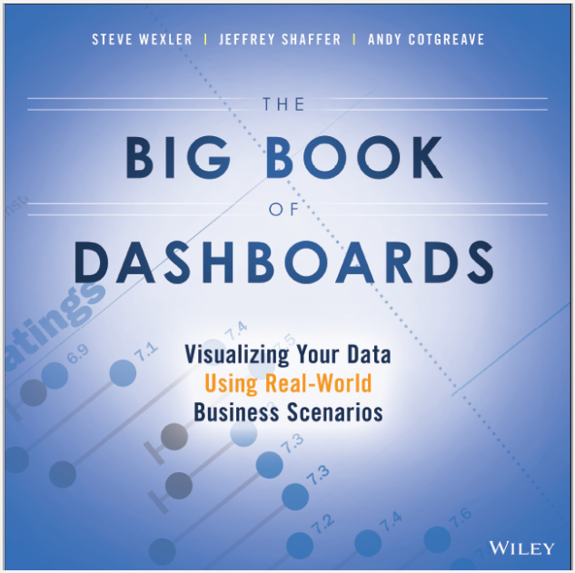
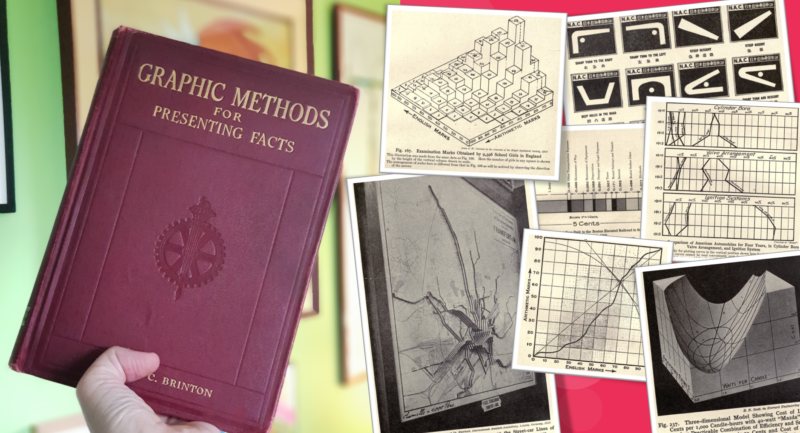
- The dashboards we’ve used in the study come from my book, The Big Book of Dashboards. Go check it out if you want to see great examples of real-world dashboards you can apply to any scenario.
- We’ve published the results of our first study and they can be found at this article on Fast Company.
- What is psychophysics? That’s a great question. Amy certainly studied some cool stuff at college.
- Eye-tracking history:
- Here is an excellent article on the history of the technology from eyesee-research.
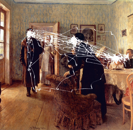
- Yarbus’Eye Movements and Vision is available to read in PDF format. I highly recommend reading about the technology: it reads like a torture manual!
- For an in-depth article on Yarbus‘ seminal research, check this out.
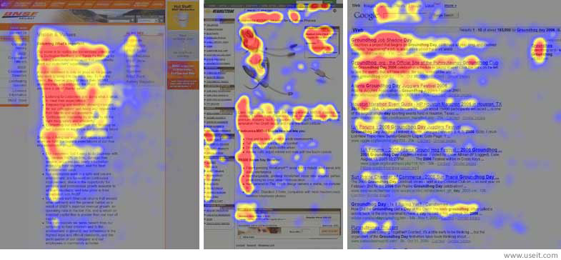
- What is the original F-pattern research? It’s here, from Jakob Nielsen and Don Norman.
- Michelle Borkin has been the recent leader in academice research. Here is her paper on Dataviz Recognition and Recall.

4 Comments
Add Yours →re Study 3: the “tasks” just scratch the surface of the issue. I work in the Federal government, and most of our dashboards try to inform managers whose schedules are filled, and whose decisions are critical and time-sensitive. “Training your users”, as Andy says, is essentially non-existent; most of these people “manage by exception”. The task of the dashboard is inform them NOW: where the “exception” is, and what is its magnitude, in cost and schedule. I think the BANs help, can you suggest more?
hi guy. Thanks for the comment. I guess the trick is to drive the flow to those three tasks you describe: Summary, magnitude, cost, with a Next Action very obvious. Also visually encode the steps that need action to drive focus. Like this?
I have a question regarding eye-tracking that I haven’t seen covered (though I haven’t read the Big Book of Dashboards cover-to-cover yet!)
My question is about visualization vertigo. For example, on complex combination line and bar charts (dual axes) my eyes are trying to go left-to-right following the line graphs, but are also being pulled up-and-down for the bars of the barchart. (It’s akin to the split-attention affect when referring back-and-forth to a color legend.) Similarly, with some circular graphs, my eyes do loopty loops. I also have a hard time viewing some bar charts that seem to wiggle (moiré effect?). Do you know if anyone has studied this type of eye tracking on data visualizations/dashboards?
Hi Terry – that’s a good question. To be honest, I don’t know the answer. My hunch is that this hasn’t been studied. If not, it would be an interesting path to follow.