Today Andy Kirk and I duel it out in the annual Data Debate. We tackled big and small issues in the field of data. The recording will be available here. This post contains links and further reading on the topics covered.
Follow us
Find us all on Twitter:
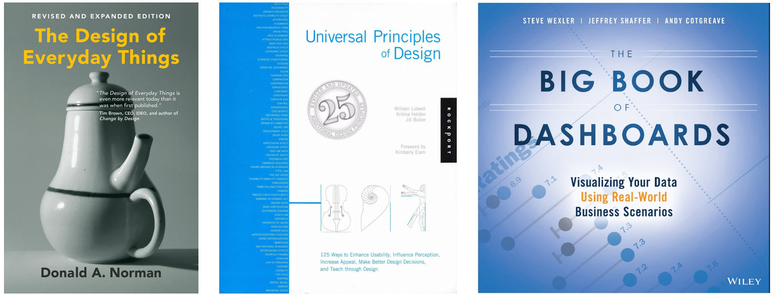
My book is The Big Book of Dashboards and Andy Kirk’s is: Data Visualization: A Handbook for Data-Driven Design. Jade is yet to write a book, but I’m sure it’ll be amazing if she does.
Data has lost its way in the public sphere
Are politicians emboldened to say whatever they want? If they are, is that changing society’s attitude to data? Is social polarization accelerating this trend?I fear it is.
Sir David Norgrove, Chair of the UK Statistics Authority, was driven to write to Boris Johnson in September warning him of his “clear misuse of national statistics.” William Davies writes on this in the Guardian, using GDP as an example of the end of statistics. Simon Kuper offers a glimmer of hope with advice on how to take on the populists in the FT. However, his main argument is to ditch the facts and lead with emotion and the story. Sure, that might win people over, but if there’s no role for information and data, have we lost the fight?
The case for animation
My main argument is that animation is exceptional for presenting data in a dramatic way. It enables storytelling and creates tension, surprise, and drama.
- The master was Hans Rosling, who astounded us in 2006 with his first TED talk on health data, and later with his Joy of Stats
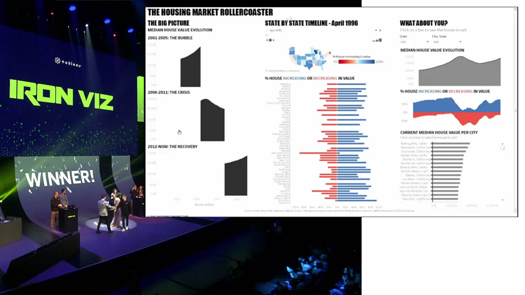
- Tristan Guillevan won Iron Viz at least in part because of his use of animation to tell a compelling story about US house prices.
- Bloomberg’s climate warming chart is, I believe, one of the best animations in dataviz. It reveals the creeping, then accelerating, trends in temperature in a way that stops and makes you think.
- Finally, I ran a terribly weak poll on Twitter. The poll is bogus, of course, but the thread of conversation was excellent.
Which comes first: the chart or the question?
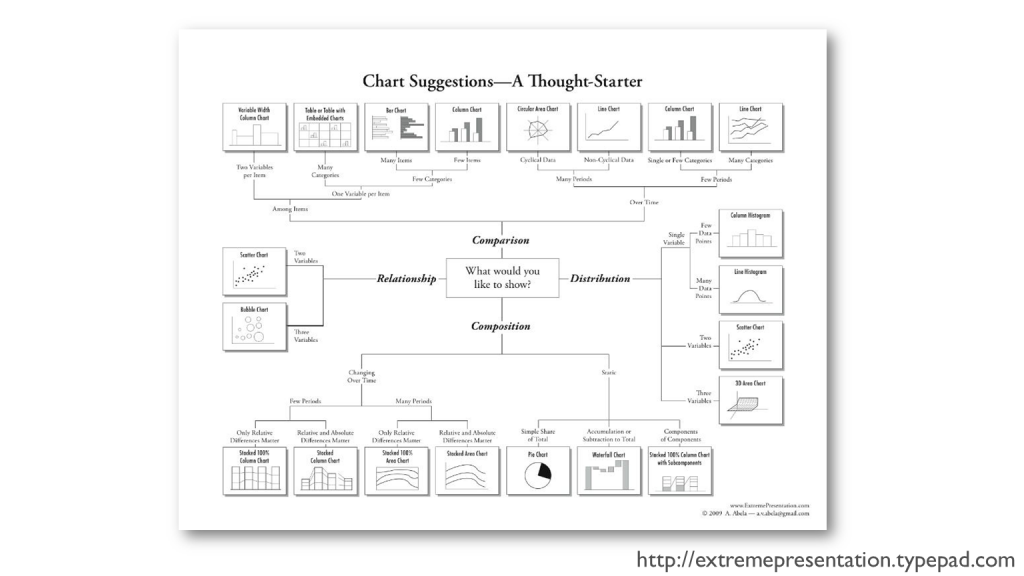
I was hugely influenced by the Chart Chooser from Extreme Presentations; this was the first time I saw that charts had such a powerful underlying structure. There are other excellent chart choosers, such as the FT’s Visual Vocabulary, Jon Schwabish’s Graphic Continuum, and Andy Kirks’s encyclopaedic, tool-focussed, Chart Directory.
But I see a lot of people fixate on the chart they want to build rather than focus on the question or the data itself. Watch this video. The end result is a chart you’d never find this in a chart directory. But, if your question is: In which years does B outsell A, it’s a wonderful way to represent it (it’s not the only way, but it does work).
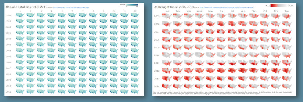
Also consider the two charts below. One shows drought index in the US and the other shows US Road Fatalities. The structure of the data is the same (month, year and state). Only one is a successful chart (the drought chart on the right). Consulting a chart directory, there’s a risk you’ll pick the small multiple and publish. But of course, the data itself drives the appropriate chart type.
Big Ass Numbers: awesome!
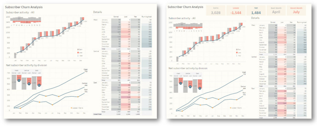
Which of the above dashboards conveys a headline better? The one with the BANs or without the BANs?
I came to appreciate BANs through the writing phase of The Big Book of Dashboards. I consider them the Headlines for your dashboard. A well defined set of BANs will capture your KPIs in a way you can interpret instantly. Clever use of colour or other visual indicators can show, straight away, whether they are above or below target. Once the headline is digested, then you can decide if you need to devote time to interpreting the charts in the rest of the dashboard.
Steve Wexler considered the BAN issue in his recent blog on iteration and collaboration.
Defend the Indefensible
This was fun! What I like about defending “bad” charts is that it emphasizes the lack of “rules” in dataviz. There are only guidelines and any binary argument of right or wrong is a failed endeavor.
Stacked bars
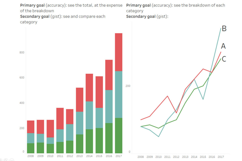
My defense is simple. If your primary goal is to show the total of all categories, then a stack is fine. Yes, that comes at the expense of being able to accurately see the changes over time of the individual categories. If the primary goal is to see the individual categories, a stack is a poor choice. I believe you should consider primary/secondary goals in all assessments of charts. Remember: All charts are a compromise.
Bubbles
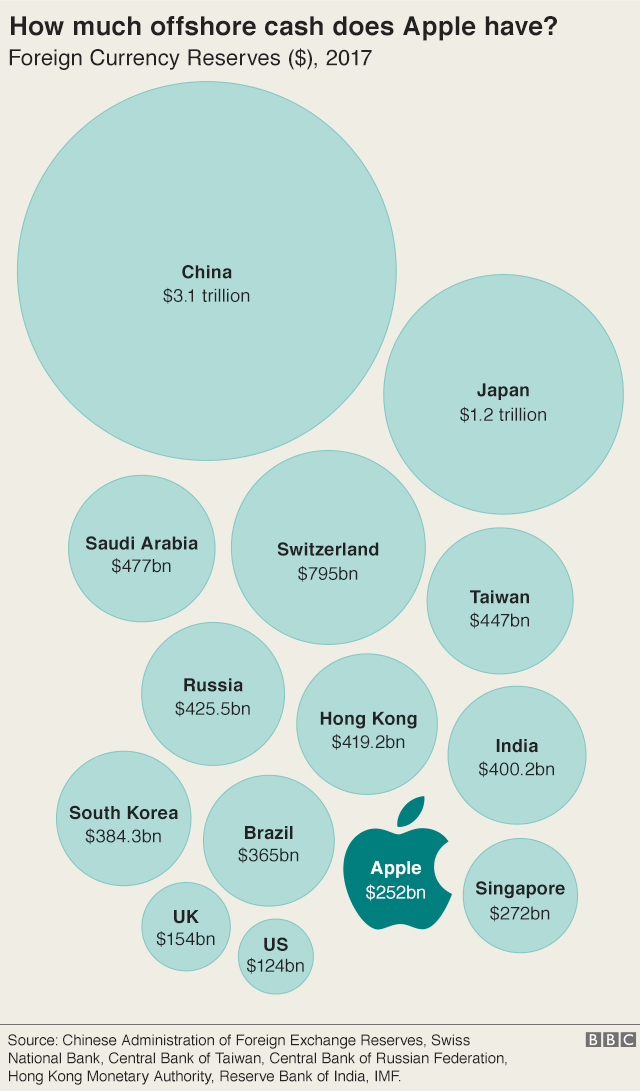
The same defense applies here. If the goal is to give the gist of the data, as they tried to in the BBC article on Apple’s Tax Bolthole, then you’re ok with bubbles. A bar chart will provide more accuracy, sure. In the case of the BBC article, I’m not convinced readers miss out by their inability to accurately see if Apple is precisely 30% bigger or smaller than another bubble.



1 Comment
Add Yours →[…] It seems I’m not the only person who has been thinking about stacked bar charts (see posts from Cole Nussbaumer Knaflic, Jonathan Schwabish, and Andy Cotgreave.) […]