Here’s a quick learning point from a task I was trying to do today: positioning of elements in any UI is vital.
This morning I was was reading a blog and needed to know the author’s name. The answer was literally on the screen in front of me, but I couldn’t see it.
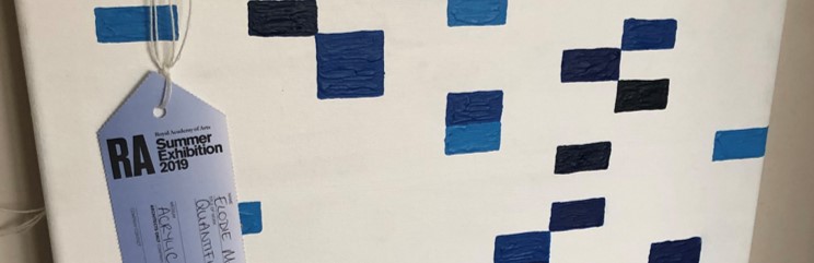
I was curating links for the Sweet Spot, an internal (and sometimes external) newsletter I do to discuss the wide world of data. I wanted to share this fantastic article about using Strava, Tableau and Alteryx to create a submission to the Royal Academy’s summer exhibition. It’s a great post combining data art, the best data-exploration tools in the market, a great story, and Strava data (I’ve done my own Strava Art as you might know).
To share it, I needed to know who wrote it. But I couldn’t find the author’s name. It isn’t on the Contact page or the About Page. I couldn’t find her name anywhere.
So I sent a request to a Tableau Whatsapp group I’m on. The answer came back in moments: Ellie Mason. Phew.
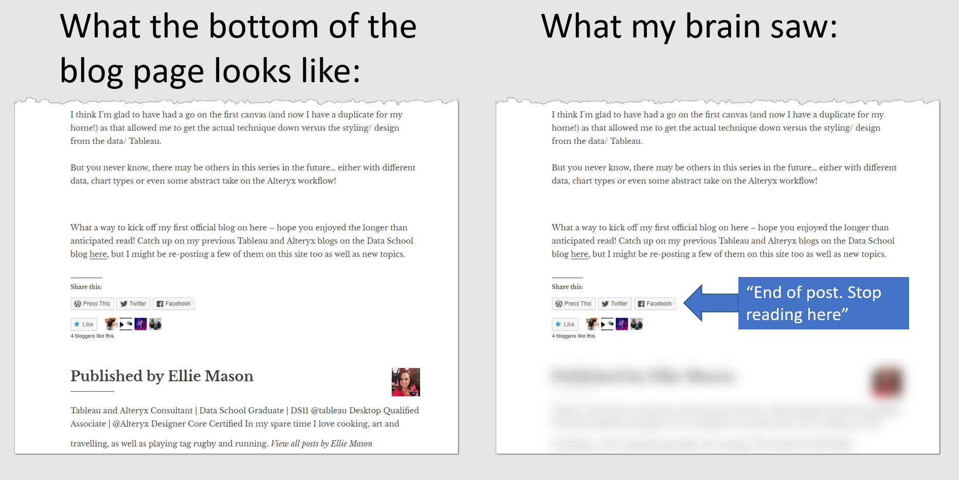
That answer was swiftly followed by a screen shot showing that her name was at the bottom of the blog post, in large font:
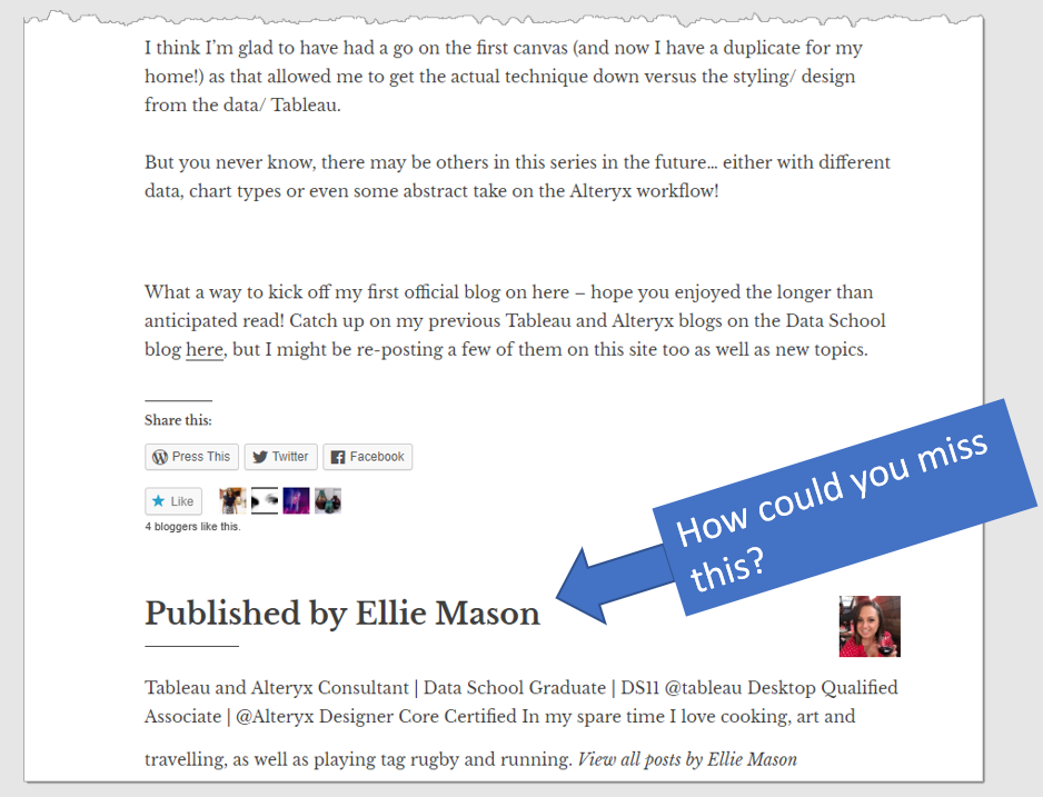
Well, that’s kind of embarrassing – how could I miss that?
Thinking about it, it’s the layout that fooled my brain. Here’s what my brain saw:
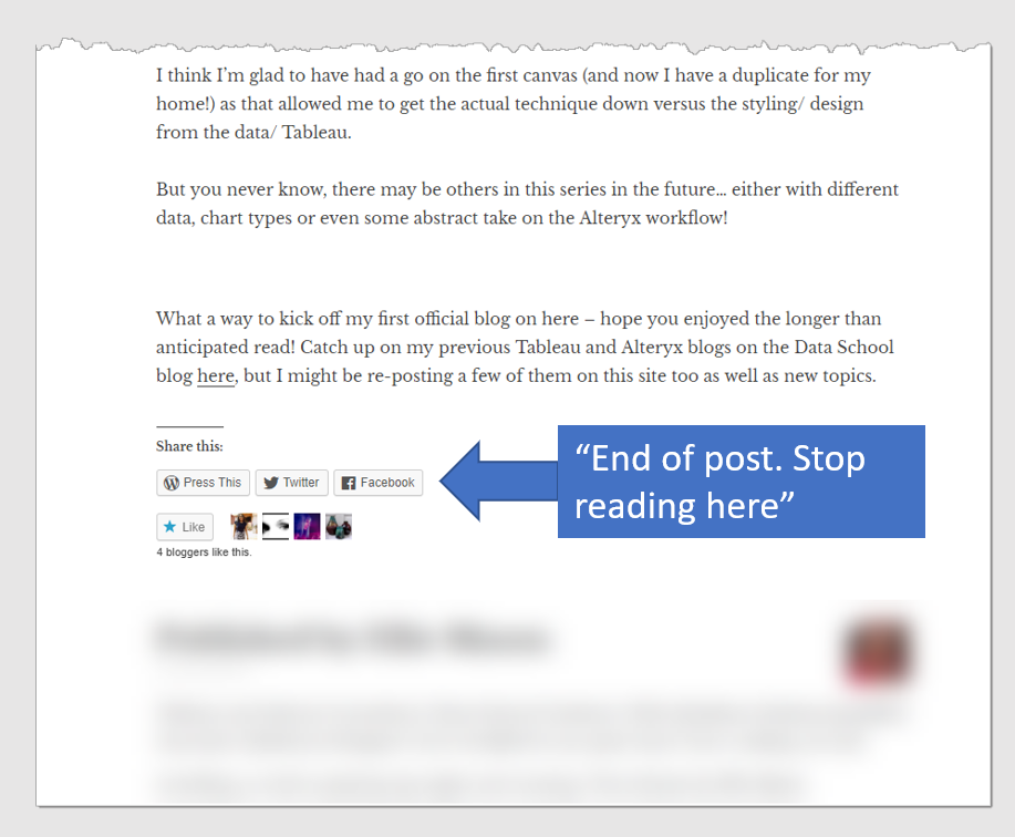
The “Share this” icons told my brain that that was the end of the article. Since my brain (and yours) is lazy, it decided to ignore the rest of the article. Why should I spend any cognitive effort processing info that’s not part of the article?
And thus my fate was set: now my brain had decided to ignore the lower part of that page, I was doomed not to see it.
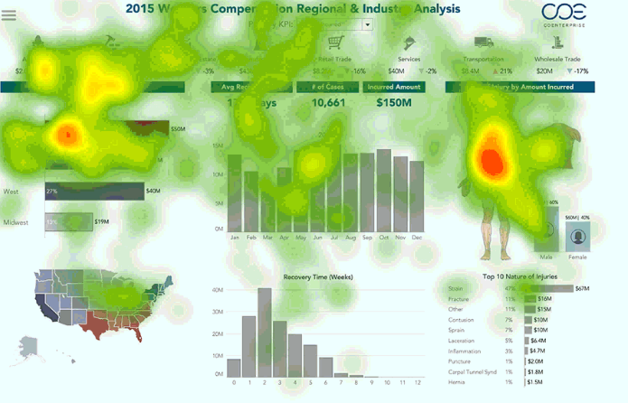
Whenever we design visualizations, we must bear this in mind. I often see important information squirreled away in the bottom right of a screen.
This applies to dashboards, too. The eye-tracking studies Amy Alberts and I have been running have shown that the bottom right of a screen is generally ignored. If you have important info the user needs to see: don’t put it down there.
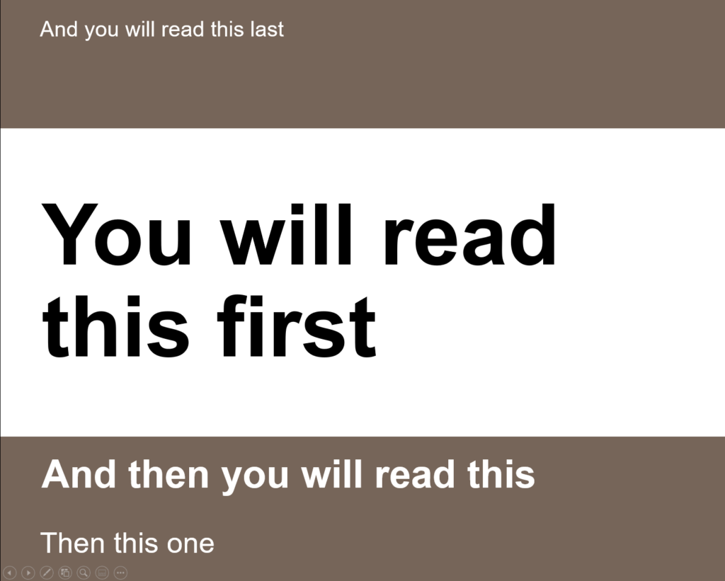
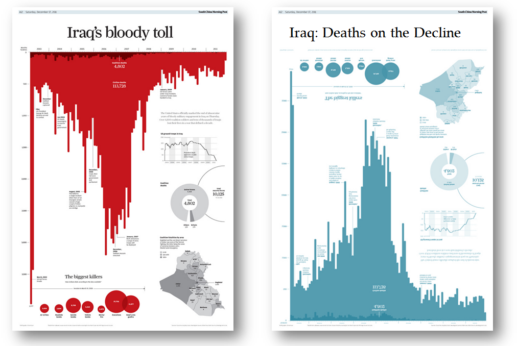
Finally, this experience reminds me of a classic Powerpoint/Typography piece:
If you like this post, do follow me on Twitter: @acotgreave
Recent Comments