
Here I am for the first time with the Storytelling with Data Challenge. This month? Rebrand Cole’s sales chart with the look and feel of another brand.
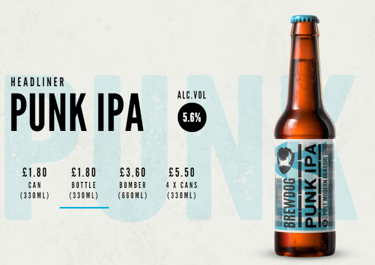
The company with the best branding in the world? I think it’s Brewdog. They’ve been marketing masters ever since 2007 and have a wonderful, distinct style. Since it all started with Punk IPA, that’s the style I’ve chosen.
This was fun to do. The hardest thing was deciding on the saturation of the background.
The default Brewdog style is a pretty bold background. Getting the font and background of the label was pretty straightforward, and I think the header matches the bottle style very well:
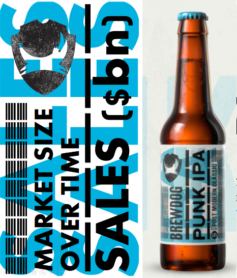
But for visualizing data? Well, it renders the data all but invisible:
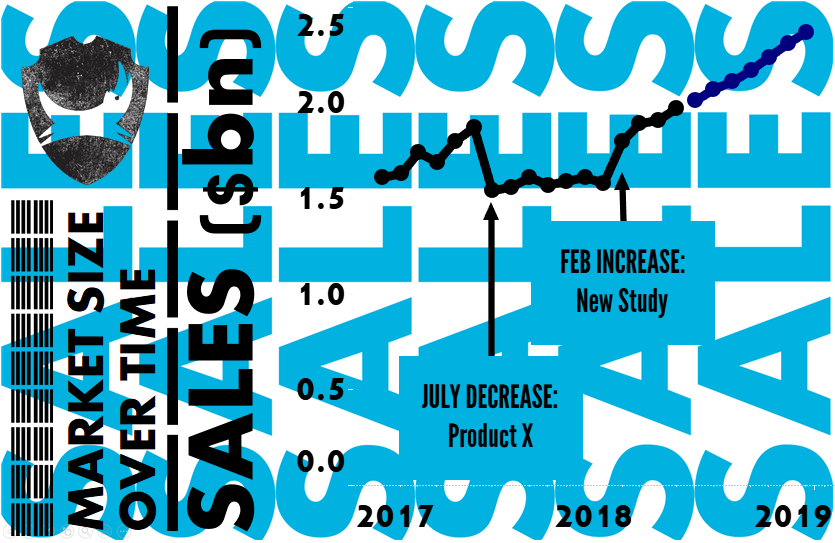
So I thought that I could, instead, keep the saturation on the left-hand side, but lighten it behind the data:
Now I think there’s simply too many things to parse.
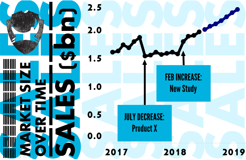
How about no background?
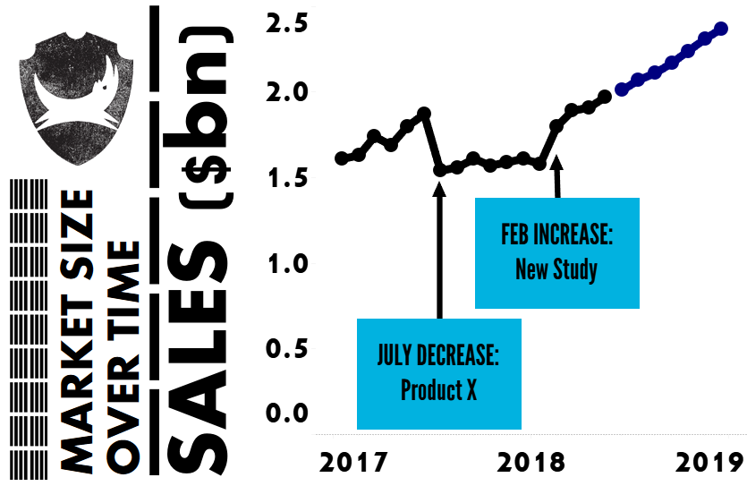
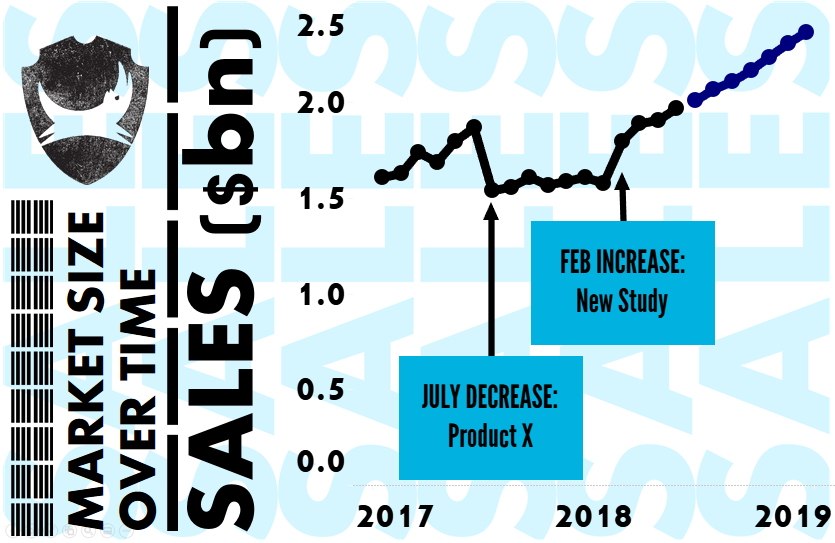
Without a doubt, with no background, it’s the best method for seeing the data, but now it’s not Brewdog enough. And so I went with a much lighter background for the final version:
If you want to download the workbook, it’s here.
There’s not much technical stuff happening here, but here’s a summary of the techniques:
- All objects are floating. Read more about that on Tableau Online Help.
- I used the Arahoni font for the vertical. It’s not quite the same as Brewdog’s but it’s the closest I could get.
- The annotations are League Gothic, which is the main font on Brewdog’s website.
- I created the background image in Powerpoint.
Thanks, as always, to Cole for running this amazing series. I’m delighted to have finally been able to participate.
And thanks, too, to Brewdog, for making some of the best beer in the world.

Recent Comments