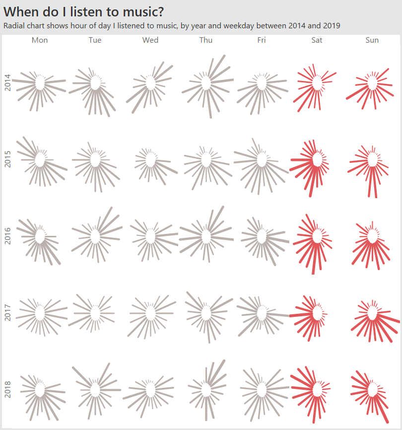
This month’s Storytelling with Data Challenge is: radial. Now is not the time to argue about the rights and wrongs of this approach. It’s time to dive in. Like Cole, I’ve never built a radial viz before, so this was an opportunity to try something out. Thank you to SuperDataScience for the excellent tutorial and example workbook.
Since I’m also in the midst of doing a bunch of posts about music data, that’s the data I’m going to use. My question is: “When, during the day, do I tend to listen to music?”.
The final result is above. Here’s the things I learnt and how you can use them.
How do others read your chart?
I’ll admit, my chart looks pretty. But can you understand it? I don’t believe it’s possible to really understand this chart without interacting. I added 2 interactive features that, I hope, bring this to life:
Highlight actions
I used a highlight action and a large tooltip to make it easier to compare hours. See how it works in the GIF below:

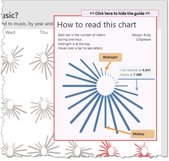
Tutorial chart in an overlay container
I used the Show/Hide Layout Container feature to create an overlay showing just one, large, radial chart.
“It shoulda been a line/bar chart?”
Yes, I shuddered a little doing this challenge. But there is a place for radial charts. For a start, they are more engaging. I created a bar chart version, too. Check them both out below. Which one catches your eye?
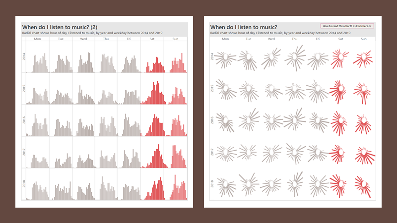
Getting insight from the radial chart is way harder than the bar chart, but if my intent is to engage eyeballs, then radial is going to win the battle. If that engagement encouraged clicks to my site, where I provided more accurate insight, then that would be a win, right?
Thanks as always to Cole and the team at Storytelling With Data for putting on these challenges. They’re a great way to learn.
Update (3pm Monday)
Seeing a 24hr chart built as a radial bar is pretty common, but even though it’s cyclical, it’s always something that’s bugged me: the clock you and I are used to only has 12 hours on it, not 24. So if I see a big bar extending to the right, I mentally see it as 3 o-clock, and yet it’s 6am on a 24hr dial.
So I’ve been playing with splitting AM and PM into separate panes. But which is best? (note: “neither” could be the correct answer to the question)
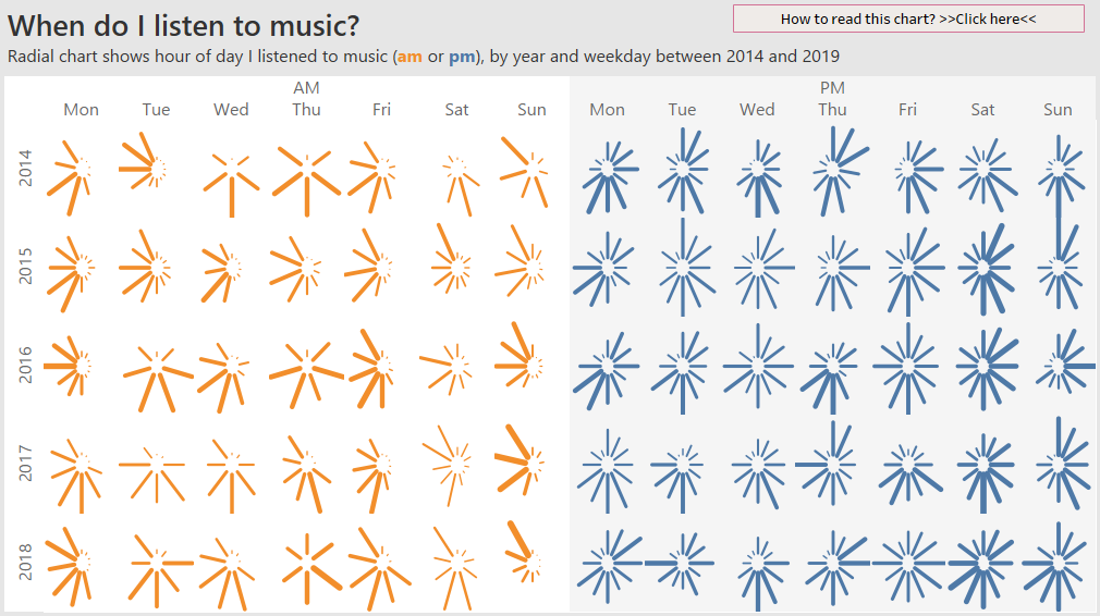
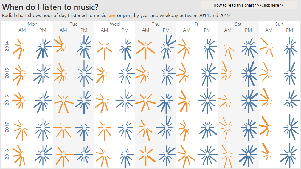
Or even blend them all into one pane. In the example below, I had to remove years, to ensure all there was data for all hours.

I don’t know which is best. I suspect I could stay down this rabbit hole for a long time!
Now go and interact with my radial chart!
Let me know what you think, and do follow me on Twitter (@acotgreave)
Recent Comments