Today (Thu 16 April) I did a Webinar for Tableau, “How to drive the message home with the right dashboard.” (the webinar recording will be available on that page very soon).
The slides are available here.
And here are the links to the resources I shared:
Design books and projects

- Stephen Few’s excellent book about dashboards: “Information Dashboard Design“. If you are just starting out in visual analytics, this is a must-read book. It’s balanced and sets out good principles which, once learned, can be adapted.
- Iraq’s Bloody Toll. This is one of my favourite charts/dashboards of recent years. So simple and yet so effective.
- “Hey! Your viz is ugly *and* confusing” – the best post about design and user testing Tableau dashboards
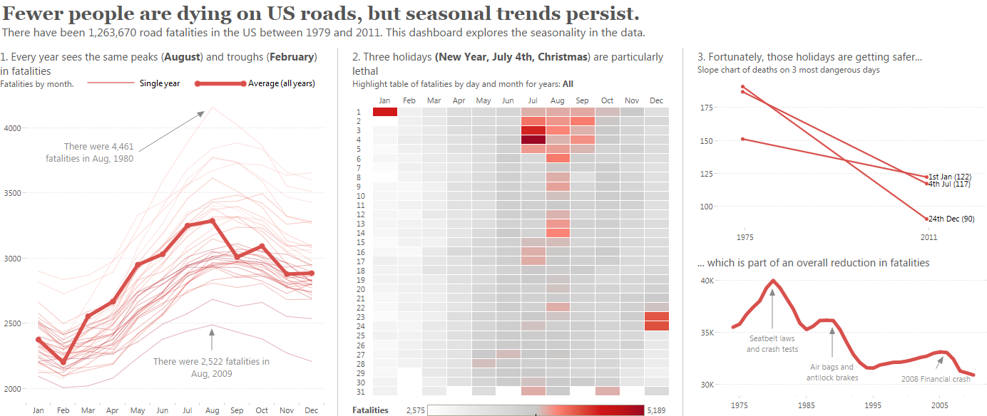
- “Tableau Design Month” – a series of posts I wrote deconstructing a dashboard about US Road Fatalities
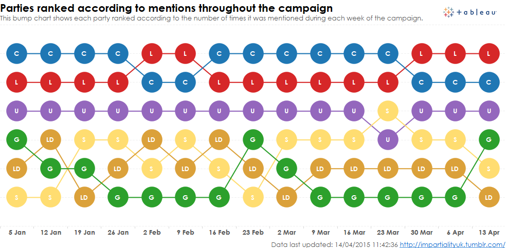
- My general election project is at http://impartialityuk.tumblr.com/
Tableau Dashboards
- “What movie should I watch?” A detailed dashboard with the instructions in the top left – the only place you could guarantee someone will read them.
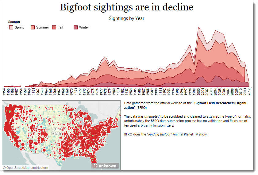
- “Finding bigfoot” Ryan Robitaille’s excellent bigfoot sighting exploratory dashboard.
- “A tribute to Fearless Felix” – Ben Jones’ amazing Felix Baumgartner dashboard
- “US Road Fatalities” – my Tableau Design Month dashboard
Inspiration and further use cases
- Tableau and Google Analytics
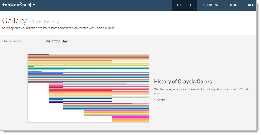
- Tableau Viz of the Day – a great data story, every day
- Best of the Tableau Web…. – a monthly round up of great Tableau blogs

Recent Comments