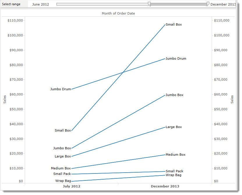
Slope charts are cool. They emphasise change between an end date and a start date by removing the noise in between. For a much more detailed explanation and justification, go read Andy Kirk’s homage to slope charts.
This post is going to show how to build a slope chart in Tableau. It’s not the first tutorial on this: there are others by Ben Jones and Andy Kriebel. The issue with those examples is that they all start with data that has just two time points. What happens if you have lots of time data and just want to show the start/end points?
I’m building this using the Superstore sample data.
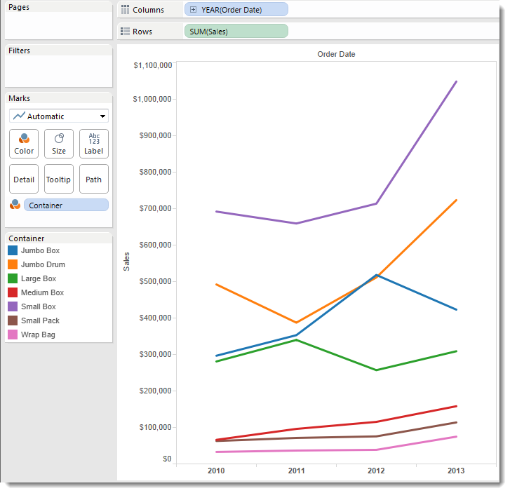
Start with a time series.
First use a standard time series chart. In my example, I have Sales by Year for each Container. It doesn’t really matter whether you have a continuous or discrete date pill on your column shelf.
Keep only the first and last values
I want this to be a dynamic slope chart; if I filter the range of dates, the chart should continue to show only the start and end values.
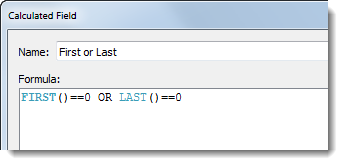
To do this, I create a simple calculated field [First or Last]:
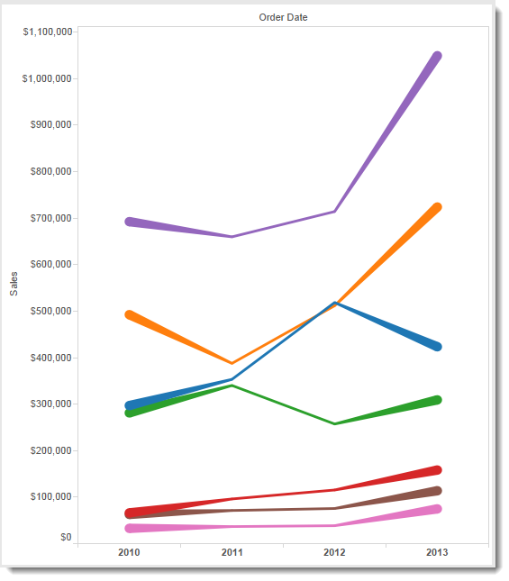
This calculation returns TRUE for the first mark on each line of each Container. Here’s what happens if I put the calculated field onto the Size shelf:
Show only the ends
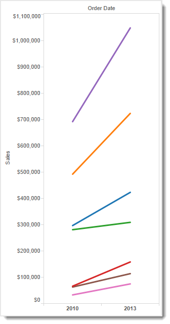
Why put the calculation on the Size shelf? Because we need to Hide everything that isn’t the first or last values. In other words, everything that our calculation returns as False. Dropping a pill onto the size shelf reveals a legend:
Click on False. Then right-click and choose Hide. Voila! We have our basic slope chart:
Improving the basic slope chart
It’s easy to take this much further.
The first thing you can do is move Container from the Colour shelf to the label shelf. I like this for two reasons:
- It’s easier on the eye to have fewer colours
- The labels are right on the line so the viewer doesn’t have to move their eyes around the canvas too much to identify which line is which
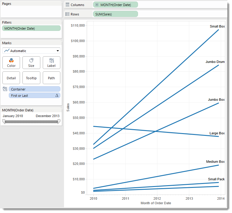
You can also switch the time pill to something else if you wish. In the example below, I’ve switched to a continuous month and added a quick filter for Month:
We’re almost done.
I don’t like the labels, though. They’re above the lines rather than next to them and they’re only at one end.
To make space on the axis for labels alongside the lines and get the alignment correct, I need to:
- duplicate the SUM(Sales) pill on the Row shelf
- create a dual axis chart
- change the continuous Month to a discrete Month, as shown below:

And we’re done (click here for an interactive version and to download my example):
We now have a completed slope chart. It looks great and you can change the filters in order to clearly show the change in Container sales between any two dates.



8 Comments
Add Yours →[…] How to make a slope chart in Tableau | Gravy Anecdote […]
[…] How to make a slope chart in Tableau | Gravy Anecdote […]
[…] could keep going: bump charts, slope charts, small multiples, etc. But which is the right one? There’s no definite answer to that. The […]
[…] Slope chart https://gravyanecdote.com/tableau/how-to-make-a-slope-chart-in-tableau/ […]
[…] 2010, and then starts giving stats for each year.) I focused on the last 6 years a settled on a slope chart to show the […]
Great post! Just what I was looking for. The tip on adding the dual axis to get more space for the labels really makes a difference (although I’m not exactly clear why that works…).
[…] all the data marks that are not at the start and the end, and exclude them”, and has written a blogpost which goes into further detail, with example calculated fields to help make the approach more […]
I know this is a somewhat old article, but wanted to share a guide that I put together recently. Many people have found the 6 step process very helpful!
What you will learn in the 1,100+ word guide:
– Why slope graphs are a great way to show “before” and “after” data
– The 6 steps to creating Tableau slope graphs (sometimes also called slope charts)
– How I transformed a boring before-and-after table into an awesome interactive Tableau dashboard
I hope this helps!!
https://newprediction.com/tableau-slope-graphs/