
At the Tableau Customer Conference this week, I did a session entitled “The Visual Design Tricks Behind Great Dashboards”.
You can watch the recording here. (registration required)
Here are the resources I shared.
Design Tricks
For all the design tricks, including the impact/difficulty breakdown, check out my Design Month posts.
Books
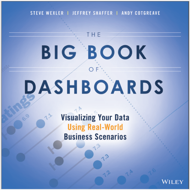
- My book, The Big Book of Dashboards, is out in April 2017 sign up for updates here: http://bigbookofdashboards.com/
- Don Norman’s The Design of Everyday Things is an excellent read, still relevant 25yrs after publication.
- Do you like Function or Beauty in your work?
- Functional: Information Dashboard Design by Stephen Few is excellent
- Beauty: Knowledge is Beautiful by David McCandless is great
- In the middle: The Functional Art by Alberto Cairo
Visualizations referred to in the talk
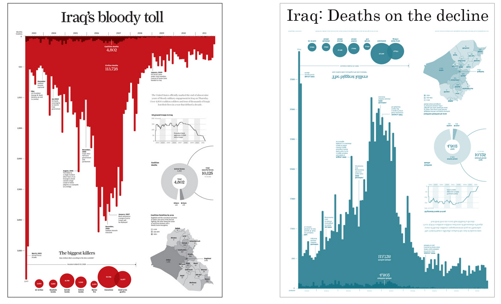
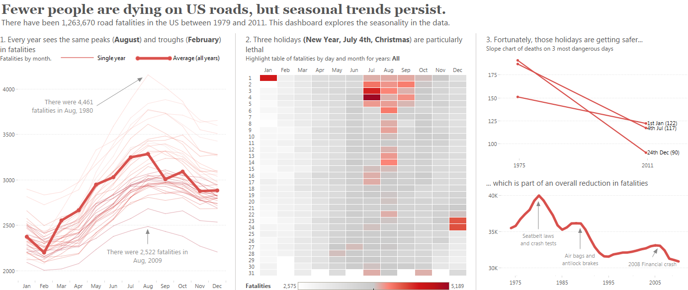
- Iraq’s Bloody Toll by Simon Scarr is a great piece of work. I’ve written about it here.
- Eric Brown created the excellent Longevity/Gestation analysis.
- My World Cup “Goooaaal!” chart is here.
I hope you enjoyed the session! What other design tricks would you add?
Recent Comments