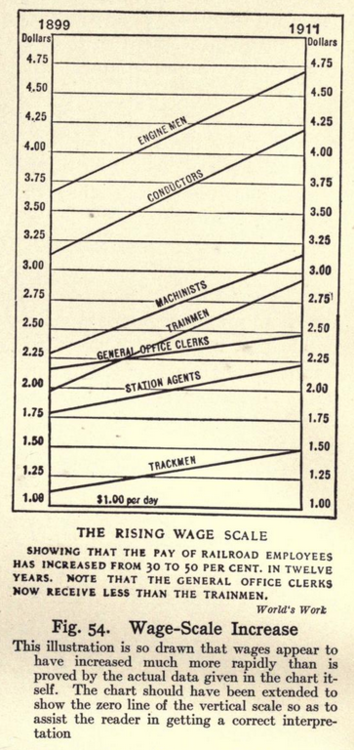

Time series charts are great – you can see the ups and downs of your measure nice and clearly. Sometimes, though, you want to focus on just the start/end for each category. Brinton liked this chart because it “indicates total movement rather than short-time fluctuations.” But he thought the axes were too dark and dominant. Sound familiar? Yes – Brinton was talking about data-ink ratio 70yrs before Tufte. (go read the text yourself)
Slope charts are in vogue (see Andy Kirk’s post and the cover of Alberto Cairo’s book).
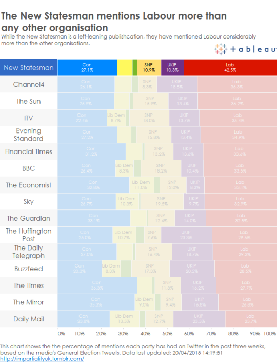
You can build dynamic slope charts in Tableau – click here to see a tutorial.

Recent Comments