
Stephen Few has this week come up with another innovative new ways of visualising data: wrapped bars. Check out his article for an explanation of what they are and why they are useful.In this post, I want to discuss my thoughts on them. I have also implemented wrapped bars in Tableau: that’s a separate post you can view here.
Let me know what you think in the comments, or on twitter (@acotgreave).
1. The fear of the new
Stephen has created wrapped bars to fix problems in treemaps. I confess I initially looked at wrapped bars and disliked them. But was this the fear of the new? They clearly fix a problem in treemaps, but I initially thought, “Well, treemaps are good enough, why do we need something else to fix a smallish problem with them?”
But what if Ben Schneiderman had invented Wrapped Bars, not treemaps, back in the 1990s? We’d be comfortable with those, by now, I suspect. And then imagine Stephen Few comes along and fixes a problem with Wrapped Bars by giving us the treemap. Would my reaction still be that the new thing was inferior? I suspect yes. This is something one should always be mindful of when assessing new visualisation types.
With that in mind. what is the sweet spot that wrapped bars fix? In essence it’s finding the exact relative magnitude of dimension members at lower ranks. For example, what is the rank of the red mark in the treemap below?
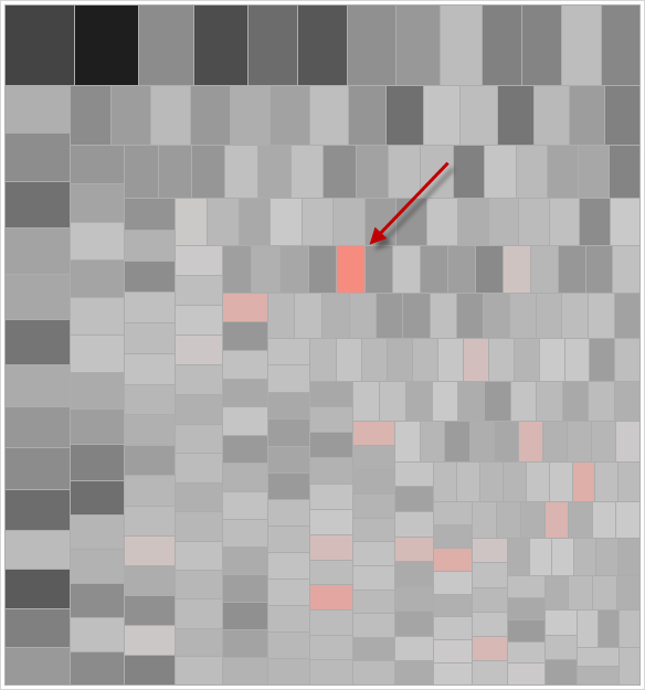
It’s very hard to answer that. Now check out a Wrapped Bar version with 60 rows in each column (incidentally, you can change the rows/column count in my interactive version)
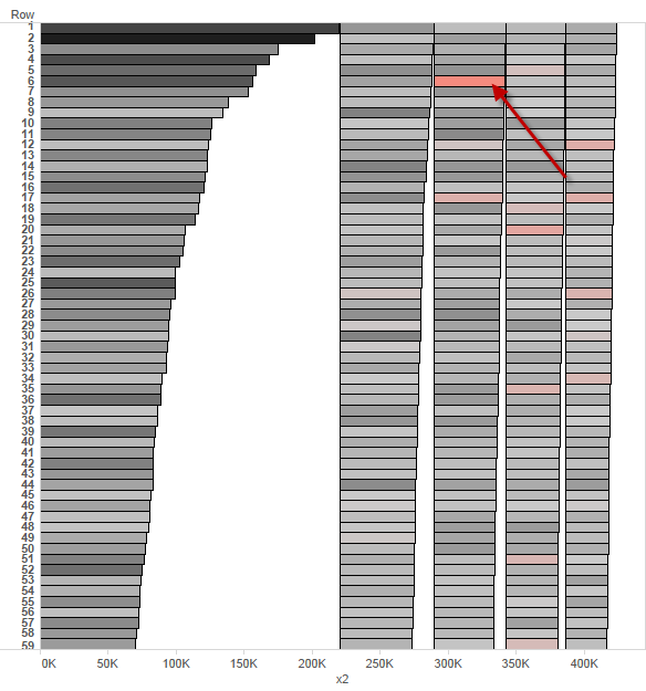
It’s much easier, isn’t it? I am interested to know how big an issue this is for users of visual analysis tools. I don’t think I have ever felt a need for a middle ground between the treemap and bar chart. Switching between those two has sufficed for me so far.
2. Moire pattern
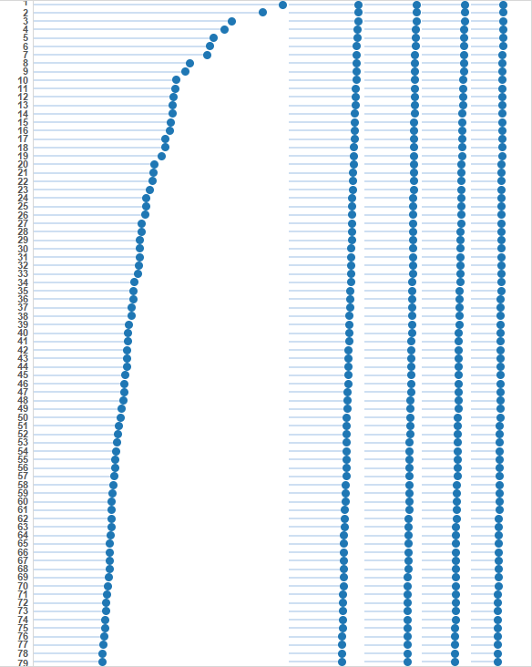
The bars on the first few pages of his article create a moire pattern that disturbs my eyes as I scan the graphic. I would recommend using lollipops for wrapped bars: they reduce the amount of ink while preserving the link from the dot back to the axis origin. I created the lollipop version in Tableau, too, which you can see in my “How-to” blog post. Incidentally, lollipops should only be used when the scale begins at zero. If you are showing another value, then the line should extend right across the plot area.
3. Negative values?
Stephen addresses negative values and draws an example where a small number of values are negative. This works well enough and is an improvement on treemaps. It would be an interesting exercise to see how well they work if, say, 50% of values are negative. I tried it in Tableau but my implementation did not work with negative values.
5. My conclusions
The Wrapped Bar has definite advantages over existing visualisations, but I fear that whatever these are, this visualisation will be slow to be adopted. Slower than bullet charts, at any rate, I think this is because the problem being solved is not as pressing as Stephen’s most successful innovation, the excellent bullet chart. If it was a chart type that could be switched to and from very quickly, I expect there would be more success. There are times during a visual analytic cycle that you do want to understand the lower ranked members of a dimension and I believe the wrapped bar might have more value there. Click – bar chart – click – wrapped bar – click -treemap: that kind of cycle would visually answer different questions very quickly.
What do you think? I am always very wary of my first reactions to new visualisation types. People are naturally resistant to change. Are my concerns part of a natural fear of the new, or are they correct? Let me know below or on twitter (@acotgreave).
And don’t forget – if you want to see how you can do this in Tableau, click here.

1 Comment
Add Yours →[…] Stephen Few’s wrapped bars: thoughts | Gravy Anecdote […]