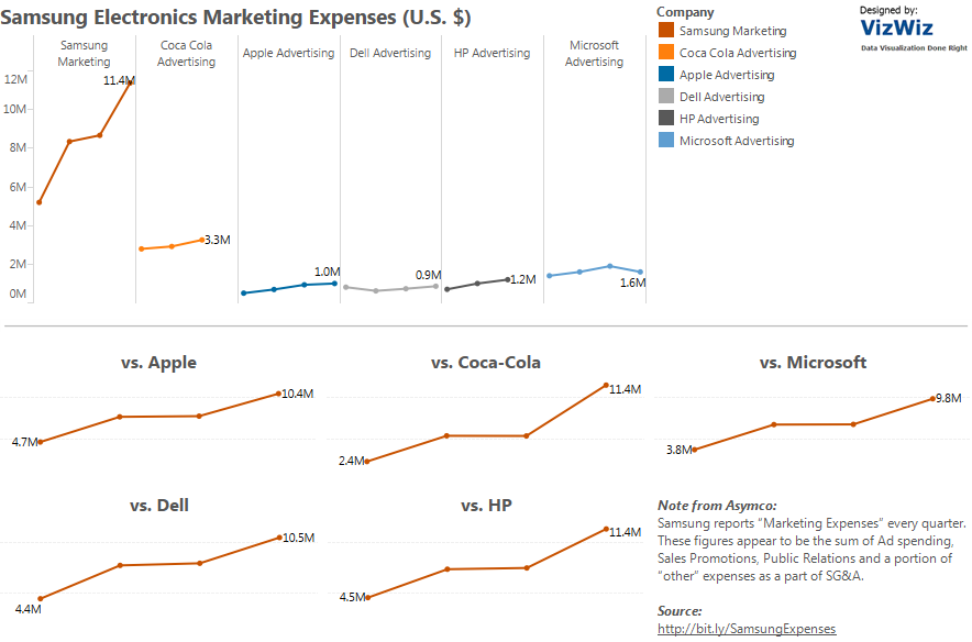
Andy Kriebel just posted a chart makeover. He’s improved things from Samsung’s initial effort.
However, when comparing different categories over time, I like putting the Dimension onto the column shelf so you get a separate column for each member – this way you can compare their volatility/growth without the lines overlapping each other. This works well when there aren’t too many members in a dimension.
Image below – click for the workbook


Recent Comments