[Update: in theory, v6.1.1 has made it easier to create the bars described in this post by using REPLACE() and SPACE(). However, at time of writing (19 Aug 2011) there is a problem: while the solution works fine in Tableau Desktop, the view won’t display on Tableau Public – have a look at the “Using REPLACE and SPACE() tab in the embedded workbook below. The calculations have also been optimised using parameters.]
Consider this map:
It highlights one of many situations when pie charts don’t work. The smallest pies are so small you have no chance of making out the size of the slices. And what if I wanted to show Profits on the viz, as well as Sales and Product Type?
The Tableau guys have come up with a way of using Gantt Bars to emulate a bar chart and maybe solve some of these problems. This works okay, but has its own flaws; mainly that it’s still hard to make out the individual bar segments.
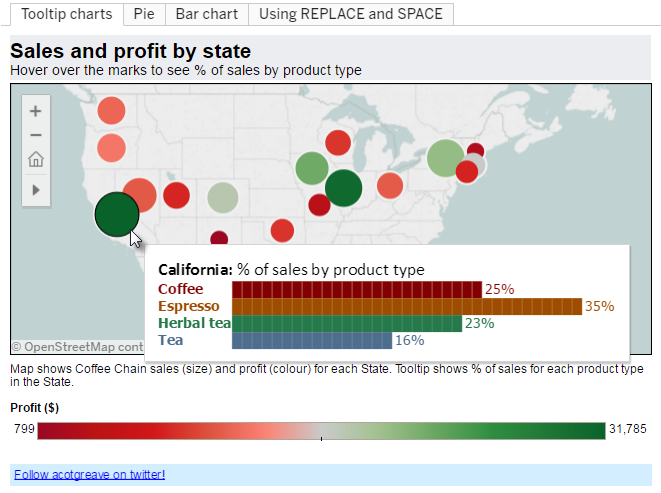
Well, how about using a bar chart inside a tooltip? Surely you can’t do that? Well, yes you can:
The viz above solves several problems. The circle size is based on Sales, and Profit by colour. And the tooltip shows the proportion of sales of each Product Type. With just a mouse-hover, you’ve revealed a new dimension on the data. Three dimensions on one map viz – bingo!
How do we do this? Well, first we need to decide if our dataset is suitable. First of all, you need a known number of values in your tooltip-chart dimension, because we’ll be creating a calculated field each one. In the above, we only have four Product Types, so that’s a suitable candidate. Secondly, there is a maximum length that the bar can be. Too long and it will wrap around in the tooltip. As we’ll see, the bar is built using a text string, so we can’t just have an unlimited bar with a value in the 100s. Percentages work best as they are going to have a maximum value of 100.
For each Product Type, we need two calculated fields. One works out the percentage of sales of that product type:

and the other works out the length of the bar. How do you build a bar out of text? Simple: use the ALT+219 ASCII character. That’s this one: ?. You create it by pressing the ALT key and then 219 on the Number Pad (using a laptop? Copy and paste the one in this blog instead!). We need to create a parameter – [Bar] – which is one loooong string of 100 ? characters, and then create a calculated field that is a subset of that, based upon the % value in your other calculated field. Here’s the text of that field:
LEFT([Bar],ROUND([% coffee sales]))
Now we have two calculated fields for each Product Type. Drop them all onto the ever-so-useful Level of Detail shelf, and now you can build your tooltip as follows:
You’ve done it! You’ve now become a tooltip genius. Using the skills we’ve learned in our other tooltip posts (basics here, and conditional formatting here), your tooltips can be as jazzy as your vizzes themselves!
Those of you who are big Excel users may know where the inspiration comes from. This post gives a huge Tip o’ The Hat to the posts from Juice Analytics, Daily Dose of Excel, Jon Peltier, and Chandoo that showed us all how to do in-cell charts in Excel in the last few years. Also, thanks to Richard Leeke on the Tableau forum for giving me the last piece in the jigsaw for this idea: Excel has a REPT function that can be used to create the long string. Tableau doesn’t. Richard pointed out that the only way round this is to type the string out manually and take a substring of it. Nice!


18 Comments
Add Yours →Andy, I’m loving the charts in the tooltip! Have you tried applying your Conditional Formatting tip to the bars? Maybe you could show the profit by product category?
Awesome, in Excel I have advocated using the Script font, size 7, with the pipe character, |
This allows you to have a higher resolution to your bars, and the script font at a small enough size has no spacing between the characters. For some reason though, Script does not show in my list of fonts in Tableau.
I found that the Stencil font works well as a replacement.
You could also create a calculated field that works out the maximum size of the bar that your data will create, and use that to size the bars automatically.
HI Alex
I played around with using the pipe character in different fonts, but they just didn’t quite render properly.
The calculated field idea is a great one – in my solution, I’m currently a bit limited to showing percentages only, but with a calc. field you could extend it a bit further. Tableau tooltips won’t show more than about 80 characters on a single line, so any bar would have to be worked out as a proportion of that maximum.
Andy
Great reuse of an Excel trick. The one thing the bars in the tool tip are missing is an axis.
I found that if you lower the font size of the blocks to 6, you get thin lines between each block, and I feel that helps the readability in the absence of an axis.
I imagine this will also be useful when Tableau Calculations are available for use inside of calculated fields.
Update: the workbook above doesn’t work in Beta 6 (as of 1 October). There’s a “Wide string” error. I did a workaround where you use only 50 character strings, and take a proportion of that length. That seems okay.
I also tinkered with Alex’s suggestion of using Stencil, which works really nicely. Apart from some tooltips which render the bar in random characters – not sure what’s going on there!
My advice to anyone trying this technique: make sure your data works within the tooltips before releasing it to the world!
Very cool Andy.
I had a bit of a play with some of the other folks’ suggestions and didn’t hit all the same limitations as you. I found a pipe in the stencil font worked fine, and didn’t wrap till it was over 400 characters long (in 10 point with a reasonable amount of text and a tab to the left). It seemed to render OK for me (but maybe I’m less discerning – or maybe you’re talking on Public, which I didn’t try).
If your datasource is Firebird it can handle substrings up to at least 400 characters. With Jet the limit is 256 – but if you’re publishing on Public you’ll be in Firebird anyway.
I tried in v6 beta2 and noticed you only get that wide string error with the data engine, not if you leave it in Firebird. Probably not the highest priority beta issue – but worth reporting if you haven’t already.
But I also found that with v6 if you store the bar as a constant in a separate calculated field, rather than embedding it in each calc that works fine (i.e. it avoids the wide string error, and avoids having to embed it in every calc).
Richard
Great info – great to hear that you’re getting the Stencil font to work with long strings; I’ll have to try it with a different, non-Jet database.
Storing the bar as a constant: glad to hear it works in v6. It didn’t in v5, and was raised as a bug.
Andy
Ohhhh, it works on my iphone!!!! nice.
Andy,
When you say that “Tableau tooltips won’t show more than about 80 characters on a single line” does that mean that if i were trying to create bar charts in my tooltips where the percentages I’m trying to show were over 80% that it wouldn’t work properly? I’ve followed your instructions in creating them but it’s not working correctly and I’m wondering if this is my problem.
Thanks,
Troy
HI Troy
Yes, that might be your problem. You could reduce the length of the bar to 50 characters, and then change the second part of the LEFT(…. , …..) calc to:
ROUND([% coffee sales] / 2)
That way, your bars are only ever going to be a max of 50 chars. You lose some granularity this way.
Alternatively, despite my comments above, Alex K was right – you can use Stencil font to get more space on the tooltip.
Andy
Andy,
I reduced the length down to 50 and it worked great, thanks very much for the suggestion!
Troy
[…] The bar-chart tooltip […]
[…] Charts in tooltip https://gravyanecdote.com/andy-cotgreave/charts-in-a-tooltip/ […]
This technique works great on the viz sheet, but has anyone figured out how to transfer it to a Dashboard? The tool tip with piping works on the sheet but when adding the sheet to the Dashboard the tool tip doesn’t show the custom fields. I’ve removed and re-added the sheet.
Close and restart fixed it!
[…] mentioned her inspiration stemmed from Andy Cotgreave’s charts in tooltips using ASCII characters. Funny enough, there’s been 2 articles released recently by Rody Zakovich and Jeffrey […]
[…] The tip involves combining a parameter with a string of Alt code squares (Alt+9632) or rectangles (Alt+219) with calculated fields that compute how many symbols to display. As Andy has had seven years to optimize his approach, and I do not have anything to add at this time, I’m going to point you his way for this last tutorial. […]
[…] The tip involves combining a parameter with a string of Alt code squares (Alt+9632) or rectangles (Alt+219) with calculated fields that compute how many symbols to display. As Andy has had seven years to optimize his approach, and I do not have anything to add at this time, I’m going to point you his way for this last tutorial. […]