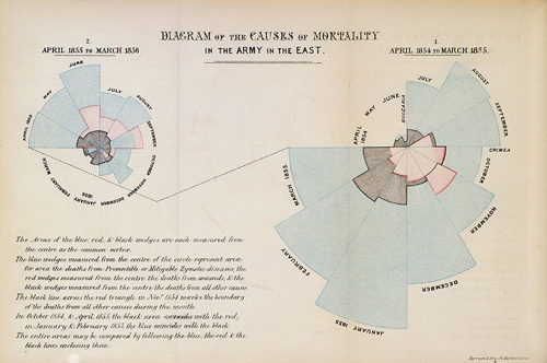
Florence Nightingale’s rose diagrams are one of the most famous and influential visualisations of all time. The story behind her and the creation of the charts is a fascinating one. I tell it in my “Influential visualisations talk”.
As part of the talk, I talk about how people criticise her diagrams for not being best practice. Phooey, I say to them. Why? For two reasons:
- She didn’t have the benefit of books and blogs about data viz best practice.
- She was trying to convey a simple message: soldiers were dying needlessly. The message was what counted to her.
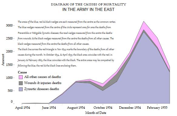
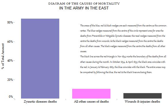
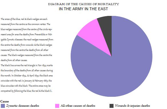
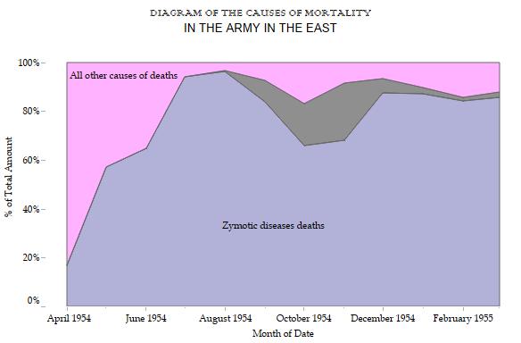
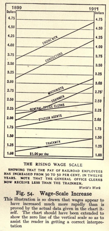
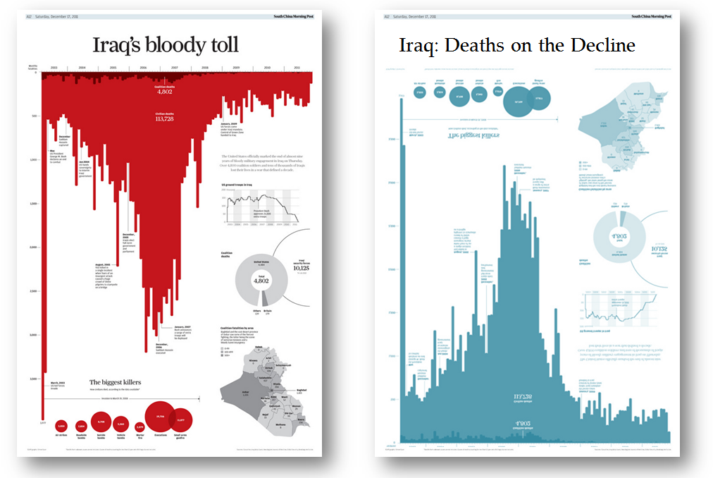
I got to thinking, though, what would the charts look like using “best practice”? The answer: boring. Sure, they’re accurate, but they aren’t engaging. And it brings to mind something Andy Kirk and Alberto Cairo often talk about: while scientists tell us what to do, creatives tell us what we could do. Nightingale was a creative data rockstar.
So here are my attempts at reworking them. Do you think any of them are more effective at communicating the message than Nightingale’s?

As a final note – I concede I’m a little confused about whether Nigthingale’s originals were sized by area or by distance along the radius. Two great articles seem to contradict this (at least as far as my tired mind can interpret). One article that suggests the area is correct is on the excellent Understanding Uncertainty blog. Whereas Dynamic Diagrams thinks the area is incorrect.

4 Comments
Add Yours →[…] Florence Nightingale didn’t need to worry about best practice | Gravy Anecdote […]
[…] Florence Nightingale’s classic “rose diagram” – Andy Cotgreave wrote about this one, also this past week – , Robert Fludd‘s The Great Chain of Being (1617), and the […]
[…] You to be the judge: View the original rose diagram and newer versions here. […]
I almost never comment, however i did a few searching and wound up here Florence Nightingale
didn