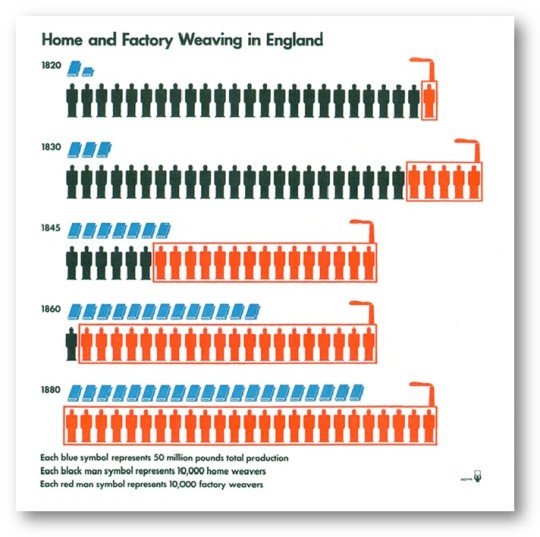
So: can you recreate my list of influential vizzes in Tableau? Sure. Mostly. Here’s an interactive gallery. Whether you SHOULD recreate these vizzes or not is a discussion in itself. I leave it to you to debate this in the comments below. The supporting slides and more info can be found in this post: “SXSW: The most influential visualisation of all time“.
William Playfair
Playfair nailed it. It’s a great viz that also looks great in modern tools. Well labelled and nicely designed. What can I add? Um – interactive tooltips?
[sb name=”WilliamPlayfair”]
Florence Nightingale
Tableau can’t do radar chart or rose diagrams. That’s probably a good thing. I tried many different views but the one that had the most impact, I believe, is a stacked area chart.
[sb name=”FlorenceNightingale”]
Charles Minard
Thanks to Kim Rees of Periscopic – she did this one. It’s great. Again – Minard’s has more soul.
[sb name=”CharlesMinard”]
Hans Rosling
Rosling’s Gapminder is a modern tool. Tableau doesn’t animate so well in the browser, so while we can approximate the experience it’s not nearly as smooth an experience as the real thing.
[sb name=”HansRosling”]
John Snow
This one needs animated pages to work properly. My verdict? John Snow definitely did a better job
[sb name=”JohnSnow”]

Recent Comments