For the slides – head to the end of this post
For Tableau-versions of the vizzes, head to this post
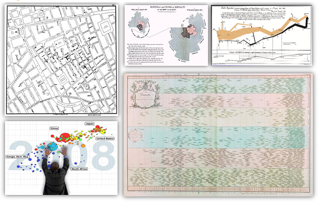
What do you think are the most influential visualisations of all time? I asked that at SXSW today: what a great time it was delivering the session to everyone. If you want to watch the session again, you can watch an older version I recorded with Data Science Central.
I’ve also uploaded the Tableau workbook I used to recreate the visualisations (see this post). This in itself was an interesting exercise. Do they look better in a modern data visualisation tool? I don’t think so (as you can see in my exploration of Nightingale’s chart earlier this week). What the originals have is the depth of the personal touch. Being hand-drawn they contain the soul of the author of the viz. Each dot of ink will have been considered carefully:
– What layout will best communicate my message?
– Should I use colour?
– What thickness should the axis be?
Today, not enough people stop to take the time to make those considerations.
My slides are also available on slideshare. And if you want to go do some further reading, I have a bundle of links on Bitly.
I’m interested to know what you think of my choices and if you would choose different ones.


2 Comments
Add Yours →[…] Andy’s summary blog post: https://gravyanecdote.com/uncategorized/sxsw-the-most-influential-visualisations-of-all-time/ […]
[…] The most influential vizzes of all time (#SXSW) | Data Viz News […]