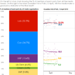
The chart on the left shows how many times each party has been mentioned in all the tweets we’ve collected since Jan 5th. I’m surprised that they seem to echo the latest poll of polls.
I’m not making claims of statistical significance here, but by collecting data from left- and right- leaning organisations we appear to have a big picture that relates to voters’ intentions.
One for more rigorous research, I think.

Recent Comments