Welcome to the Sweet Spot! In this series, I share 3 interesting things I’ve been reading and watching in the last 2 weeks. Each relates to a mission to help people see and understand data.
I’m starting a Sweet Spot mailing list: do you want to receive these each week? If so, please enter your email below, and you’ll get the three cool things, delivered to your Inbox, every two weeks:
This time, let’s look at user experience. What can Fortnite, buttons, and urban design teach us software and dashboard design? Quite a lot, as each of these three links show.
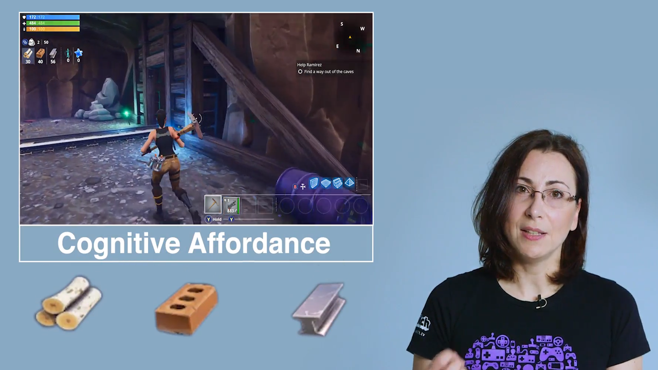
10 things you might not have noticed in Fortnite (Ars Technica, 13 minute video)

Addicted to Fortnite? Or have a child who is? Well, knowing Fortnite could well help us build dashboards, too. In this breakdown of Fortnite’s UI by Celia Hodent (UX Director at Epic Games), she explains how they enable onboarding, how they incorporate cognitive affordances and how they use colour. Don’t see much Red in Fortnite? That’s because it’s a reserved colour used for very specific signaling.
I’d love to see some Fortnite inspired UX touches in your dashboards!
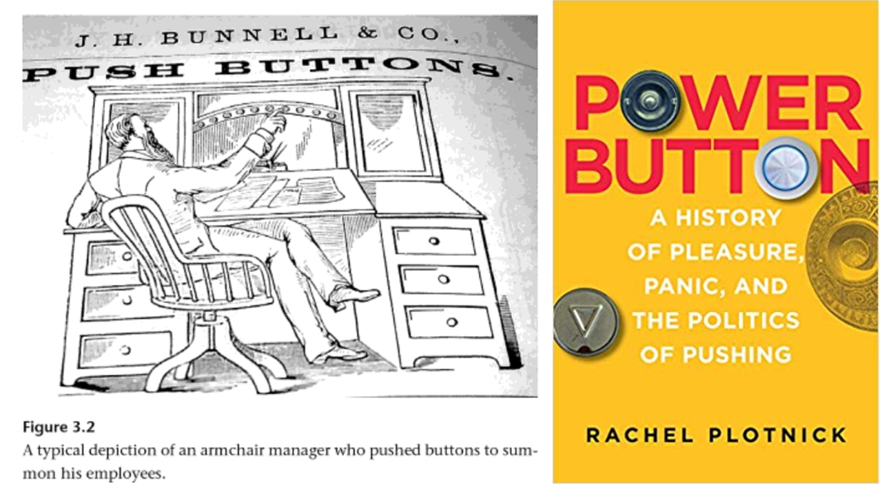
Push Buttons (BBC Thinking Allowed, 28 minute podcast)

Buttons are on every desktop application, and at Tableau, we’ll soon be adding them to dashboards! But wait: have you ever stopped to think about the history or philosophy or sociology of buttons? I certainly haven’t.
This fascinating episode of Thinking Allowed talks to people who have thought about the deeper meaning of buttons. Are they neutral? Do they always make our lives easier? Who gets to push the button and who has to respond? Is mobile changing the button? There’s a whole book by one of the guests, Rachel Plotnick – go check it out.
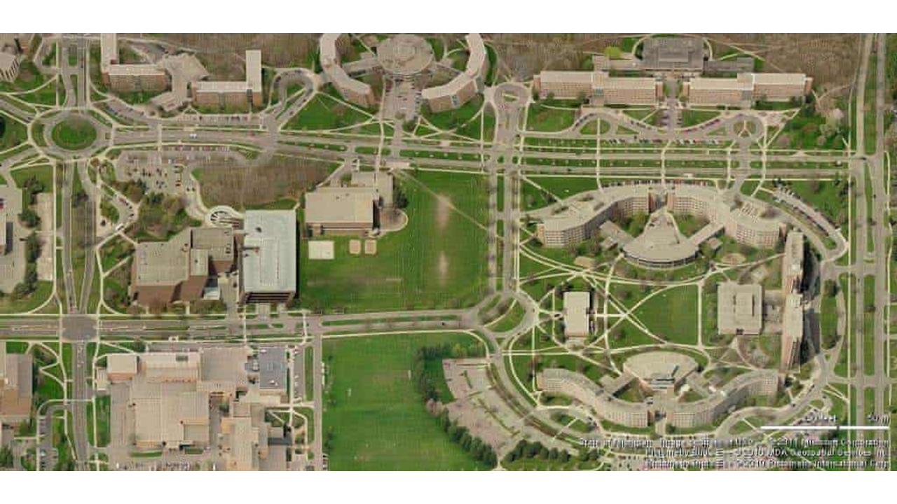
Desire paths: the illicit trails that defy the urban planners (The Guardian, 4 minute read)

“Desire paths” are a well-known phenomenon displaying the tension between urban design and people’s yearning for a path of least resistance. This is a great overview, including one great nugget that Michigan State University (pictured) didn’t install any path when they built their campus: they waited for students to beat their own paths and then paved those! Could a similar approach be used for software or dashboard design? Can our user paths determine our future interface?
That’s it for now! As always: please join the slack channel #soc-the-sweet-spot to continue the conversation, and to add other interesting things you find on the web.
Have a great fortnite [sic], Andy


2 Comments
Add Yours →Hi Andy,
Thanks for surfacing this high quality content, and for providing a variety of media types to enjoy!
I had never really thought about it, but my own path I tread every day cuts across the park in a direct line from one entrance to another. It is well trodden by many a commuter, yet there is steadfast resistance to acknowledge it’s usefulness: they regularly try to returf it or cordon it off when it gets worn down. Now I know they should heed the data and pave it!
As regards software and buttons, there is a quote in the podcast:
“it is the logic of this reified bourgeois world that their services are only noticed when they cease to exist”
Doesn’t that describe the relation of every business to its IT team?
Hi Sheel
Thanks for the kind words! You caught a great quote from the podcast. Yes: sounds like IT to me!