I had a great time delivering my TC18 presentation “Clear and Presentation Danger”. You can watch it below:
All presentations can be improved, so I wanted to look at how I can make it better. Post-conference, I am reviewing the content with two goals
- Can I improve the flow?
- How can I reduce it to 30 minutes (I’m delivering it as keynote at Big Data London next week).
How about using data to help improve my presentations?
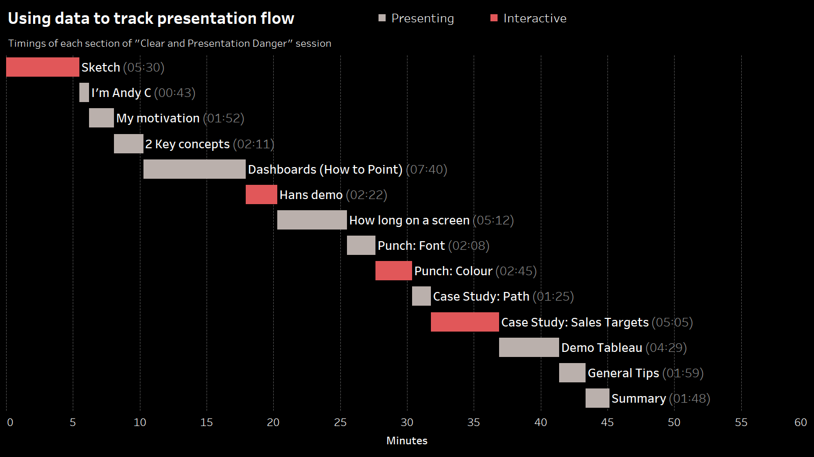
Time each section
I timed the recording of my session in order to work out how long each section was. Check it out:

This really helps me in a couple of ways:
Enough interactivity?
The red indicates sections where I am not the key presenter. It’s either interactive, or a video. These moments help break the flow of a presentation. I can see that the cadence of these breaks is pretty good.
Any sections too long?
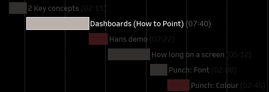
The “Dashboards (How to point)” section is the longest. I strongly feel that it is important to go through all of thse, but i wonder if that sections drags on? That’s something I’ll seek to ask others about.
In my feedback comments, some people asked for more content in the section about designing charts to punch home a message. It looks like I should reduce the dashboard section and increase the “Punch” section.
Is there enough content?
The one disappointing data point is that the total time is 45 minutes. At TC, it was a 60 minute time slot. I got several feedback comments saying the session was too short. Believe me when I say nobody was more disappointed about this than me. 🙂
I did 4 run-throughs of this talk in front of audiences, and in each one I overran. I did take out 2 small sections before going live at TC, but I have no idea how I cut out 15 whole minutes. So: if you’re somebody who thought my session was too short: I apologise. It was too short.
How can I cut it to 30 minutes?
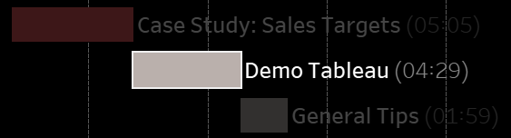
Looking at the timings, I can make some pretty easy decisions: for a 30 minute session, I clearly need to reduce the Dashboard section. It’s not a Tableau event, so perhaps I can drop the entire “Demo Tableau” section. That’s 8 minutes, easily. My sketch and case studies section each contain multiple examples, so I could remove one from each section.


Recent Comments