
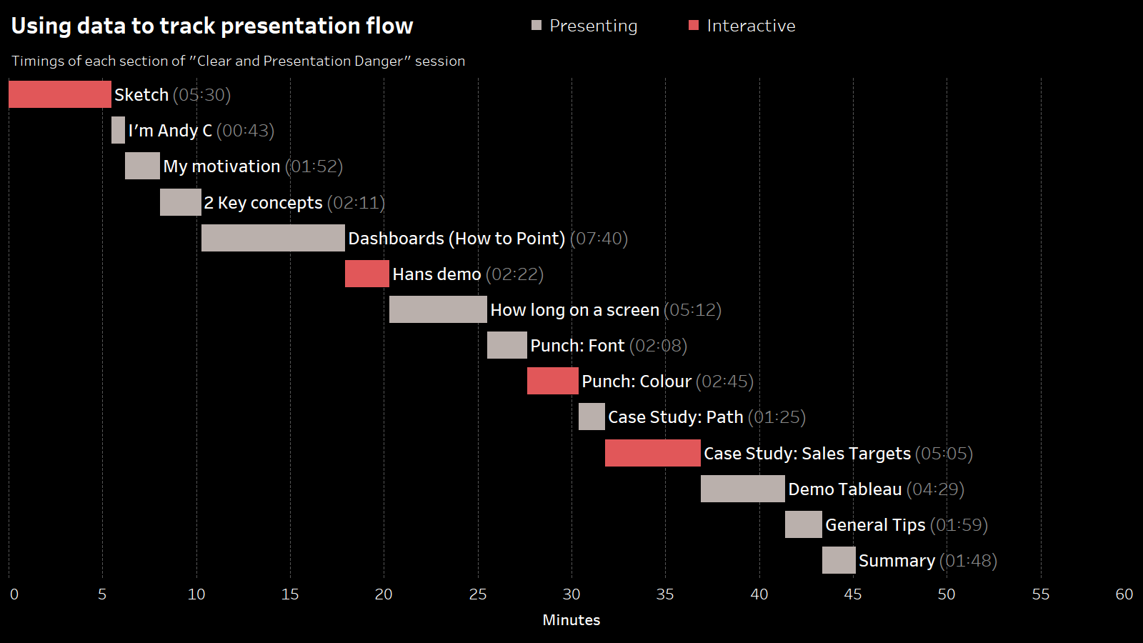
This is part of an on-going series about how to improve a data presentation.
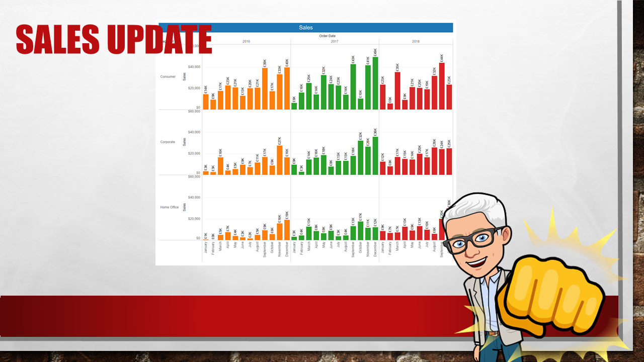
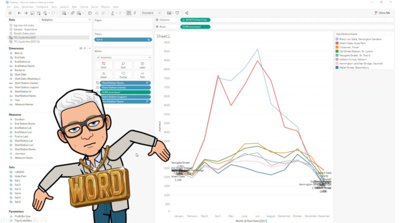
It’s time to show your dashboard to an audience. Perhaps it’s to your bosses, showing what you’ve been doing with your BI tool. Perhaps you’re sharing with colleagues in a show-and-tell. Or maybe at an industry user group? Or to a big keynote audience?
Whatever your audience: you’re projecting a small-screen, complex interface onto a big screen. Your audience have no clue where to look. How are you going to be sure they’re looking at, and understanding, the part of the screen you’re talking about?
Check out the rest of the Clear and Presentation Danger series for many more tips. If you want a great book to read on this topic, I recommend Cole Knafflic’s Storytelling with Data.

1 Comment
Add Yours →Thanks for the sharing. I personally would print screen the dashboard to the powerpoint, then cover all of the charts first. After that, I uncover each of the charts one-by-one as I explain what the chart is showing and the interaction that the user could do. After that, I will jump to the Tableau dashboard and show them how to play around the dashboard.