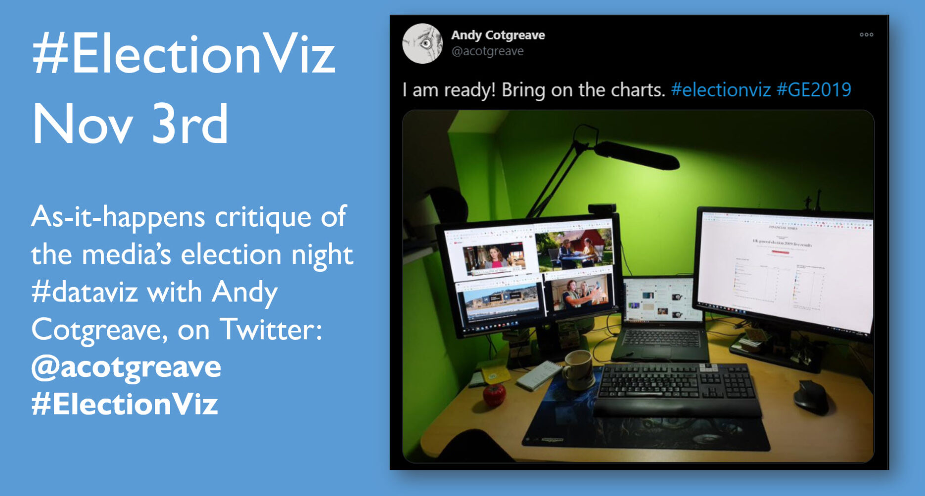
The US Election is on November 3. As I did with the UK General Election in 2019, I will be tweeting through the night, critiquing the broadcast media’s use of charts on the night. I’ll be hunting out the good and bad across the channels, and sharing the lessons we can all learn as data storytellers.
Sounds good: how can I follow this?
You can follow me on twitter (@acotgreave) and I’ll be using the #ElectionViz hashtag.
Shall we talk about politics?
No. #ElectionViz is 100% not about the political story of the night. There are countless other places to engage in political conversation. I am not interested in talking about the political aspects of the US election: I want to talk about the charts. My intent is to be 100% neutral. I will ignore any comments about the politics of the content and encourage you to do the same.
Can I contribute?
Yes. I want YOU to share the good and bad use of data you see on the media on election night. Using #ElectionViz, share what you see, and tell us what you like or dislike about the viz you find. I want this to be a big opportunity for us to celebrate the best of data storytelling in the media, and to help our community learn from the highs (and lows) of the night. I want people to approach this with positivity – let’s find the good, and be gentle when we see something sub-par. For advice on criticising data visualizations, read this wonderful piece from Alli Torban.
Sounds great. Tell me again how I follow along?
Simple: follow me on twitter (@acotgreave) and keep your eye on the #ElectionViz hashtag. See you on November 3rd!

Recent Comments