
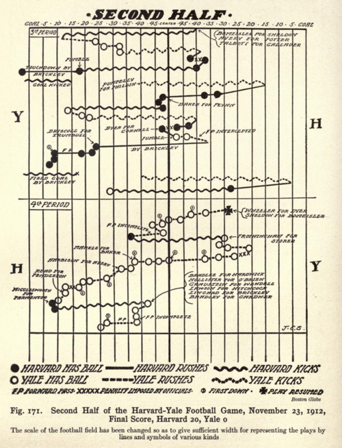
Drive charts are excellent ways of visually summarising football game data. They are certainly not new. Here’s one Brinton showed in the mapping section of his book:
We can recreate these today in Tableau as explained in Dave Andrade’s blog.
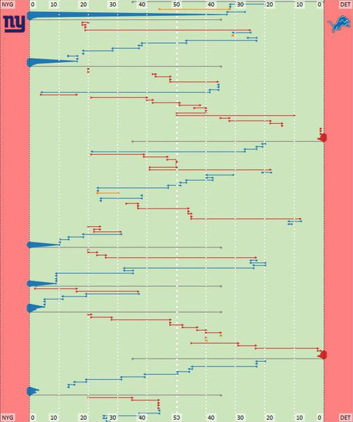
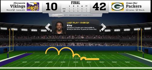
The big media companies all use Drive Charts to show their data. I like the pseudo-SD nature of the NFL’s charts and the clarity of those on the Seattle Times.
Do you have any favourites?
Does anyone know when the drive chart was first used?

Recent Comments