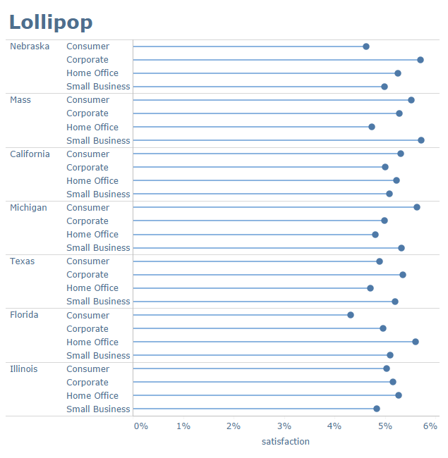
Stephen Few has written about lollipop charts in his latest blog. “Malformed bar graphs,” he calls them. The poor things – lollipops are more than that.
The problem is, he didn’t consider the problem I was trying to solve when I first created them in 2011*:
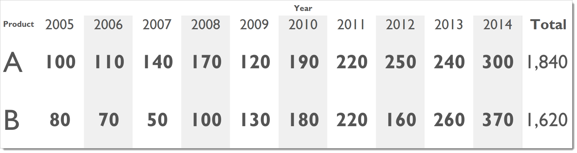
Problem: A bar chart with many bars of a long length are unpleasant to look at.

I believe lollipops create a visual experience which is easier to look at. In his post, Steve used an example using 7 bars with a large range. I didn’t create the lollipop for that situation. While I believe a bar or lollipop works for that kind of data, criticizing the lollipop without addressing the original intention is disingenuous. I did consider fat bars and thin lines, too, in seeking a solution. Fat bars are just too inky, and the thin lines don’t have enough definition. Lollipops are an attractive compromise to solve the problem.
*Did I invent lollipop charts? Alberto Cairo credited me with their invention in his book The Truthful Art, and I’m not going to argue against that! The images on my original post are no longer available, unfortunately.

5 Comments
Add Yours →There are other lollipop nuances that Few skipped past as well.
1) Bars that go above & below zero. I especially prefer lollipops in these situations if one or two of the data points is very close zero (in which case standard bars can almost disappear, but the lollipop circle is easily seen).
2) Using something other than a circle on the end. Few’s concern seems to mainly be one precision, but a Gantt mark or an X in place of the circle solves that issue pretty quickly. I’ll admit that such a plot doesn’t actually look like a collection of lollipops, but it’s pretty much the same concept.
I do think that Few raises some worthy concerns about lollipops, and that there are certainly many situations in which standard bars are better, but I don’t understand why I’ve seen him and others strongly imply that lollipops are universally inferior.
I am failing to see how having both positive and negative values changes anything in this debate, regardless of which side of the argument one is on.
Can you elaborate?
Perhaps it’s the name itself which might give the graph a bad first impression.
However, in your example above, I can’t get Steve Krug out of my head and his book Don’t Make Me Think.
With your lollipop chart, I don’t have to think–I immediately get it. The bar chart below–yes, too much ink.
Your chart is now in my toolbox.
I am curious what thinking has been eliminated in the lollipop version?
To me, I see a bar chart that is hard to determine useful information from, followed by a lollipop chart that is at least as difficult to determine useful information from…
In either case, I look for end points that stand out, and trace them back to their category label.
In fact, I would say I find it slightly more difficult to trace the thin line of the lollipop.
Very good example, Andy!
A similar chart to Lollipop is the plain dot chart, as on the cover of Cleveland’s great book:
https://images-na.ssl-images-amazon.com/images/I/51MY3M1fUQL._SX356_BO1,204,203,200_.jpg
It is very useful, especially to compare multiple categories
http://thewhyaxis.info/content/46-gap-remake/regap-in5.gif