
When designing objects, be they hotel room taps/faucets, iPhones, or cars, the creators grapple with the concepts of affordances and signifiers. These terms were introduced into design by Don Norman, author of The Design of Everyday Things, based on earlier work by JJ Gibson.
What are these and how can we apply them to our dashboard design?
- An affordance is something an object (or dashboard) can do. A tap/faucet can run hot or cold water, for example.
- A signifier is an indicator of some sort. In our tap example, this might be red/blue dots signifying which way to turn the tap to get hot or cold water.
How many times have you tried to use a tap in a bathroom and not known which way to turn it for hot or cold? This is a frustration of modern life: apparently a sleek design is more important than signifying (red/blue) the affordance (hot/cold).
Dashboards have affordances and signifiers. How you implement them will influence their success. Let’s use an example. I’m going to use an excellent dashboard by Eric Brown. It allows you to compare gestation periods of different animals.
Let’s play a game. Here are the rules: take a look at Eric’s dashboard and, without using your mouse, identify all the ways in which you can interact with the dashboard?
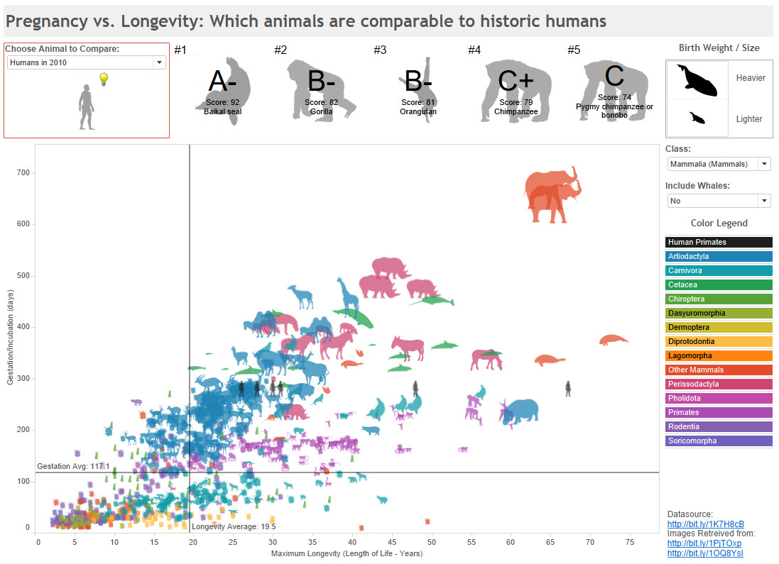
How many did you count?
There are eight intentional affordances Eric built into this dashboard. Did you spot them all?
How many of those eight affordances have a signifier?
Here are the affordances:

- 1, 5 and 6 are drop down filters. Drop-downs are a staple of interacting with dashboards, and web pages. But why put the three filters in different places?
- 2, the light bulb, is a hover-help tooltip. Hover over the light bulb and you see a description explaining how the compatibility score is calculated. That’s great if you’re familiar with the “hover-for-help” trope, but if you’re not, then, well, it’s just a light-bulb. How would you know it contains an explanation?
- 3 and 4 allow you to click on the animal to highlight it in the scatterplot and see more details.
- 7 is the colour legend. If you click on one of the colours, it highlights all animals in the scatterplot in that category. Does the dashboard tell you you can click on the legend?
- 8 allows you to click and see the datasources.
- Note – did some of y ou think you could click on the silhouettes of the whales in the top right? If you’re a Tableau expert, you might have thought you could. But, no, that is just a legend. It has no interactivity.
That’s a lot of stuff you can do with this dashboard. But only some have signifiers.
We could solve the problem by ensuring every affordance has a signifier. Here’s what that could look like:
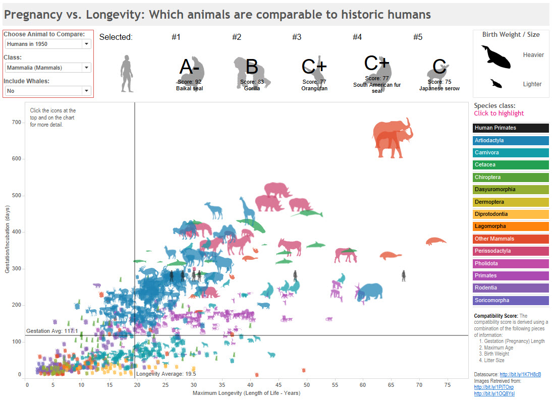
Here are the main changes I made:
- Move all drop-down filters into one place
- Added instructional text to the scatterplot and colour legend
- Removed the hover-help tooltip and placed the calculation explanation in the bottom right, above the data source links
I could now claim to have fixed the “problems” with Eric’s dashboard. Anyone now coming to the dashboard with no prior training in it, or dashboards in general, now has a signifier for every affordance. If they invest the time in reading the dashboard, they will be able to interact fully.
Should I always create a visible signifier for every affordance?
No. Sometimes you are designing dashboards for an internal audience. They may be familiar with dashboard interaction, or you can train them. In which case you could remove the signifiers.
The thing you need to do when designing a dashboard is consider your audience, and how you can communicate to them that they can interact with the dashboard. Skilled users know to click and experiment, or can be trained to do so. New users don’t have that knowledge or confidence. Your job is to make these decisions consciously, not by accident.
Although this example isn’t in my upcoming book, The Big Book of Dashboards is pakced full of successful dashboard designs and tips. Sign up for details here.
Note: Eric’s dashboard is excellent, it looks super and is a pleasure to explore. He’s graciously given me permission to use in this post, and I thank him for that.

2 Comments
Add Yours →[…] are eight ways to interact with Eric’s dashboard. Did you spot them all? I'm guessing that you didn’t, but that’s ok. Not all the […]
[…] Wikipedia: AffordanceThe theory of affordancesH Locke: Affordances and signifiersUX Design Glossary: How to Use Affordances in User InterfacesAffordances and Signifiers: applying design theory to your dashboards […]