
Stephen Few’s latest newsletter, “Information Visualization Research as Pseudo-Science” is a critique of the academic process in visualisation research. In it, he savages one paper in particular: “Beyond Memorability: Visualization Recognition and Recall.” He uses this as an example of what he thinks is a problem widespread in this field.
I agree there are problems in this paper. I agree with his suggestions for fixes.
However, I think it’s unfair to say this is a problem with visualisation research: it’s a problem with all research. In all fields, there are great studies and there are bad studies.
In this post, I’ll explain my own thoughts on the flaws of the paper, then the areas where I think Stephen is being unfair.
1. Stop publishing 2-column academic papers online!
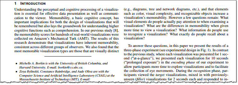
Why are academic papers STILL written in two columns? This is ridiculous in a time when most consumption is on screen. To read a 2-column PDF on my phone or tablet I need to do ridiculous down-up-right-down-left scrolling to follow the text. Come on academia: design for mobile!
2. Why are they measuring memorability?
I agreed with Stephen on the key problem: why are they measuring memorability? Isn’t it more important to understand the message of a visualisation?
3. Hang on, Steve! Problems with experimental technique are not unique to visualisation research
Stephen goes to town dismantling the study’s approach. For example, he criticises the small sample size and much of its methodology. I am not as expert as Stephen in this, but I find myself agreeing with most of this.
But where I differ is how he damns visualisation research as if the rest of research doesn’t have the same problems.
Let’s look at some:
i. Statistical unreliability
There are no shortage of academics papers with statistical problems caused by small samples. Here’s one on fish oil, dismantled by Ben Goldacre. Incidentally, the study he refers to also used 33 subjects.
He also outlines a statistical anomaly so extreme, that half of all neuroscience studies are statistically wrong.
Conclusion? Statistical problems are not unique to visualisation research.
ii. Methodological misdirection
How many of the 53 landmark studies in cancer had results that could be replicated? 6.
Yes, 89% of landmark cancer studies have results which cannot be replicated. (source: this great article “When Science Goes Wrong” from The Economist)
Conclusion? Methodological problems exist in all science.
iii. Logical fallacies
Logical fallacies are hardly unique to visualisation research. For example, this list of the top 20 logical fallacies is a good example of how this is a problem in all science, not just visualisation research.
Part of this critique is surely just part of scientific rigor?
For a conclusion, I acknowledge that I’m not an academic and I don’t read many academic papers, so I am naive.
Part of me thinks that surely lots of this critique is just part of scientific research? Researchers publish papers and the world responds, positively and negatively. Future research then improves.
I assume Stephen’s frustration stems from the fact that many of these problems are perpetual and should have been fixed before the study started. I can’t disagree with that. But I don’t think the paper is “fundamentally flawed” as Stephen describes. Maybe memorability of the view is important? If so, this is a first step in the iterative, slow advance of academic research. The paper at the very least makes us consider the question of what it’s important to remember from looking at a visualisation. Having read it critically, I have considered the question and formed an opinion. That’s of value, surely?
I found it very interesting to sit and really read an academic paper in detail. I don’t do it often, and I respect people who can wade through the dense formulaic wording to get to the meaning.
[Updated 5pm 3 Dec to expand my summary]
7 Comments
Add Yours →Andy,
If you are my neighbor and I observe you beating your wife, should I not criticize nor attempt to stop you because other men also beat their wives? I criticize flaws in information visualization research because it is my field of study and I want those flaws to be corrected. May I not address the flaws in information visualization research without equally addressing them in other fields of study that are not my own? Your argument is flawed. (Perhaps I shouldn’t point this out, however, without first pointing out that other people’s arguments are also flawed, else you’ll accuse me of being unfair.)
Hi Steve,
Thanks for commenting. First of all, as I’ve clarified in my response to Jeff’s comment, I don’t want to claim to be an authority here. My post has been my attempt to put down my thoughts, admittedly in an area I am not expert on (academic research).
I do however feel you didn’t generalise to all research. In fact, you seem to go to some length to specify this field. My intepretation stands: you’re focussing on one area as if it is somehow different to others.
Some examples.
One example where you do generalise things: “Academics are forced to publish research papers. This particular problem is not unique to information visualization.”
I wish you’d made it clearer that the problems aren’t unique to this field.
Andy,
I’m confused by a number of your statements.
First, Steve isn’t stating that it’s only visualization research that is fundamentally flawed. However, that’s his area of expertise. Even so, why would it be “unfair” for someone with expertise in a specific field to target research in that field? Your writing here seems to imply that there are errors in all areas of research, so it’s ok that it’s wrong in our field as well. Are you suggesting that we not critique our field of research since research is flawed in every field? I really don’t think the statement “damns visualization research as if the rest of research doesn’t have the same problems” is a fair characterization of what Steve was trying to convey. His point was to point out these issues so that we can move the field forward in the right direction for future research.
Second, you acknowledge that the fundamental question being asked is the wrong question and you also acknowledge that the research techniques are potentially flawed. If this is the case, how is the paper not “fatally flawed”. For example, if the sample size pool is invalid, then what’s the point? Additionally, none of these points that Steve has made have been proven wrong by anyone thus far. Ms. Borkin has a Masters and PhD in Applied Physics from Harvard, so I’m sure it would be simple for her to explain her methodology so that the community can examine further. For example, her methodology and testing for the sample sizes. If she could present a case that is statistically valid in her approach then I’m sure Steve could be convinced that the sample size was appropriate.
Finally, you and others have called Steve’s writing “aggressive”. This appears to me to be a subjective statement, based on your interpretation of tone, but the examples you provided don’t offer an evidence of this. Someone even went as far to use the word “persecute”, which is just absurd.
We’re all data guys, so I took the liberty of taking his entire PDF, removing any quoted material by others, and ran a text analysis on it. The results show more positive words than negative words by a wide margin with an overall polarity of “neutral”. When examining emotions of the words, emotions such as “anger” and “disgust” scored very low while the highest emotion scored was “joy”. In fact, “joy” was actually 4 times higher than “anger” and 12 times higher than “disgust”.
Unfortunately, Steve is dead on with his comment, “the information visualization community tends to accuse anyone who writes a negative critique of being aggressive.”
Jeff
Hi Jeff
Thanks for your comments. If you’re confused that’s fine; it will be the weakness of my own argument. I’m not an expert in academia, and I’m happy to have my opinions challenged.
That said, here’s some responses.
Focussing on just info viz research
I do think by singling out InfoVis research he is implying this is a problem specific to this area. The first sentence of his article is “Research in the field of information visualization is usually mediocre, often severely flawed, and only occasionally well done.” He spells it out in the first sentence! The ONLY time he generalises is in section 2 of “What should we do?” At every other time he specifies “info vis research.” The implication I get from that is that he sees it as a specific domain problem.
Is the study “fatally flawed”? To be honest, I don’t know. I enjoyed reading Borkin’s paper, even though I wasn’t sure memorability of charts themselves was appropriate. I felt that the authors set up a reasonable study, if small, and made some interesting observations. Borkin’s paper set out areas for further research such as is memorability of the chart or the message more important.
If it’s flawed, then isn’t the value of this kind of paper that we can build and improve on it? I freely admit that’s just my naive opinion – if that’s not how academia works, then enlighten me. “Some” flaws don’t make something “fatally” flawed, as far as I understand.
Re: aggression.
Yes, this is very hard to quantify. I can’t argue with your analysis of his vocabulary. Each time I reread his article, it becomes clearer that Stephen chooses his words extremely carefully and skillfully. For example, a sentence such as this: “Borkin’s study illustrates a fundamental problem in many visualization research studies: the researchers do not understand what people actually do with data visualizations or how visualizations work perceptually and cognitively.” On first read, it came across to me as aggressive. On subsequent reads, I realise the use of the word “many” is a way out of any claims of aggression.
Is the paper aggressive? Well, I certainly came away with that opinion. But does that mean I’m defensive about criticism of data visualisation? Of course it doesn’t. Isn’t this just a logical fallacy? (and I am going out on dodgy ground here, because I barely know what I’m talking about)
1. Mr X criticises an article about cheese
2. Mr X is jolly
3. Therefore all criticism of cheese is jolly.
I believe Steve’s comment is an attempt to defend his tone. I LOVE criticism, and if criticism is well written and correct, I LOVE IT MORE. I really enjoyed reading Stephen’s article. Based on my limitied knowledge of the field, its seems likes its correct, too. But if I call it aggressive it doesn’t mean I am dismissing criticism of academic research. That’s ridiculous.
Finally, I’m interested: what did you think of Borkin’s paper and Stephen’s response?
I, too, am not an academic, nor do I read very many academic papers (I’m an accidental reader of scholarly papers…stumbling into them vs. seeking them out), so I don’t feel qualified at all to assess the merits of this particular study. But I do feel that the argument put forth in this blog post is a little mis-guided. The phrase that sprung to mind while reading it and the responses is “think globally, act locally”. In other words, while the issues and limitations with this study may be shared by the broader academic community, data visualization is Stephen’s area of expertise and focus and so he wants to effect change in his sphere of influence. Similarly, the deficits in data sense-making that I see at my company are no doubt experienced across a majority of other companies, but I don’t need to wait for a tidal shift towards better practices before embarking on improvements where I work.
-Mike
Thanks Mike – you make a good point. I acknowledge Stephen was acting locally. Other people read the post as such. He’s told me the same.
[…] perception. I’ve not studied things like memorability, pre-attentive attributes, or the whole host of discussions that are occurring in space today. Read, yes. Study, no. Want those discussions? Go find […]