
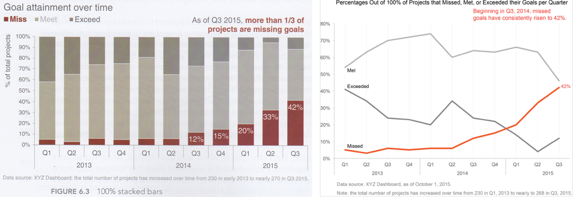
Stephen Few has been discussing 100% stacked bar charts. He’s opened a great debate with Cole Nussbaumer. I recommend you go and read the blog and the comments. In a nutshell, Steve prefers lines over stacked bars because they allow comparison of all data points at all places in the time series.
My problem is Steve’s assumption that Cole intended people to be able to compare all data points at all times in chart. In one of the comments, he says this:
“The information and eventual understanding that we get from a graph is more important than any impression that it provides unless that impression is all that matters.”
What if ‘that impression’ IS all that matters?
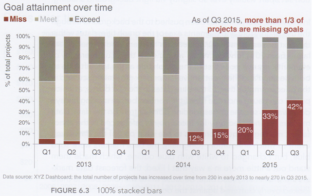
Sure, Steve’s lines allow you to do more accurate comparison of more data points. However, why should that be the only purpose of a chart? That purpose is one he imposed on Cole’s chart. It might not be the objective Cole had in mind when designing it.
Maybe Cole’s objective was to highlight the % missed only (ie the red marks on each chart). The other bar segments are secondary information, not vital to her key objective in making a 100% stacked bar. The “impression” I get from her stacked bar is that Missed Targets have increased to 42%. If her intention was that I get that impression, then it’s a success.
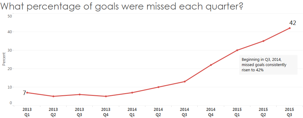
I might argue that if that was her intention, she could have drawn just the % missed data, and ignored the rest. However, this is at the expense of secondary information. Here’s what that could look like:
Steve also wanted other example of multi-segment stacked bars. I found one from my UK Election project:
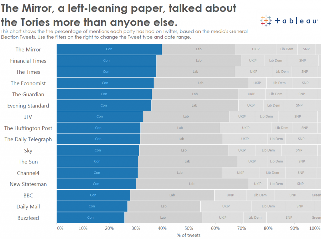
I acknowledge the problems with this chart: it’s very very hard to see which organisation tweeted most about UKIP, or the Lib Dems, or any of the other central segments.
But my intention was NOT to allow comparison of every segment. My intention (as shown by the title of the view) was to highlight which organisations were tweeting most about the Conservative party. That was my prime goal. The Conservatives are the left-most segment and sorted in descending order: it’s easy to see which orgs tweeted most about the Conservatives.
Other information which can be learnt from this is secondary to my prime purpose and therefore was intentionally compromised by using stacked bars. An interactive version would add tooltips and more contextual data, allowing the curious to discover more in the chart.
I acknowledge the stacked bar isn’t perfect, but I don’t know how else I could have designed the chart so that it answered my prime intention (% of tweets about Conservatives) and allowed the viewer to see secondary information. How would you have redesigned it? If you wish, the data is here.
Remember, every visualisation is a compromise. And every visualisation has a prime intention which must be considered before critiquing it.
I wholly recommend the following posts for further reading:
- Ben Jones articulateswhy both Stephen and Cole are right
- Moritz Stefaner wrote “Little boxes” which constructively summarises the validity of the art/science debate
- Cole herself asks if there is a single right answer to any viz. (My answer? No)


3 Comments
Add Yours →Hi Andy,
This beautifully encapsulates the dilemma I and my team deal with when putting visualizations together. Steve’s version works better when we remain essentially agnostic about the data, i.e. we don’t have an agenda other than displaying the data visually and facilitating multiple comparisons etc. Cole’s version is better when we have an opinion about the data and want people to pay attention to a specific story or section of the data. Personally, I prefer Cole’s version because it does tell a very specific story very clearly, but in the corporate world we don’t always have the luxury of stamping our opinion onto the reports we send out and therefore have to design the views in ways that make it easy for a number of different people to ask different questions of the data. For that, Steve’s version is more effective.
-Mike
Andy,
You seem to suggest that I proposed my line graph solution to the 100% stacked bar graph that appears in Cole’s book without considering her intentions. That is not the case. Not only did I consider the intentions of her graph, I demonstrated how the line graph served Cole’s purpose better than the 100% stacked bar graph.
You also quote me out of context. You have suggested that the impression that I’m referring to is the primary message of the graph: Missed goals are increasing over time. That is not the case. Here is the sentence that precedes the sentence that you quoted: “The point that I’m making is that the part-to-whole impression that one gets from a 100% stacked bar graph is of less value than the ability to actually interpret and compare the values, which a line graph supports more effectively.” I was addressing Cole’s central argument, which is that the 100% stacked bar graph is the better choice because it provides the immediate impression that were looking at parts of a whole, despite the fact that the line graph clarifies this in the title and goes on to display every aspect of the data more effectively than the 100% stacked bar graph.
Hi Steve
My apologies – it was not my intention to misquote you. However, the preceding sentence also fits my argument. You said:
“The point that I’m making is that the part-to-whole impression that one gets from a 100% stacked bar graph is of less value than the ability to actually interpret and compare the values, which a line graph supports more effectively.”
I agree that the lines support the ability to interpret and compare all the values. I disagree that that is always less important than visually showing the part-to-whole relationship.