Note: if you’re interested in doing something like this, get scrobbling to last.fm. When you have a big enough corpus of music, download it using Ben Foxall’s lastfmtocsv converter.
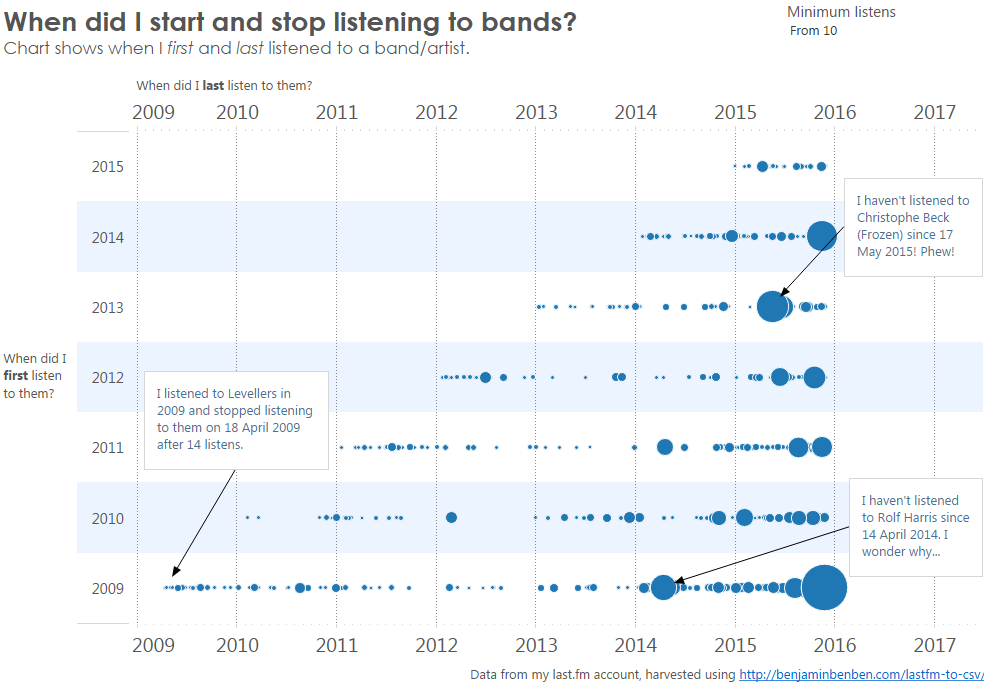
Also I want feedback on the chart below. I want to show when I first and last listened to all bands in my data. The chart below works for me, but took me ages to explain to someone else. How might you show that data?
What’re the trends in my music habits for 2015? Last year it was all about Gabby Young, Frozen and Heavy Metal. Has anything changed this year? Yes. This year was about listening to new bands/artists. 1,237 of them!
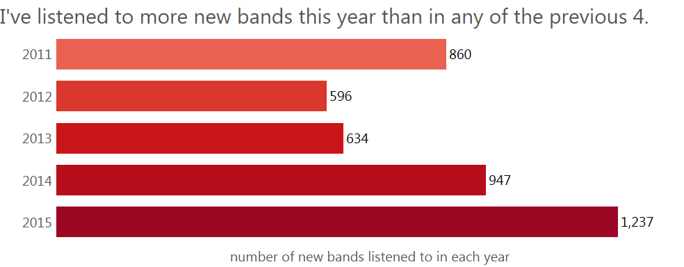
In 2012, however, I only listened to 596 new artists, less than half the amount in 2015. Not only was 2012 a bit of a drought, I’ve also not listened to those new bands very much since:
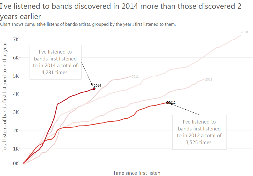
So what happened in 2014? How come that year has cumulatively accounted for so many listens? One band: Gabby Young & Other Animals. We saw them at Just So Festival in 2014 and they became a family favourite.
I also wondered, of all these new bands, which ones did I stop listening to, and when? That’s the chart at the top and repeated again below. I’ve shown when I first and last listened to an artist. For an interactive view, click here.
What do you think? How would you show data like this? I think having time on x AND y is confusing.

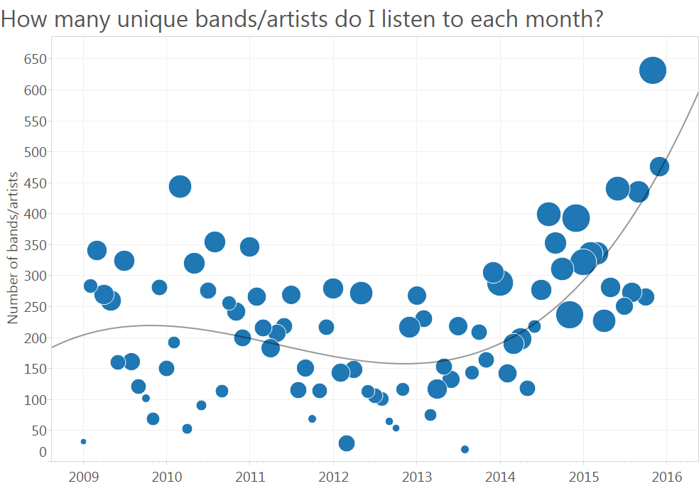
Finally, I wondered how many different bands/artists I listen to each month. The results were fascinating. It turns out I am listening to more artists each month than ever before. I need to do further analysis on this: does it represent the death of the album? Spotify’s Discover Weekly playlist has been a revelation this year, but this chart shows it’s led to fewer complete album listens.
Who knows what next year will bring!
You can do this too! Just use Ben’s lastfmtocsv tool. Then download my Tableau workbook and replace the extract with your data.

4 Comments
Add Yours →Andy,
As requested, I decided to play (again). You can find my current proposals here: https://public.tableau.com/views/TableauFitVizGames2AndyCotgreavelastfm2015/Alt1?:embed=y&:display_count=yes&:showTabs=y
I’ll keep playing and will do a write-up, but thank you for the fun challenge of playing with this data! Great challenge!
Hi Bridget, these are excellent. I’d considered the scatterplot myself. My version just feels wierd with time on both rows and columns. Whereas the scatter solved that problem. However, it’s conceptually complex for someone who hasn’t built the view. You labelled the axes very well, though, which makes a big difference.
The cumulative listens (Alt 4) is very much like the stuff I’ve done before, and I love it. But my aim was to highlight the LAST listen, and I think the noise of all the lines obscures that.
Ultimately, what all this shows is that every viz is a compromise, but remixing things teases out new insights, new opportunities and stops people being passive consumers of data. And that’s my definition of success!
Andy, thank you as always for your kind words. The scatter evolved out of my attempt to put it in a quadrant, but the shape of the data was not really conducive. I still might try, but you stack heavy on what I call “Mainstays” while “Forgotten Fads” are widely dispersed. I did a logarithmic scale originally, but felt that would REALLY add too much complexity.
One of the things I learned with interpreting was that every rendition was just that: one way of deploying an interpretation. Go figure, it’s not much different here, and I really appreciate you bringing this dialogue to the forefront. Cheers to a successful new year!
[…] look at Christmas music. Allowed to interpret that as we wanted, I decided to borrow some tips from Andy Cotgreave and connect my Spotify account to last.fm and start scrobbling […]