
Last week I attended The Graphical Web in Winchester. Tableau were sponsors and I was lucky enough to get to spend time with the people at the cutting edge of open source web graphics. Here’s 7 things I learnt:
1. Google’s maps are like leaves

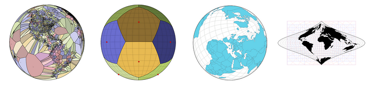
One key theme from all cartography sessions was that effective cartography (and, by extension, data visualization) is about taking out as much information as possible. Ed Parsons showed the iterations of Google’s maps as an example. In the past, Google feel into a typical cartographer’s trap of trying to show all the info.
Now, when you search, you get much less information. The colours are more subtle. Ed explained how they took the simplicity of a leaf as inspiration for their newer road network palettes.
2. Circular diagrams can work
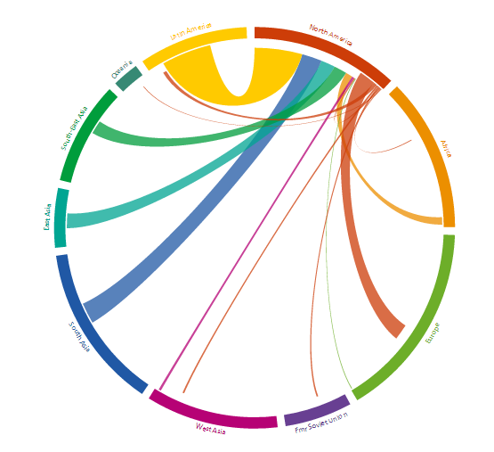
I’ve never really liked chord diagrams, thinking there is always a better way to show the data. Nikola Sander changed my opinion in her explanation of the migration data she works with. Not only was the transition from a table of numbers to a chord diagram visually appealing, I came to realize that I’m not sure there is a better way of looking at this kind of data.
Chord diagrams cannot generally be digested quickly, but once the user has trained themselves to use them, they are an effective method for complex data.
3. You don’t need to be a proficient public speaker to be engaging on stage
Jason Davies, co-author of D3 led the afternoon keynote. From a public speaking perspective, he session not great: not much structure, a bit hesitant, and Jason doesn’t always project his voice well.
So how come this was one of the best sessions of the conference?
Answer: because his work speaks for itself. What Jason has done is push interactive graphics forward with great humility. A showreel of his work is enough to engage an audience as he walks through one after another amazing piece of geometric madness.
4. Twitter’s Visualisation Lab doesn’t sit still
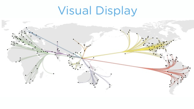
Nicolas Garcia Belmonte led a fantastic review of the interactive work at Twitter (slides here). What amazes me is that his team comes up with such varied ideas. We often see teams have one or two great ideas and then overwork the same idea until it is no longer inspiring. One look at Twitter’s interactives page tells you this is a team with inspiration.
I get the feeling that these visualisations don’t get enough exposure outside the field of data visualisation. Do you agree? What can we do to change this?
5. “It depends” is the only right answer.

Scott Murray’s talk “The Keys to a Successful Data Design Process” (slides) generated a good debate. How should you go about your design process? It depends. How should you design your chart? It depends. What data should I use? It depends.
This is something I’ve touched on before in my post on data storytelling: you can’t have rules or laws in Data Visualisation – everything depends on something else.
6. Weather guarantees viral content
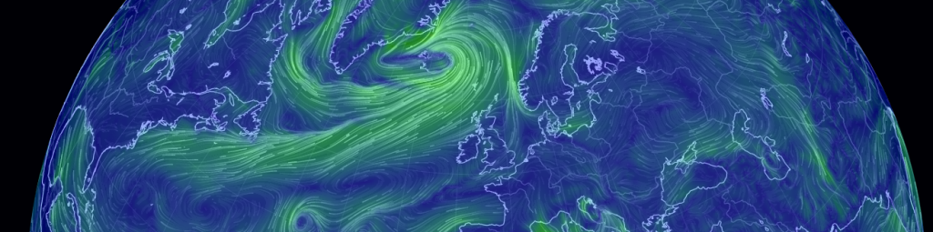
My favourite session was Cameron Beccario’s story of how he created Earth, the amazing live wind map of the globe. I love this kind of story: a project of passion that uncovered many many side projects and problems. It’s a story of data hunting, skill learning, and serendipity that ends in huge success.
7. I had dinner sat next to a cannon.

That’s cool. Alan Smith and the Office of National Statistics did an amazing job organizing a great conference. I had been suspicious of the need to drive to Portsmouth for a good evening reception, but a tour around the harbor followed by dinner on the gun deck of HMS Warrior was amazing.
Recent Comments