
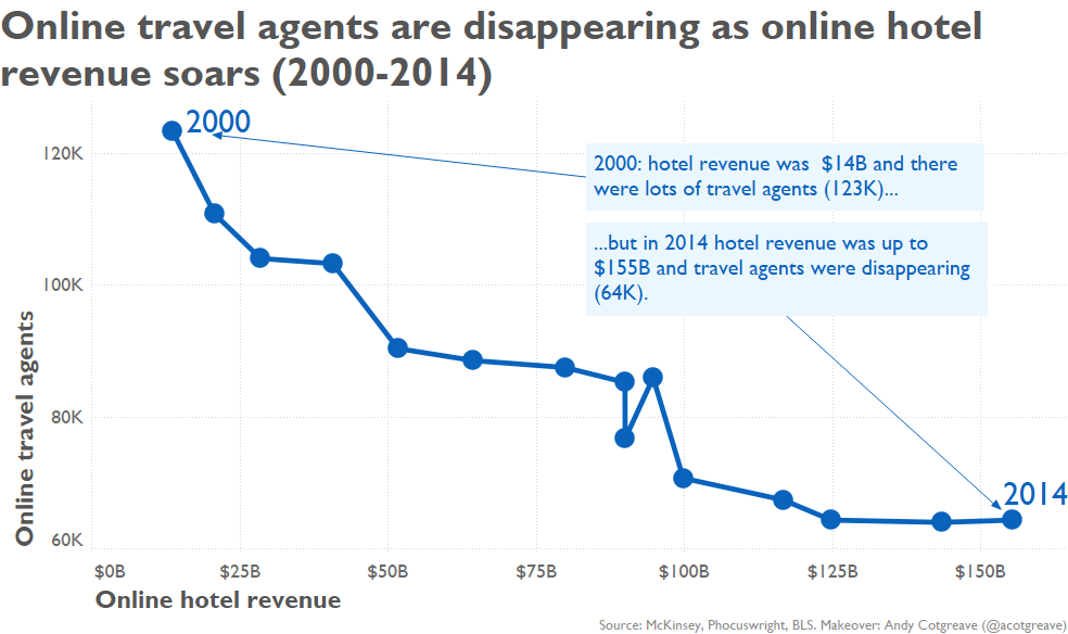
I had fun with this one, deciding to do a connected scatterplot. There is much debate about the efficacy of connected scatterplots. I agree they require an extra mental leap to comprehend, but once the meaning is grasped, I think they are powerful.
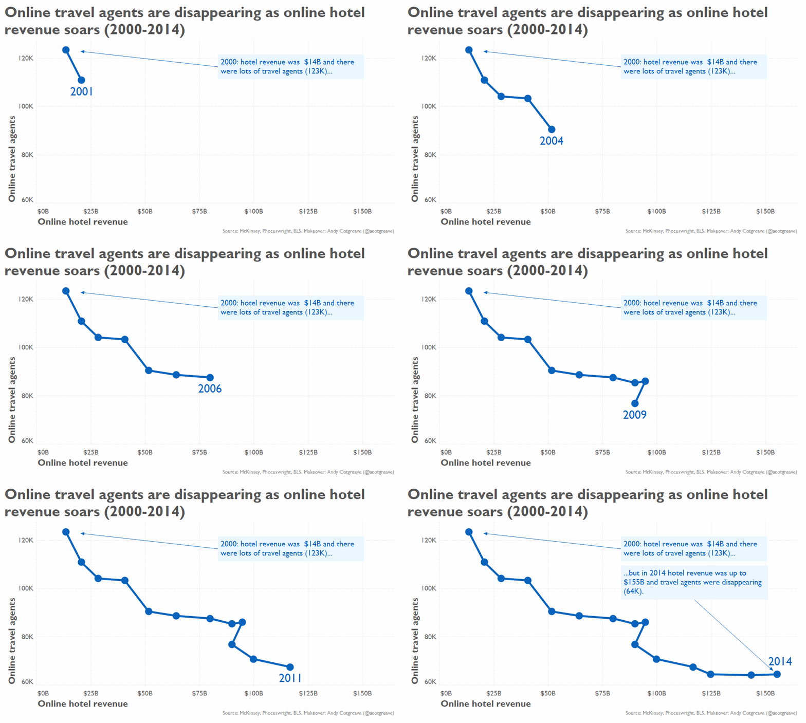
As Hans Rosling proved, they are especially effective when animated, hence the GIF. Following the animation is like following a story, the up/down and left/right movements adding drama and anticipation for the viewer. A static version of the chart is below.
The original this week, on first glance, wasn’t too bad. There’s nothing inherently wrong with a dual axis line chart. However, once you try and work out which axis is which and which colour is which, you realise the creator of this didn’t think through the positioning of the labels!

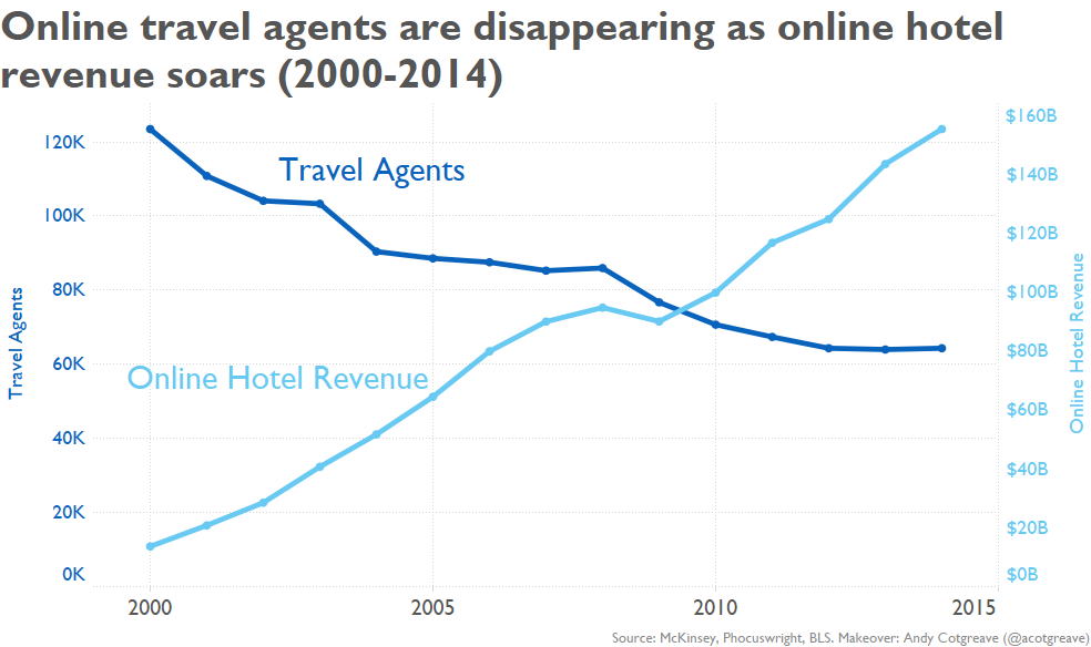
A simple makeover would have been to fix the labelling and make things much clearer using colour to help the reader. Here’s what that would look like:
I’m happy to concede even that the simpler approach may be better than my connected scatterplot version!
4 Comments
Add Yours →I have to say that I have not found any of the arguments in support of the connected scatter plot very compelling.
I think they seem to essentially rest on the idea that sometimes the patterns are such that they leave good space for annotation, and look cool.
🙂
Of course, now I have to also disagree with your statement that there’s nothing inherently wrong with a dual y axis chart like this.
I think it’s just a silly thing to do. There is no way to avoid some level of confusion about what relates to what, and lines crossing will always be taken as some sort of milestone event, when clearly they’re not.
I think this data is much more clearly and simply displayed as two separate plots sharing an x axis, as here:
http://imgur.com/goe3j3I
It’s not an exciting or novel way to plot the data. But it’s one that makes sense, and shows extremely clearly what has changed over time.
(this assumes, of course, that the comparison of these two variables makes sense in the first place, and that we are accounting for the right things (and using the right terms) if it does)
Your second chart mixes the points for 2008 & 2009, giving a different apparent shape to the little blip in the curve. Coincidentally the “other” Andy did the same thing.
Hmm, so it does. I need to go back and check why, because that’s odd behaviour. Thanks for pointing it out!
Personally I like connected scatterplots! For this one, maybe try rotating counter-clockwise 90 degrees so the line trends right (decrease in agents) and up (increase in revenue). Seems like it would be more identifiable to graphs we usually see.