Jerome Cukier has put together a great viz for the current Tableau vizualisation contest. Here it is, with my thoughts below (his original blog post and commentary are here):
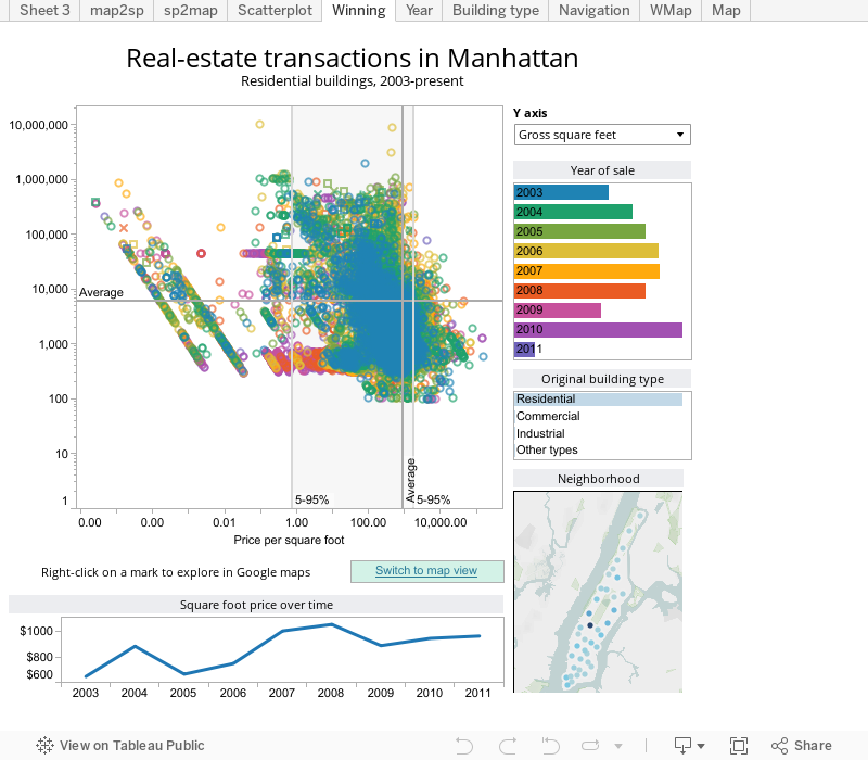
The dashboard is excellent. It is technically superb and the story is clear.
Would I change anything? Not much,but I thought i’d list some comments. Don’t take the length of this list as a comment on the quality of the viz – I am trying to speak as one expert to another!
- Each of the panels on the right is a filter, but that’s not immediately obvious to non-Tableau users. Maybe put a Text panel saying “Filters” at the top of those four panels, and put a border around their layout container? I do something similar here.
- The “Switch to map view” is really nice. You could achieve that within a single dashboard using a trick that Joe Mako and Ty Aliversos have blogged about. Here’s Ty’s blog post. There’s a recent thread on the forum that explains this too but I can’t find it right now.
- It’s not clear what the bars in the “Year of sale” represent. I assume it’s number of sales, but there’s no tooltip or other indication of what the length shows. Using a bar chart as a filter is a great use of screen space, much more efficient than a filter and I blogged about that a while go, too.
- There’s no Y-axis label. I guess that’s because you can’t dynamically control the axis text. However, if you put the parameter onto the column shelf next to the measure, and then rotate it so it’s vertical, you get the same effect. I did this in my gapminder post.
- In order to make the story more clear, you could annotate a couple of indicative marks on the scatterplot that highlight the issue. You’re tight for space on this dashboard, so it may not be possible.
- Your label below the scatterplot says “Right-click….” That’s what you do in Desktop, but not in Public. You should change it to say “Click on a mark to explore”. Actually, what you really need to say is “Click on a mark, wait, then click on it again, and then you’ll hopefully get a hyperlink you can click on.” 🙂
- Finally, there’s nothing you can do it about it, but, boy, Tableau Public is slow (at 3pm on a Friday in the UK)
Good luck to Jerome and all the other entrants!

2 Comments
Add Yours →Andy and Jerome,
I agree with all the comments. Looking forward to exploring this workbook in more detail. Best of luck in the contest, Jerome.
MANY BLESSINGS!
Peace and All Good!
Michael
Dear vizmasters, think it is better to use median (and quantiles) for the power distribution like this.
Just my two cents.
Cheers.