
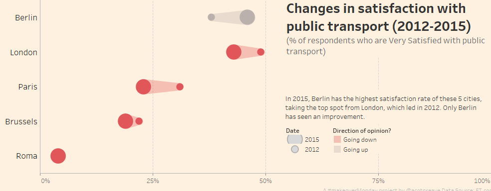
This week’s Makeover features a simple, effective stacked chart from FT.com. Rather than find multiple new stories in the dataset, I focussed only on the original story: satisfaction in 5 European cities.
Decision 1: if you show % satisfaction, you can get away with not showing % dissatisfaction since they’re almost binary. (that’s not entirely true: there is nuance in the differences between “very” and “rather” satisfied/unsatisfied) but I do think it’s valid.
Decision 2: bring in the delta for extra context. Berlin is not only the city with the highest satisfaction rate, it’s overtaken London in the last 3 years. That story is not visible in the original.
Decision 3: improve on the comet chart. Once I’d made the first two decisions, I figure it would be a good time to draw a comet chart. However, they are hard to read, as I’ve written about before. I think I’ve solved the problem by fading the trail. Do you agree?
Decision 4: set the x-axis to go from 0-100%. Berlin’s the highest satisfaction but it’s still below 50%. Setting the x-axis at 100% is intended to highlight the hidden levels of unsatisfaction.
Decision 5: Formatting. I didn’t see a reason to format it any differently to the FT’s original. I love their background colour! I did move the title to the blank space created by the long x-axis though.
The original chart

The original chart is great.
What do I like?
- It’s sorted by “Very satisfied” which is a good way to rank the cities
- The title shows the metric rather than an unsightly label on the x-axis. Jon Schwabish wrote a great post on this recently.
- Stacked bars let me easily compare to categories: the ones at each end. In this case, they are “Very satisfied” and “Not at all satisfied”. They’re the most important.
What might I improve?
- Stacked bars have an inherent problem in that you can’t easily compare the middle sections. Stephen Few sparked a significant debate on this recently which is worth your time.
- The ordering of the colour legend is confusing. I read it left-to-right, top-to-bottom. But it’s order top-to-bottom, left-to-right. I initially thought one colour was missing from the chart until I realised this.
Recent Comments