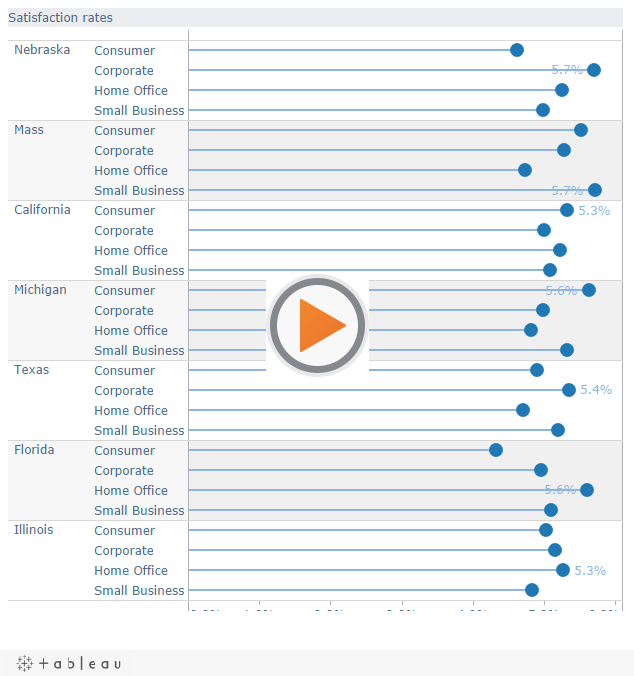
In my previous post, I explained how I stumbled across the lollipop chart as a way of displaying data when the values are all very high. This post reveals how I did it. Those of you who are savvy with the new features in v6 will probably have immediately guessed it was using dual axes. Here’s what my lollipop chart looks like:
What’s the trick? It revolves around duplicating your measure on the columns shelf, as follows:
You need to make sure it’s dual axis. Right-click on the second Measure pill and choose “Dual Axis” to draw each AVG(Satisfaction) on the same pane. Then right-click on one of the axes and choose “Synchronise axis” to make sure they match completely. This step is important because if you add labels to one of the measures, Tableau might stretch one axis to fit the text of the label in.
The next step is to define multiple marks. This feature might be new to you, and doesn’t exactly jump out at you in the user interface. Click on the little drop-down arrow at the right of the Marks shelf and choose “Multiple Mark Types”:

The Mark shelf now has a new row: it will say “All” and have left/right arrows. With the multiple mark feature, you can format all measures at once, or each one individually. What we need to do is set one mark to be a bar (a very thin one) and the other to be a circle, as shown below:

In my example, I have also added colour to emphasise the Customer Segment dimension. You’ll see that each Mark uses a different Dimension. While experimenting with the lollipops, I discovered that if the connecting line is the same intensity as the circle, it overwhelms the circle. By using a lighter palette on the line, things look nicer. I achieved this by duplicating the Dimension, and assigning lighter colours of the same hue to its members.
To label the min/max I turned on labels for just the Circle mark.
That’s about all you need to do. I added some shading and subtle row divider lines to highlight the different states. Finally, I formatted the axes so they were pretty much hidden.
I’ve started using this technique regularly as it engages users, and improves the data-ink ratio without sacrificing interpretation. What do you think?

11 Comments
Add Yours →There are two features of these charts that I find distracting. My eyes zing across the chart looking for patterns but making no sense of the chart.
The lines (lollipop sticks). In a “standard” dot plot (see Naomi Robbins, http://www.b-eye-network.com/view/2468) the lines are very faint gray lines across the entire plot area.
The colors. In said dot plot, these data points would be marked with identically formatted symbols, such as a black or gray open circle.
Good point, Jon. I look at the examples now and agree: there’s too much noise. How about this example instead:
http://bit.ly/hFbwdl
It is possible in Tableau to reproduce the gray lines going across the entire plot area (Joe Mako has done this – maybe he can share it?) in the same way as Naomi does. What I dislike about the lines going across the whole plot is that the lines to the right of the circle is unnecessary – all you need is the line from the Dimension label to the dot.
I agree with Jon about the colors. Other improvements could also be made to these plots. Alphabetical is rarely the best order for categories in graphs. I would order both the states and the category that includes consumer and corporate by mean or median customer satisfaction.
Our comments “crossed in the mail.” Your new graph is very confusing with a different order in each panel. I missed that at first. I meant that you should order them by their overall order. Also, do you really need the decimal place in the axis label?
When the line goes all the way across one judges the marker by position along a scale. When the line stops at the marker one judges length. Lengths must begin at zero while position does not require a zero point. Therefore, when you include zero as you did, the line to the right might be unnecessary but it is absolutely necessary for scales without zero. When the values are very high there might not be enough distinction between the points if zero is included.
Here are two examples, what Andy is referring to his comment above, that I set up last week in response to the original Lollipop chart Andy created:
http://public.tableausoftware.com/views/dotplot/Graywithwhitelines
http://public.tableausoftware.com/views/dotplot/Whitewithgraylines
I feel that if the lines do not go all the way across, they become a pattern that my eyes want to look at, it creates something interesting, and because of that, I feel the lollipop lines are distracting from the message. When the lines go all the way across, they are no longer as interesting, they become a part of the background, and are there to help trace the dot and the text label to each other.
As for considering the extra length of line past the dot as unnecessary, I disagree, the extra length informs me that this line is not the visualization, but rather just visual assistance so I can get to the real story the comparison of the dots to each other.
Also if you are going to start the axis at zero, and use a dot pot, you are not taking advantage of the benefit the dot plot allows. The main reason I would use a dot plot over a bar is because I want to see the subtle variations between the values, and not waste valuable dashboard space/area so the axis can start at zero.
An interesting take on it Joe, however I find the black dots on a white background cause visual issues such as the moire pattern on bar charts.
This is my attempt at improving the view, I feel the visual issue is solved by using a light grey for the marks.
http://bit.ly/hjVRaV
I am not a fan of having to refer back to the axis to understand what a mark corresponds with and therefore have put the mark labels for the state alongside.
Kevin, Thanks for pointing out the color issue of the dot, I have changed it from black to gray. I agree, the black mark on a white background was a harsh contrast.
With your example, placing the text as a label on the mark, that I believe detracts from the representation of the value the mark is to represent. The length of the text next to the mark then becomes something visually interesting, and I believe distorts the visual representation of the value.
I agree that is does effect the visual, so I’ve changed the emphasis of the colour. Making the labels lighter and the mark darker improves the overall visual, whether you are scanning the while viz or comparing individual marks.
http://bit.ly/dXvgwr
I’ve added another sheet with circle, I prefer the circles for the easier hover they provide.
http://bit.ly/ehwssj
FWIW, I prefer Joe’s gray-on-white version over the white and black on gray. I think I like circles more than the lines Kevin used, but using a smaller circle, or a less intense gray, or an open circle may lessen the harshness. Putting the labels right on the points makes sense in many charts, but I think once there are multiple panels this will lose its effectiveness. I also think Kevin’s second chart put too much emphasis on making the markers black and labels gray. The gray of the original markers is good, the gray of the revised labels is too light.
A search for lollipop chart landed me here. Great work!
PS.The first link seems not working.
Well the steps have changed but the chart is the same… Just what I needed when the 30 bars on my chart were a bit too overwhelming.
Also, setting the Opacity lower for the lines really makes the circles standout.
Thanks!