Skip to the content Skip to the main menu

GravyAnecdote

Wherein Andy pours stories about data onto the web

  • Subscribe!
  • About Me
  • Home
  • Charts on Screen
  • If Data Could Talk

Recent Posts

  • I used data to find the best* starting word in Wordle!
  • Trump’s literacy, KPIs and Citizen Data: final lessons from covid-19 charts
  • 3 more lessons from the charts of covid-19
  • After 12 months of covid-19 charts, what have we learnt? (Sweet Spot #58)
  • Sweet Spot #57: Crosswords, communications and Bob Ross

Recent Comments

  • My Tableau Story: Andy Cotgreave – Quant Insights Network on Charts inside a tooltip? Yes, we can.
  • abhishek kumar on Lollipop charts: part two
  • DavidStack on I used data to find the best* starting word in Wordle!
  • Genealogical data and visual design II: mixing metaphors - cromarbaile on Historical data visualisations at Princeton, part 1: DuBourg
  • Best of the visualisation web... January 2021 - Visualising Data on After 12 months of covid-19 charts, what have we learnt? (Sweet Spot #58)

Archives

  • January 2022
  • March 2021
  • February 2021
  • January 2021
  • December 2020
  • October 2020
  • April 2020
  • March 2020
  • December 2019
  • November 2019
  • October 2019
  • September 2019
  • July 2019
  • June 2019
  • May 2019
  • April 2019
  • March 2019
  • February 2019
  • January 2019
  • December 2018
  • November 2018
  • October 2018
  • September 2018
  • July 2018
  • June 2018
  • May 2018
  • April 2018
  • December 2017
  • November 2017
  • October 2017
  • September 2017
  • July 2017
  • May 2017
  • April 2017
  • January 2017
  • December 2016
  • November 2016
  • October 2016
  • September 2016
  • August 2016
  • July 2016
  • June 2016
  • May 2016
  • April 2016
  • March 2016
  • February 2016
  • January 2016
  • December 2015
  • November 2015
  • October 2015
  • August 2015
  • June 2015
  • May 2015
  • April 2015
  • March 2015
  • February 2015
  • January 2015
  • December 2014
  • November 2014
  • October 2014
  • September 2014
  • August 2014
  • July 2014
  • June 2014
  • May 2014
  • March 2014
  • February 2014
  • January 2014
  • December 2013
  • November 2013
  • October 2013
  • September 2013
  • July 2013
  • June 2013
  • May 2013
  • April 2013
  • September 2011
  • August 2011
  • July 2011
  • June 2011
  • May 2011
  • April 2011
  • March 2011
  • February 2011
  • January 2011
  • December 2010
  • November 2010
  • October 2010
  • September 2010
  • August 2010
  • July 2010
  • May 2010

Categories

  • Andy Cotgreave
  • ArkhamHorror
  • BigBookOfDashboards
  • Blog
  • Conference
  • Current Affairs
  • data
  • Disc golf
  • Dual axis
  • Election
  • Entertainment
  • Filters
  • Flowing Data
  • Formatting
  • FridayMix
  • Guardian Data Store
  • Guardian tech blog
  • history
  • If Data Could Talk
  • Information is beautiful
  • Joy of Six
  • Maestro
  • magic
  • MakeoverMonday
  • music
  • Olympics
  • Parameters
  • Presentation
  • Public Sector
  • Small things
  • sport and fitness
  • SWDChallenge
  • Sweet Spot
  • Tableau
  • Tableau Design Month
  • The Data Studio
  • tooltips
  • Uncategorized
  • visual analytics

Meta

  • Log in
  • Entries feed
  • Comments feed
  • WordPress.org
  • Twitter
  • LinkedIn
  • RSS Feed

Wherein Andy pours stories about data onto the web

  • 100 Years Of Brinton
  • Arkham Horror Analytics
  • Big Book of Dashboards
  • Charts on Screen
  • If Data Could Talk
  • Portfolio
  • Subscribe!
  • About Me
  • Buy data viz gear

Recent Posts

  • I used data to find the best* starting word in Wordle!
  • Trump’s literacy, KPIs and Citizen Data: final lessons from covid-19 charts
  • 3 more lessons from the charts of covid-19
  • After 12 months of covid-19 charts, what have we learnt? (Sweet Spot #58)
  • Sweet Spot #57: Crosswords, communications and Bob Ross

Recent Comments

  • My Tableau Story: Andy Cotgreave – Quant Insights Network on Charts inside a tooltip? Yes, we can.
  • abhishek kumar on Lollipop charts: part two
  • DavidStack on I used data to find the best* starting word in Wordle!
  • Genealogical data and visual design II: mixing metaphors - cromarbaile on Historical data visualisations at Princeton, part 1: DuBourg
  • Best of the visualisation web... January 2021 - Visualising Data on After 12 months of covid-19 charts, what have we learnt? (Sweet Spot #58)

Archives

  • January 2022
  • March 2021
  • February 2021
  • January 2021
  • December 2020
  • October 2020
  • April 2020
  • March 2020
  • December 2019
  • November 2019
  • October 2019
  • September 2019
  • July 2019
  • June 2019
  • May 2019
  • April 2019
  • March 2019
  • February 2019
  • January 2019
  • December 2018
  • November 2018
  • October 2018
  • September 2018
  • July 2018
  • June 2018
  • May 2018
  • April 2018
  • December 2017
  • November 2017
  • October 2017
  • September 2017
  • July 2017
  • May 2017
  • April 2017
  • January 2017
  • December 2016
  • November 2016
  • October 2016
  • September 2016
  • August 2016
  • July 2016
  • June 2016
  • May 2016
  • April 2016
  • March 2016
  • February 2016
  • January 2016
  • December 2015
  • November 2015
  • October 2015
  • August 2015
  • June 2015
  • May 2015
  • April 2015
  • March 2015
  • February 2015
  • January 2015
  • December 2014
  • November 2014
  • October 2014
  • September 2014
  • August 2014
  • July 2014
  • June 2014
  • May 2014
  • March 2014
  • February 2014
  • January 2014
  • December 2013
  • November 2013
  • October 2013
  • September 2013
  • July 2013
  • June 2013
  • May 2013
  • April 2013
  • September 2011
  • August 2011
  • July 2011
  • June 2011
  • May 2011
  • April 2011
  • March 2011
  • February 2011
  • January 2011
  • December 2010
  • November 2010
  • October 2010
  • September 2010
  • August 2010
  • July 2010
  • May 2010

Categories

  • Andy Cotgreave
  • ArkhamHorror
  • BigBookOfDashboards
  • Blog
  • Conference
  • Current Affairs
  • data
  • Disc golf
  • Dual axis
  • Election
  • Entertainment
  • Filters
  • Flowing Data
  • Formatting
  • FridayMix
  • Guardian Data Store
  • Guardian tech blog
  • history
  • If Data Could Talk
  • Information is beautiful
  • Joy of Six
  • Maestro
  • magic
  • MakeoverMonday
  • music
  • Olympics
  • Parameters
  • Presentation
  • Public Sector
  • Small things
  • sport and fitness
  • SWDChallenge
  • Sweet Spot
  • Tableau
  • Tableau Design Month
  • The Data Studio
  • tooltips
  • Uncategorized
  • visual analytics

Meta

  • Log in
  • Entries feed
  • Comments feed
  • WordPress.org
  • Twitter
  • LinkedIn
  • RSS Feed

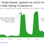
The Green Party struggles to get coverage on Twitter during the campaign. Here we can see that the media tweets about Natalie Bennett’s “brain freeze” almost as much as they did about her party’s spring conference.

  • Post date
    March 23, 2015
  • Posted in Uncategorized
Previous post: Next post:

Leave a Reply Cancel reply

Related Posts

Fallback image

Germany vs the world

  • Post date
    July 25, 2013
  • Comments
    0
tumblr_inline_nq6yclTR7f1sr3w0m_540.png

Sharing your data, 1914 style

  • Post date
    June 26, 2015
  • Comments
    0
Fallback image

  • Post date
    January 2, 2014
  • Comments
    0
Fallback image

Really? Is *that* your favourite album? Playing with last.fm data (part 1)

  • Post date
    December 18, 2013
  • Comments
    3

Theme by Anders Norén