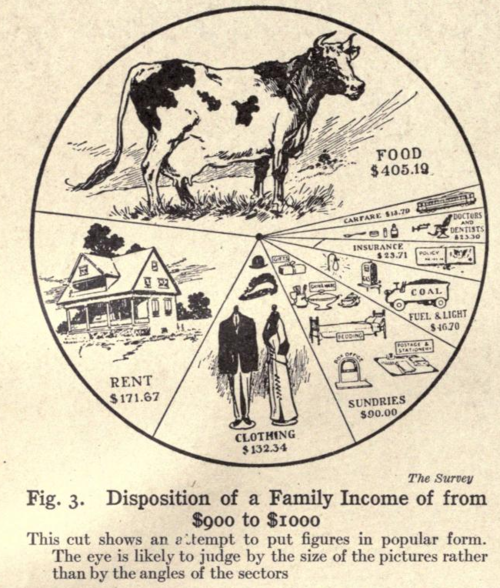
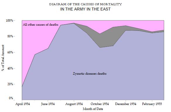
The poor old pie chart. Brinton disliked them 100yrs ago, despite them being “used probably more widely than any other form to show component charts.”
He called them circular charts. When did the term pie chart come into play? Possibly 1914 just as Brinton published his book.

The debate about pies rages on still. Some people really hate them (Cole Nussbaumer, for example). Even I used to be pretty dead set against them.
But there are times when a pie is a great choice for a chart. I really like this defense of pies by Bruce Gabrielle.
Brinton would rather we’d have used horizontal stacked bars instead. I discuss this in more detail, with an example, on my blog.


Recent Comments