Hello and welcome to the Sweet Spot: the intersection of data and daily life. Since we’re nearly at Christmas, this list is loosely on that theme! A copy of this newsletter is also on my LinkedIn profile: do come tell me what you think and share it with your network.
Who’s in the crossword?
(5 minute read, The Pudding)

Perhaps you’ll have time do some crosswords as you relax over Christmas. Have you ever considered the diversity of the clues/answers of your crossword? Are they too old, too white and too male? Unsurprisingly: the answer is mostly yes. Michelle McGhee’s analysis reveals the depth of this problem across US newspapers. Most have a very poor level of diversity. One outlier is USA Today whose crossword editor, Erik Agard, prioritizes diversity and inclusion in its clues. I like this article because it shows how data is everywhere (even crosswords) and how great stories are told with a mix of data, interactivity, and real world stories.
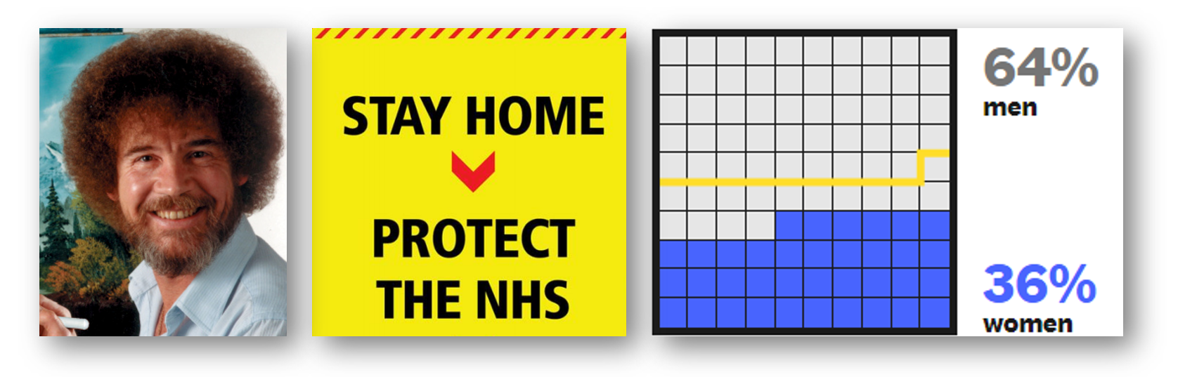
Five principles for a Covid19 communications reset
(30 minute read, Independent Sage Group)

Christmas: who hasn’t gotten into a row with a relative about some contentious current affair? Could it be you’re not communicating clearly enough? 2020 has shown just how important it is for governments to communicate with clarity. This excellent report from the UK Independent Sage group, led by Elizabeth Stokoe, describes how to balance certainty and uncertainty, use precise language, avoid sloganeering and use real evidence. Although not primarily about data, these principles do apply to any data communication we do in our work, whether that be presentations, dashboards, or published visuals. This report also led me to the fascinating world of conversation analytics, performed using the Jefferson Transaction System: amazing stuff. Perhaps this thinking might also make those difficult Christmas conversations go a bit better? (Probably not. Pass me another glass of Baileys.)
A Statistical Analysis of the Work of Bob Ross
(8 minute read, FiveThirtyEight)
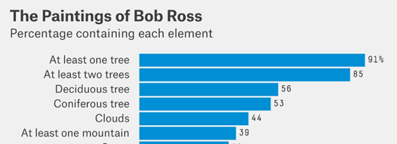
It wouldn’t be Christmas without some relaxing TV . Bob Ross could be the perfect nostalgic show to watch to bring calm after this crazy year. Bob Ross created 381 paintings on “The Joy Of Painting” from 1983 to 1994. What did he paint? Mountains and trees, right? But just how many? Were they really that dominant? Walt Hickey’s analysis confirms yes, and shows just how dominant the common themes were is Ross’ paintings. The surface analysis is calming, and then Hickey goes on to use Bob Ross data to explain the concept of conditional probability, which is a dissonant switch from “calm paintings” to “oh, we’re doing Stats 101 are we?” The Sweet Spot is about constant learning, though, so now, when sitting watching reruns of Bob Ross with your family, you too can confidently say “If Bob paints a cabin, there’s a 35% chance he’ll also paint a lake.”
What else is happening?
Here’s a list of the things I’ve been up to in the last month:
- A copy of this newsletter is also on my profile on LinkedIn: feel free to share with your network.
- On If Data Could Talk, we’ve interviewed FT columnist and BBC presenter Tim Harford, as well as running through all 3 Iron Viz final builds, with the builders themselves, to find out the whys and hows of their designs.
- In Chart Chat 17 Amanda, Steve, Jeff and I discussed US Election Vizzes and the need (or not) for certainty in data visualizations.
- I did a review of the US Election TV coverage, and suggested some changes on Medium, the Data Visualization Society’s journal.
- In recognition of World Statistics Day, I wrote about trust in data on Information Age.
- In the November issue of Digital Bulletin, I discussed how the UK govt have (mis)managed data in the covid-19 crisis.
- Where do you stand on Bar Chart Races? I was interviewed for an article on Built In based on my, ahem, forthright opinions on them.


Recent Comments