Today is the Joy of Six day. Tableau v6 is incredible, and I’ve been lucky to have had my hands on the beta versions for a while. The Tableau site itself is a great resource for learning about the amazing new features and how to use them. I wanted to do a series of posts about how these new features are already being practically applied to solve our own real world problems.
A common problem we see is that we build a view for a user, only to have them say, “Hey, that’s great, but instead of Profit, can you show Sales? Oh, and also, I’d like to see it broken down by Container, not State”. In the old days (pre v6) you had to build a view for each request. Not now. Oh no. Not now. Now you can build in masses more flexibility into your views.
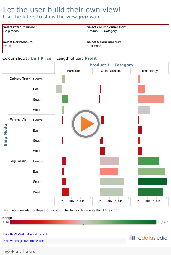
The dashboard below shows an example using Tableau’s sample data:
How do we do this trick? First let’s look at the pills that build this view.
Instead of using the actual dimensions or measures, each pill is either a parameter, eg “Choose columns”, or a calculated field based on a parameter, eg “Chosen column dim”.
There are four parameters in this view (for more on Parameters, check out this video on Tableau’s own site):
Each of these is a String List, looking something like this:
Each item in the List of values box should be a Dimension (in the above image) or a Measure (not shown) you want to the user to be able to choose. You need a parameter for each user-editable area of the worksheet. In my example, that’s a parameter for Row, Colum, Bar length, and Colour.
Once you have your parameters, show them all on the worksheet (right-click on the Parameter name and choose Show parameter control).
Our next step is to connect some calculated fields to each parameter. The “Bar” calculated field looks like this:
The IF statement returns a different Measure, depending on the value of the Parameter. There are four calculated fields – one for each parameter. I created the following for the viz above:
- Chosen row dim
- Chosen column dim
- Bar
- Colour
Now you can build your view – drop the calculated fields onto the relevant shelf, and you should now have a dynamic view where the user gets to choose what they want to see.
The final thing you should do is format the tooltips, as the default ones will make no sense. See my previous posts on tooltips for some tips.
Download the workbook to explore how it’s done in more detail.


12 Comments
Add Yours →Saw this done in Seattle Andy, couldn’t remember how it had been done, so its great to see it laid out so well. Thanks. Tom
Good explanation, it’s one of the “Parameters? Hmmm… I bet I could do this with it!” uses that sprang to mind when they were first announced.
Thanks for the explanation Andy. I haven’t been able to test out parameters yet, but this is going to reducing our reporting leaps and bounds.
Andy, one more comment. I opened this workbook in Reader and it works exactly the same way. Given Reader is how we distribute so many of our reports, this is going to be an incredible reduction in work. Man I’m excited!
Andy – I forgot to make that point in the post. Using this technique we’re cutting one of our workbooks from about 55 worksheets to just 4!!!
You’ve done it again man. Nice work!
Nice job Andy – really like this
Thanks for laying this out so nicely and clear.
Rina
well done, old chap!~ Top notch explanation as well…
Great article. Waiting for more.
Andy,
I love this, but wonder if there’s a way to handle the following construct more efficiently:
IF [Choose bar] = “Sales” then Sales
ELSEIF [Choose bar] = “Profit” then ([Profit])
ELSEIF [Choose bar] = “Shipping Cost” then ([Shipping Cost])
ELSEIF [Choose bar] = “Unit Price” then ([Unit Price])
ELSEIF [Choose bar] = “Order Quantity” then ([Order Quantity])
END
In my situation I have to test for over 100 conditions. Now, the field names (measure names) and parameter strings are identical, so is there any way to tell Tableau that
“Profit”
should be treated as
[Profit]
without a very long CASE statement?
Steve
Just a follow up that the massive CASE statement works fine and does not slow things down too much. A shout out to Andy Cotgreave who saved my behind by suggesting this approach.