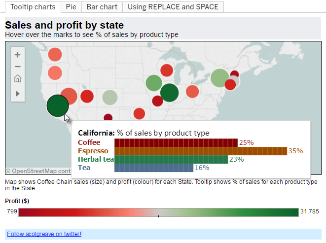
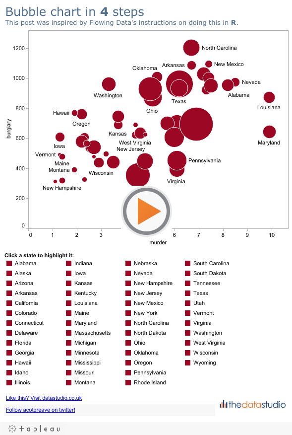
I couldn’t resist adding one more post in my Joy of Six series. Even though v6 has been with us a while , I’m still discovering how to use its great new features. In particular, calculated fields are a huge new addition that require a certain amount of head scratching before it all becomes clear. This post describes how I solved a problem with calculated fields.
In my day job at the University of Oxford, we’re about to publish our annual student statistics. These have line charts of changing number of students over time, broken down by gender, programme type, nationality, etc. The dashboard doesn’t have a lot of space on it, so it’s difficult to add labels to the lines. This means that while the trends are clear, the actual values are hidden. Our users are wary of charts without labels: they are more comfortable being able to easily see the numbers.
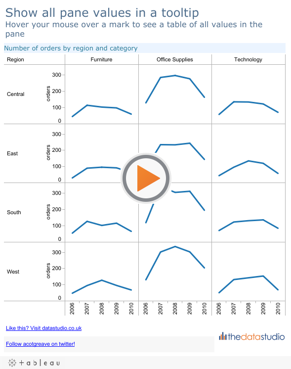
I wanted to stick with my clean, label-free charts, and put all the information in the tooltip instead. Regular readers know I love to muck about with tooltips (whether it’s conditional formatting or putting bar charts in them). The solution that is shown here was a collaboration with Joe Mako and Richard Leeke – the two people who know more about calculated fields than anyone else I know. I’ve recreated the solution using the Superstore samples data below. Hover your mouse over a mark to see all Order values that are on the line you’re over:
The viz shows a basic small-multiple of number of orders by Region and Category. Nothing special here, and the default tooltip isn’t spectacular, either:
The key point is that it only shows the value for the mark your mouse is over. I want all the values on the line. Calculated fields allow us to do this. This post can’t cover the full scope of Table Calculations: one could write a whole book on the subject. I’ll just cover how this problem was solved.
Let’s first see how the tooltip looks in the Edit Tooltip box:
There are two table calculations in there (the AGG(…) fields), and they are both on the Level of Detail shelf:
We build our tooltip around the mark your mouse is over. The highlighted mark is the one that appears in bold, red. It’s no different than the default tooltip. The magic is in the calculations. Before we look at the calculation, I’ll summarise what I want to show in the tooltip. Depending on which mark I have selected (is it first in the line, in the middle, or at the end?) I want some values before or after the current mark:
We can’t avoid it any more, we need to see how the Text Before and Text After fields are written. It’s not pretty. In fact, it’s too wide to even fit in the width of the blog. Here’s a thumbnail of the Text Before field. Click on it to see its full “beauty”:
What on earth is going on in there? Here’s the logic:
Let’s say your mouse is over 2009. The calculation iterates through each year in the dataset (using a parameter called Max Year In Dataset). For each year that is less than 2009, it builds up a string with a carriage return, the year, a tab character, and the sales from that year, using LOOKUP, offsetting from 2009. Yes, it’s convoluted. You may even think it’s not worth the effort. But, if you’ve made it this far in the post, I’m thinking that you’re with me! The Text After field does the same thing for years after the year your mouse is over.
Once you’ve written the field, you need to think about the addressing and partitioning. I can’t go into a full description of the principles here (but the online help was good enough for me to get my head round the basics). For this viz, we are only interested in the Year of Order Date field, so, once the calculation is dropped onto the Level of Detail, set it to Compute Using > Year of Order Date:
You’ve now got all your parts in place. You need to build the tooltip and format it as you want. Phew!
Granted, that was not easy. And, given the complexity, was the juice worth the squeeze? If you had lots of space on your dashboard, a better way to do the same thing would be to have a separate sheet on the dashboard that updates on a Hover Action. If you hover your mouse over a mark, the extra worksheet is updated to show the list of orders for that pane. That would be more visible than the tooltip, and easier to implement. However, it depends on you having plenty of spare space on your dashboard.
There are several caveats of course. Here’s two. I’ve used a parameter to hardcode the maximum year value, which is a maintenance headache as the dataset changes. I’ve also limited it to show values 4yrs either side of the current year. Writing a table calculation to show anything more than 5yrs before/after the current year is going to be impractical.
As I am also discovering, there are many ways to create the same solution using table calculations. It’s also very easy to create table calcs that slow your workbook down. The solution outlined here is possibly the fastest. I certainly came up with much slower ways while developing this solution. For information on optimisation, I’d really recommend you check out the relevant threads on the forum. Good luck!


2 Comments
Add Yours →Another very clever trick Andy. Thanks for posting!
Andy, i’m very new to Tableau and would really like to figuire out how you did a small table on the bottom with 2 hyperlinks. Thank you