We’re one week away and, as ever, all the media outlets have an election poll tracker. How do they stack up? Do they mislead? Do they adhere to good practice? Do they communicate well with their audience? What can we, as data analysts, learn from these?
Today I’m taking a look at 5 trackers from across the media and political spectrum.
Overall, there’s lots to like. I didn’t find any egregious visualization crimes. Instead, I found simple charts, attempts to show uncertainty, and some new ways to tell stories.
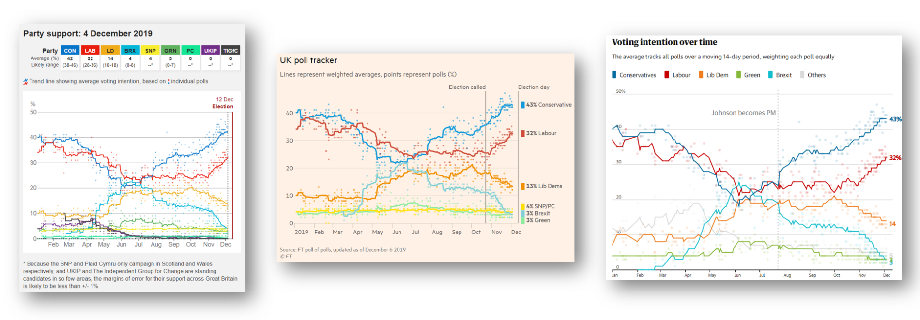
FT, Guardian, BBC

I’m struck at how similar these three are. Why is this? I believe it’s because many organisations realise that simple, effective charts are best. People want insight more than they want shiny toys.
The use of lines and colour saturation makes it easy to see the movements of each of the parties over time. Adding dots to indicate each individual poll is a very good way to communicate the variance and uncertainty.
Each tracker has a couple of nice features the others’ don’t, as well as a couple of things I might like to see improved upon.
The Guardian
The front page of the Guardian’s election site doesn’t show the tracker. Instead it shows BANs: the headline numbers. Do I like this? Well, I wrote the book that introduced BANs to the world, but here, I’m not so sure. Headline numbers are amazing, but in an election, it’s the value relative to the others and how it’s changing that is most important.
I think that for the front page real estate taken with these numbers, it would be possible to show the info with some sparklines. Something like this, perhaps:
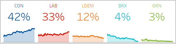
With the above approach, we get the headline numbers, but also the sense of change as well as a way to compare parties visually and quickly. Sparklines are great for mobile, too, as they will shrink down really small while maintaining readability.
The Poll Tracker itself is the only one of the three with interactivity. Hover over a dot and it highlights all the polls by that pollster, for that political party:
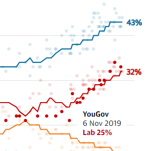
I like this interactivity because it builds a deeper insight into each pollster.
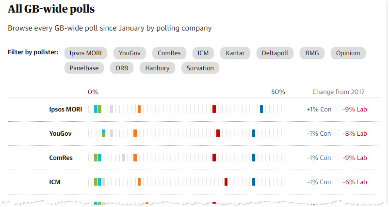
Beneath the line chart is another interactive chart, showing all the polls, row by row. I like this too: it’s a visual representation of row-level detail (contrast that with the BBC and FT which both have plain tabular data beneath their trackers)
The FT
The FT tracker lacks the interactivity of the Guardian, but is otherwise equally well done. There is one nice feature that’s extra:
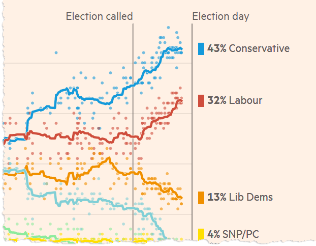
I like the labels at the right hand side on the FT tracker. They form an at-a-glance headline, embedded in the visualization itself.
UPDATE: This tweet from Martin Stabe at the FT adds some extra context about the line-end labels:
I also like that the FT Tracker page contains changing polticial and methodological commentary which they update throughout the campaign.
BBC
How does the BBC do it? As we’ve seen they have the same overall approach.
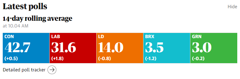
The top of the BBC tracker has a headline section, too:
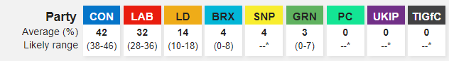
This is the only tracker to show the “Likely Range”. I think this is really important, because it’s the only one to show, in “headline” form, the uncertainty in the data. Including “Likely Range” let’s us see how close the parties might be at the upper/lower ends of the ranges.
There are 2 small niggles with the BBC’s tracking chart:
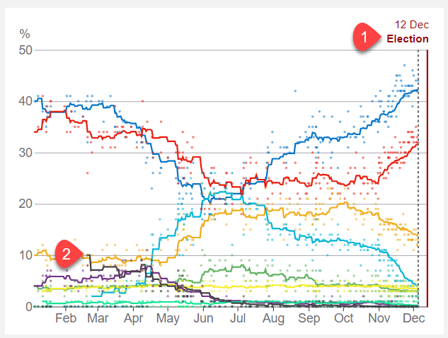
- Number 1: which line is this label referring too? I was confused. It’s a reference line label to the solid red line, not the dotted grey line. It took me a moment to work that out. I originally interpreted the solid red line as a border, not a reference line
- Number 2: the BBC chose to include more party lines than the FT and the Guardian, and the result is that the smaller parties’ lines become unreadable. Try following the black line from start to end: it gets lost.
Daily Mail
The Daily Mail doesn’t seem to have a tracker per se, but is publishing regular articles about polling data. I quite like that approach: it makes the polling numbers more of a news item than something to remember to go check in with.

I have some issues. There are a couple of things to like. They chose bar charts, which is great. There’s a nice clear headline. That tells me what I am looking at.
But there are issues:
- Why 2 bars for each party? Have a look at the chart and come back to tell me what they mean. … … … You’re back? It took about a minute, right. Now you’ve worked it out, does it help prove the point being made in the title? Not really. Are side-by-side bars the best way to show change over time? Not really.
- Since this is a chart about the Tories, in a Tory-supporting paper, why did they sort this so the smallest was on top?
- I don’t like the background images, personally. They might drive up engagement for a non-data audience on social media, but they do nothing for me.
- Why is the data source and explanation floating next to the Labour bars? It should be alongside the title, or at the bottom.
The Mirror
The Mirror have taken a different approach. Check out their page: where’s the charts? A video?? What madness is this?
Yes, it’s a 30 second video of a line chart. The chart itself isn’t particularly exciting (mainly because the data hasn’t moved much), but I think they’re doing something clever here.
Last week I blogged about Bar Chart Races and why they’re like Fidget Spinners. But despite my misgivings, the Mirror’s video takes what’s great about Bar Chart Races – movement, sound and engagement – and brings it to polling data.
This means it’s a great approach for a non-data audience.
The data reveals itself to audio soundbites from the last few days. The chart builds slowly, with annotations.
Yes, it does demand 30 seconds of your time, but it’s a great little explainer. And finally: consider this as an autoplaying video embedded in your social media feed. You’re likely to stop and watch it; perhaps more than stopping to pay attention to a video?
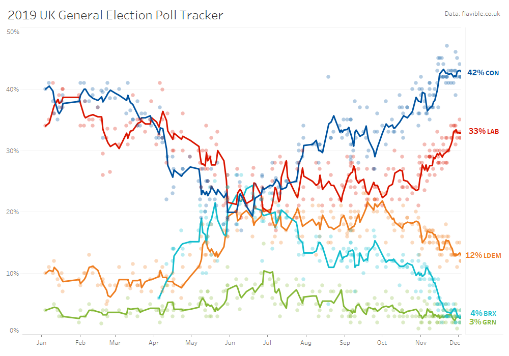
My own tracker: Tableau-built!
Finally, I thought I’d build my own, using Tableau. I took the data and combined the interactivity of the Guardian with the right-hand BANs of the FT. I didn’t push the needle out, but you can see the interactive version by clicking here.
Summary
It’s very reassuring to find that there are great examples of clean, audience-focused, clarity-driven poll trackers. Even the Daily Mail chart, for its faults, isn’t a disaster. This reflects a reassuring maturity of data journalism skills.
What do you think? Which are your favourite poll trackers? (and since I know you’re all data geeks, I know you’ll probably have an answer to both these questions!)
One more thing: I need to provide a special mention to Gavin Freeguard of the Institute for Government and his team for this poll-tracker:
Recent Comments