
What a great year it’s been in the Tableau community. MakeoverMonday has grown from strength to strength (and there’s even a book!); #WorkoutWednesday is providing technical challenges; and there are other great projects to get involved in too, such as #SportsVizSunday, VizForSocialGood and new ones such as #projecthealthviz from Lindsay Betzendahl.
As I look back, I thought about which are my favourite datavizzes of the year.
Here are my top 3. Note – I’m not saying these are the “best”, just that they each resonated with me in a special way. Click the vizzes to go to the interactive versions.
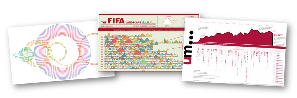
The FIFA Landscape by Harpreet Ghuman
We featured this in the Viz Gallery at TC Europe. The design of this is so beautiful. The use of colour is very gentle and invites me in. The curves are non-intimidating. The aesthetic makes me feel calm and ready to read. As you delve in, it requires a few moments to understand what the height and lengths of the curves mean. Harpeet annotated different marks in order to make it easy to work this out.
Once you have deciphered the chart, you can begin to find your own insights. Each line tells a story of a different world cup, and the mountains are super ways to show outliers.
The “hills” are also an innovative mark type: they encode number of goals and closeness of game. This is one of those vizzes that you can’t just say “Shoulda been a bar chart” to.
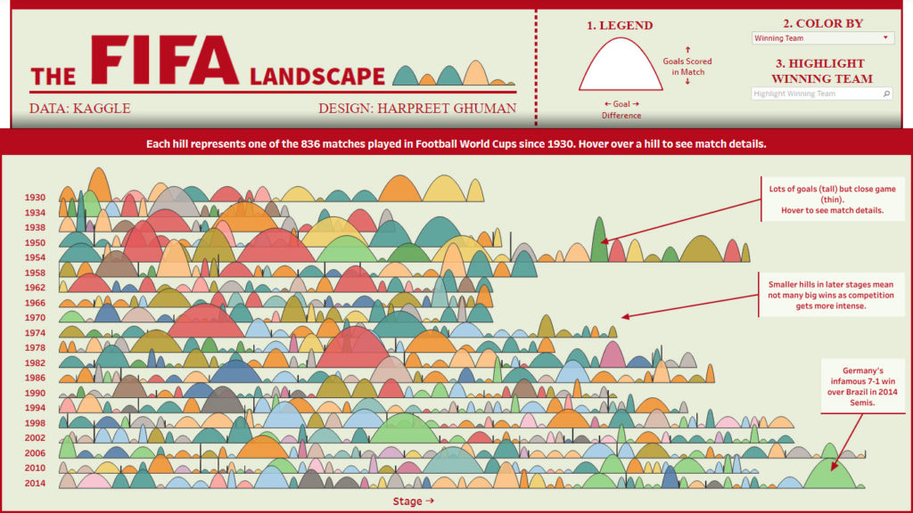
Analyzing “Ums” by Lilach Manheim
This was the first one I thought of when compiling this list. As someone who does public speaking for a living, I was immediately drawn to the data. Eradicating “Ums” is a lifelong challenge and I loved seeing Lilach’s #quantifiedself approach. This kind of exercise can reveal lots of insight about your presenting style.
The fact that Lilach had to manually count and timestamp each “Um” in her talk added to the allure of this viz: it is a labour of love to produce something like this. I love the originality and value of a visualization like this.
The Recamán Sequence, by Kevin and Ken Flerlage
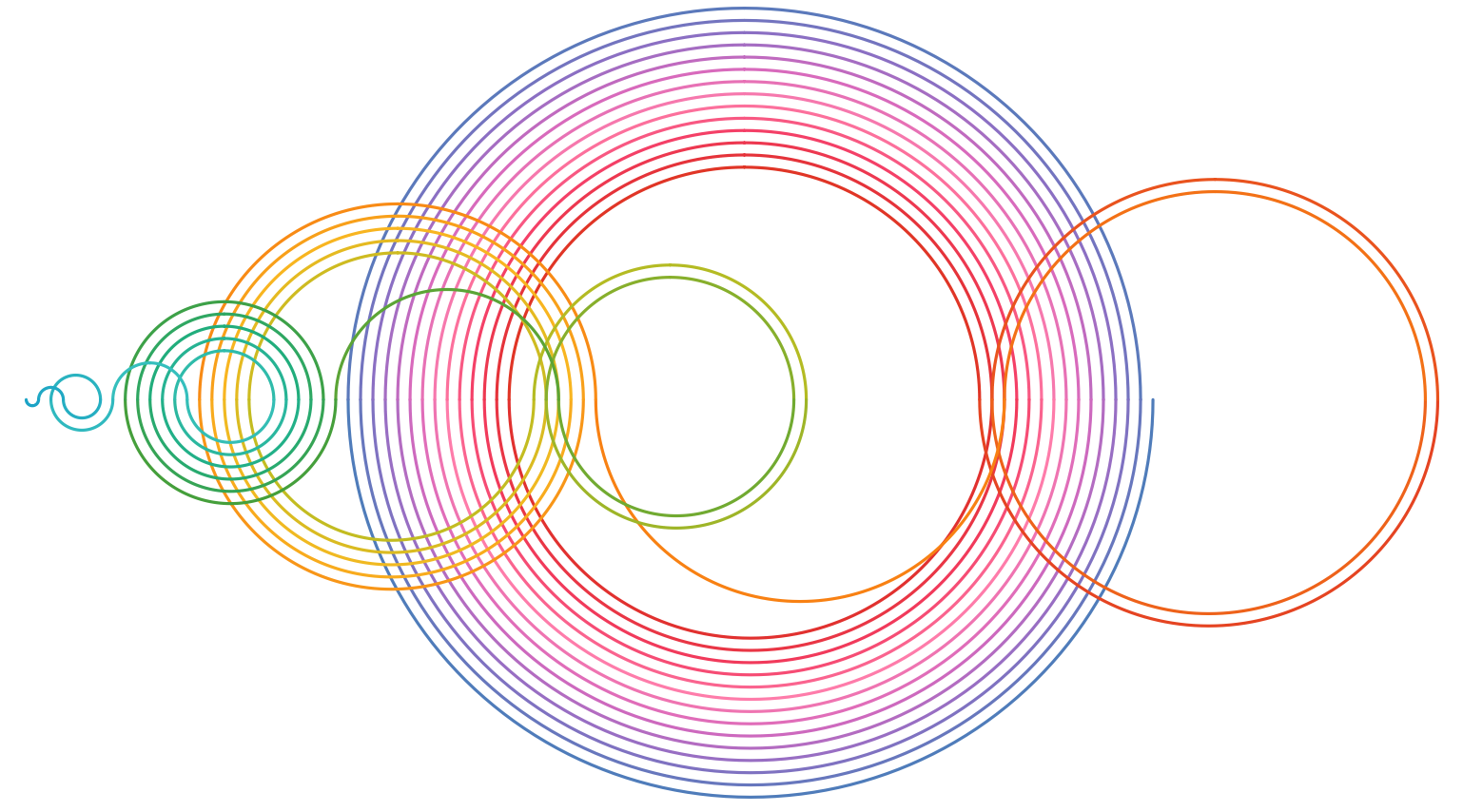
I’d seen an amazing video on the Numberphile YouTube channel about Recamán sequence, and figured it would be a good challenge to rebuild in Tableau. I confess to being lazy: instead of attempting it on my own, I asked Twitter for help.
I did feel a little bit of guilt at doing this, but fortunately Ken Flerlage took the bait. And then his brother did, too. And they both took different paths.
So this became one of my favourites partly out of guilt that I relied on the community but also because it shows how dataviz can be a scratch that needs to be itched. Also, it shows the versatility of dataviz tools. For every challenge there are multiple solutions.
And, of course, the end result is a beautiful interactive pattern based on a simple numerical sequence.
Be sure to read the write up of how they approached their different solutions.
Onto 2019
I’m looking forward to seeing other people’s favourite vizzes of the year. Let me reiterate – the above list are ones that resonated with me for special reasons.
With that, I’d like to thank everyone who published some visualizations on Tableau Public or elsewhere in 2018. It’s always a pleasure to see the imagination, the passion and the storytelling from the community. Roll on 2019!

Recent Comments