
I am a great fan of bump charts. They show changes in rank very effectively. Two bump charts caught my attention this week; they teach us an interesting lesson on how to implement them. The first was based on the history of the Oxford Bumps and bought to my attention by a post on Infosthetics. (click the image to go to the original)

The second was caught from a tweet by Andy Kirk
I’m a sucker for these types of projects! ‘A Visualization of the 2012-13 English Premier League’ by @kenandavis kenandavis.com/projects/a_sea…
— Andy Kirk (@visualisingdata) May 21, 2013
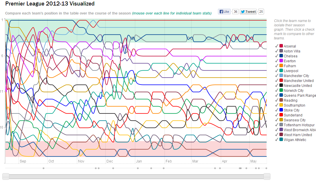
Both visualise really interesting data. But one is vastly more successful than the other. The Oxford Bumps chart is far too cluttered and difficult to read. The premiership chart is less cluttered and thu easier to read. Bump charts are, by their nature, like spaghetti and the appropriate reduction of clutter is vital. One way to solve this is to use well implemented highlighting. This is here where the Premiership bump succeeds and, unfortunately, the Oxford chart does not. Here are screen grabs of both bump charts with one item selected (St Edmund’s College on the left, Newcastle United on the right)
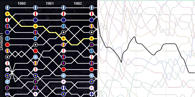
The problem should be very clear. The highlighting on the Oxford chart does not create enough contrast: it is very hard to see the yellow highlighted chart against the background. Newcastle United, on the other hand, is clear as day – the background is faded out.
The Oxford bump chart could be easily improved by reducing the noise in the chart. If the highlight is done in conjunction with fading out the background, a bump chart is much easier to read.
What do you think? Feel free to comment below.

3 Comments
Add Yours →[…] could keep going: bump charts, slope charts, small multiples, etc. But which is the right one? There’s no definite answer […]
[…] could keep going: bump charts, slope charts, small multiples, etc. But which is the right one? There’s no definite answer […]
[…] https://gravyanecdote.com/uncategorized/the-right-way-to-implement-a-bump-chart/ […]