
Before the World Cup, I was talking with Datasift about how to come up with charts that proved the business value of Datasift/Tableau. That was a fine conversation, but when I turned to crazy south American commentaries, things got more exciting. Who hasn’t loved hearing the commentators go nuts after a goal? How does that look on Twitter, we thought?
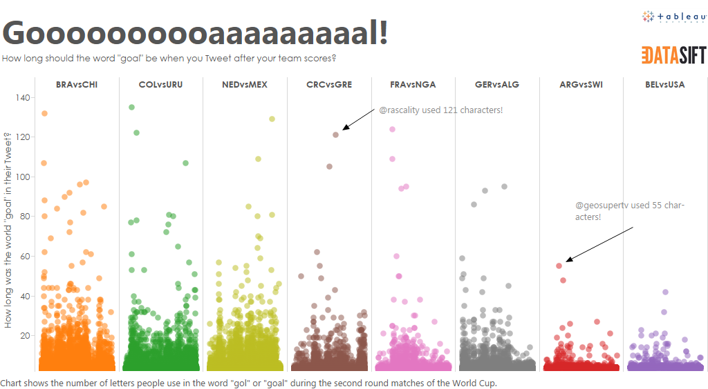
And so we built the viz above.
(We did do lots of other business-y stuff which you can find on http://agameof2halves.tumblr.com/ but this was the one that got the most engagement, by a mile.)
How did we build it?
Getting the data
We used Datasift to collect all tweets that included a World Cup hashtag (#WorldCup, #BRAvsCHI, etc) and the word goal. How do you filter for the word goal? Simple. Datasift allows you to filter Tweets by a regular expression, so we used the following:
“\\bgo{1,}a{1,}l{1,}\\b” for goal
“\\bgo{1,}l{1,}\\b” for gol
When the second round games had finished, we pulled the data into a MySQL instance.
Measuring the length of the word “goal”
How do you work out how long the word is? For a while I was stumped until a colleague suggested using SOUNDEX, a SQL function that identifies words based on their sound. SOUNDEX is one of those functions many database programmers learn about in the early days and mentally file in the “I’ll never need to use that but it’s interesting” area of the brain. That’s certainly what I did.
Realising this would work out, I dug around for a function I could use, and found this excellent example. I am grateful to Imranul Hoque for this. I made a couple of tiny tweaks, and now I had a nice query I could use to return the length of the word “goal” or “gol” in every tweet.
Visualising the data
At this point I pointed Tableau at the data to find a story and a good way to visualise it. I did try lots of views, but it took a while to find the right one. The line chart like the one below was an early attempt, but not interesting enough.
I also tried grouping tweets by “lots of letters” and “not lots of letters” but that ended up with a really dull bar chart:
I moved on to a box plot.

The boxplot itself wasn’t special but this lead directly to the end view.
A voice spoke to me. “Jitter, Andy, Jitter,” it said.
It was the distant calling of Tableau Zen Masters. I’d read about jittering on Steve Wexler’s blog, but never used the technique. Now I had the perfect data. The boxplot I had made stirred a memory of a similar image on one his post, Whatever. But jittering was the answer to making a visually exciting display of the data.
The final trick was to add a hook
A viz itself isn’t enough. I knew I wanted a good image that would work inline in Twitter. For this I needed the right size – approx 880×440 – and a good headline. Charts with a good title have more engagement than those without so I chose my title carefully.
The end result?
Simple: my most retweeted piece of content ever:
How long should “goooaaalll” be when yr team scores? http://t.co/pVHxmJV2BR #WorldCup #dataviz pic.twitter.com/ZAUJGJBgr2
— Andy Cotgreave (@acotgreave) July 2, 2014

Recent Comments